Friday, December 2, 2011

New Stock Markert Cycle is Bearish for the Year-End


The up sloping Head and Shoulders pattern had successfully decline to its target of 1160.00. Normally head and shoulders neckline's are not recrossed once they are violated. However, up sloping Broadening Wedge formations have a 7% probability of an incursion back into the formation. This is one of those rare incursions.

The only model suggests that the final wave five of c may go as high as 1288.67. Elliott Wave relationships suggest a top at 1279.00. What we now have is a smallish wave (i) and an oversized wave (ii).


The next opportunity for cycle turn is Monday morning. The low on November 25 is 1 1/2 daily pi cycles early, which is outside the normal range for a trading cycle low. For example, the October 4 low came one half pi cycle early.


However, the cycles were calling for a Master Cycle low between November 20 and November 29. It appears that the Master Cycle was on time. This Master Cycle is not the dominant cycle, but will have to keep an eye on it as we go and 2012.


In the meantime, I am still expecting a new low by December 8. That new low should take up the new head and shoulders neckline at 1158.67 and with it the October 4 low at 1074.77. Under the new cycle regime, it appears that we may get a bounce into options expiration week, ending December 16. However, that bounce may fail and produce a very nasty year end for equities.


Sunday, September 25, 2011

CDS Implied Probability of Default – Be Careful

by Peter Tchir

Unless something changes in the next 24 hours, I expect we will hear more and more talk about default, not only of Greece but of other countries and of banks. Just in case that happens, here is some information that may help you make good decisions. There will be lots of chatter about the “likelihood of default” the CDS market is implying, but although it can be a useful statistic, it can also be very misleading. Before jumping into trades based on erroneous assumptions, it is worth spending a few minutes reading this. If all it does is confuse you, maybe that is a good thing in itself, because you won’t take a headline about default probability as fact.

Recovery is Key and is often assumed away making default probability calculations less useful
Let’s start with a simple example. You have bonds of 2 different companies, each maturing in the near term, both trading at 70. What is the probability of default of each of these companies? You don’t know because that isn’t enough information. You know the bonds are trading at 70, and without a default they would pay par, providing a 30 point return. What you need to know to figure out the probability of default, is what the recovery value will be. Let’s assume that the recovery value for one company is going to be 60 and for the other will be 10. Then in the first case, the default probability is 75%. There is a 75% chance an investor would lose 10 points, and a 25% chance that they would lose 30 points, giving an “expected” value of 0 (today’s risk free rate). In the second case the default probability is only 33% (66% chance of 30 point gain plus a 33% chance of a 60 point loss).

So recovery is a key element of determining what default probability the market is pricing in. Yet, although it is key, it is often assumed to be 40% or some other number based on historical averages. That is a reason to be very concerned when you see a default probability mentioned. It is useless without looking at the recovery value, and recovery value isn’t easy to figure out. Recovery value is figuring out the enterprise value of a company after it has defaulted. It is not any easier than figuring out enterprise value of a company that is not in default, so treat estimated recovery values with the respect they deserve.

In the CDS pricing model, there are 3 key variables: the spread, the recovery value, and the up-front premium. If you know any 2 of those 3, then you can solve for the other. The market trades with the assumption of 40% recovery. That let’s traders quote a spread, and then the up-front premium is just a calculation. This is done more out of convenience than anything else. Agreeing to a recovery rate on each trade would be time consuming, and 40% seems reasonable enough for the purposes of calculating the up-front.

For high quality (tight spread names) the up-front premium is not very sensitive to recovery.
For names that trade at 400 over (BAC for example), the probability to default over 5 years is 21% with a 10% recovery, and 51% with a 70% recovery. So you need to take any probability of default derived from CDS prices with a grain of salt. Without a rational assumption for recovery, the probability of default is somewhat meaningless. Since changing recovery would change the “up front” premium, you could try and argue that the recovery must be valid. I would argue that the smartest credit investors figure out what premium they need to earn to take the risk, based on their assumptions, and then figure out what spread in a 40% recovery model world gives that up-front premium.

At the other extreme, names will eventually trade in “points”. With a 40% recovery in the model, there is no spread that can give an up-front premium of more than 60. If a dealer was willing to buy protection and pay 55 points up front, or sell that protection at 57 points up front, most investors wouldn’t complain about the liquidity. It would be as good as in the bond market. On the other hand, if the same dealer quoted that market as 3470/4430 some client might argue that 1000 bps seems egregious. Also, if a company has a bond trading at 35, dealers will not want to floor recovery at 40 since a bond trading at 35 shouldn’t exist if recovery is 40. So as default becomes more likely, the model becomes less useful.
The Curve is also important

For simplicity and market convention, the 5 year cumulative default probability is based on a flat curve. As a situation deteriorates it becomes more important to look at each point on the curve. Two names trading at 1000 in 5 year CDS would have the same implied probability of default from the standard model. But if one is trading “inverted” at the short end, and the other is steep, then at the very least the timing of default that is being priced is very different. An inverted curve means the risk of default in the near term is much higher. If you, as an investor are going to make decisions based on default probability headlines, you need to look at the curve. The 5 year default probability is a nice headline, but the devil is in the details.
Sovereigns are even more problematic when divining default probabilities

Sovereign CDS for Eurozone countries trades in USD. CDS on US government debt trades in Euros. This helps explain why CDS trades so wide for many sovereign names. If you bought €10 million of a European sovereign at par, and it defaulted, recovering 40%, you would have lost €6 million. If you had bought CDS in Euro that trade would basically offset it. If you bought protection in $’s and the exchange rate was unchanged, you would break even on the trade. But many investors believe that a default of a European sovereign would cause the Euro to get a lot weaker. So let’s say at the time of the trade the FX rate was 1.40. You would need to purchase $14 million of CDS to cover the €10 million bond position. If the default occurs and the FX rate went to 1.20, then you would have made $8.4 million on the CDS trade, which when converted back to Euros at 1.2 is now €7 million.

If investors believe an FX move is highly correlated with default, they will pay more for CDS. They make more on their negative view than they would if the FX trade wasn’t embedded. Similarly they lose less if the market rebounds. Their position in the bonds will go up, while their losing position in CDS gets converted back into more expensive Euros, thus mitigating their losses.

So on sovereign CDS, particularly at times of stress where the market clearly believes that a default is bad for the currency, the CDS spread is not just pricing in default, it is pricing in default with a currency move, making implied default probability less useful.

On top of that, recovery for sovereigns is purely guesswork. Creditors have NO rights. There is nothing they can do to try and collect on their bad debts. It is purely a negotiation. That is why the distressed investors don’t do much in sovereigns, because they are used to playing by rules, and in a sovereign default there are no rules. In some sovereign defaults, shorter dated bonds have received better treatment than longer dated bonds. That is uncommon in corporate defaults, but not uncommon in sovereign defaults, making picking a recovery value even more difficult.
Cheapest to Deliver Bonds

For banks, financials, and sovereigns the cheapest to deliver option embedded in CDS has less impact on daily CDS prices because they are such frequent issuers. For companies with fewer bonds, the cheapest to deliver option can impact CDS prices, without really impacting probability of default in the real world. If two very similar companies existed, but one had only issued bonds at times of high coupons, and the other had issued when rates were very low, the CDS on the low coupon bond company should trade a bit wider. Investors who like the “basis package” where they buy bonds and buy CDS generally prefer to buy lower priced bonds because they can benefit from a “jump to default” and lock in their basis trade profits sooner than later.

SPY Trends and Influencers 9/24/2011


Last week’s review of the macro market indicators looked to bring more consolidation for Gold ($GLD) in a broad range, but with the bias to the down side if forced to pick a break direction. Crude Oil ($USO), the US Dollar Index ($UUP) and US Treasuries ($TLT) all also look to be headed lower in the short run. The Shanghai Composite ($SSEC) looks to continue lower while Emerging Markets ($EEM) consolidate further. Volatility ($VIX) looks to remain elevated with any break bias to the downside as Equity Index ETF’s $SPY, $IWM and $QQQ are set up to extend their gains. The QQQ is by far the strongest of these index ETF’s and should be watched for broad direction. The correlations to watch for driving the Equity markets this week are the inverse relationship to the US Dollar and US Treasuries. Should these areas reverse and move strongly higher Equities will likely fall. Gold should play less of a role as it is moving in a broad range.

The week began with Gold moving sideways before a massive collapse and Crude Oil falling lower. The US Dollar Index and US Treasuries also drifted before launching higher and as warned knocking the Equity Indexes lower. The Shanghai Composite continued to consolidate while Emerging Markets were sucked into the downdraft again. What does this mean for the coming week? Lets look at some charts.
As always you can see details of individual charts and more on my StockTwits feed and on chartly.)

SPY Daily, $SPY

SPY Weekly, $SPY

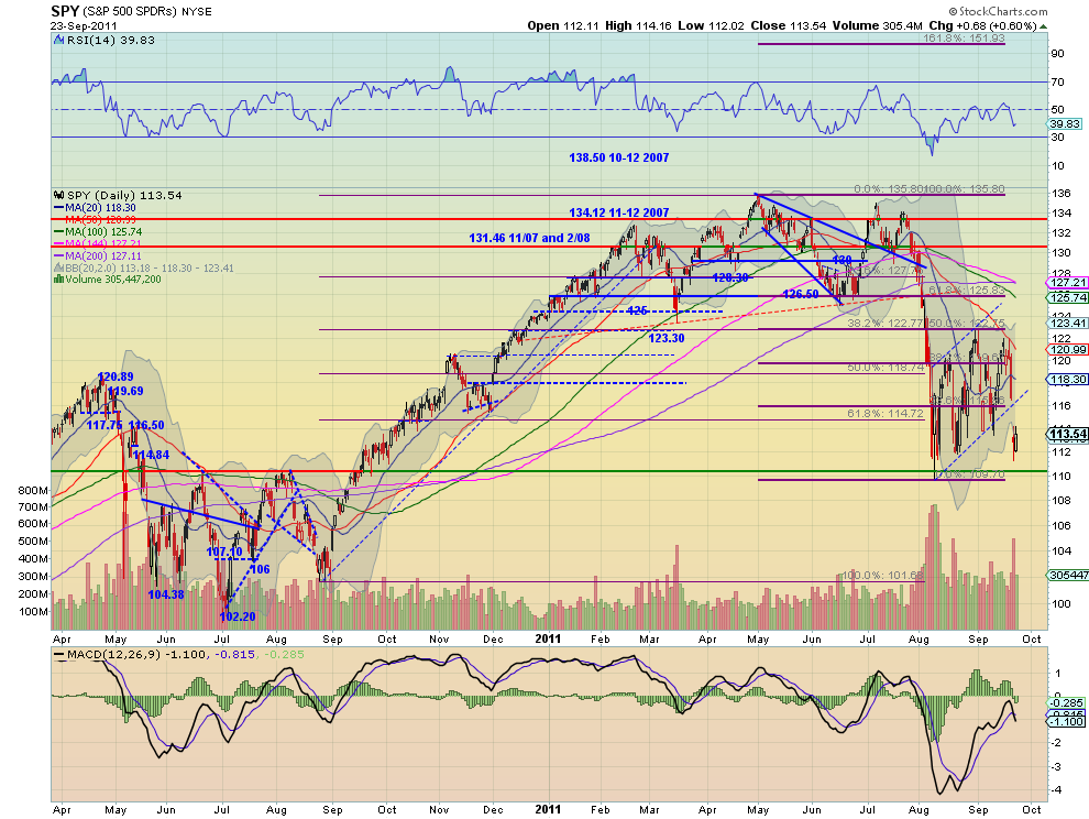
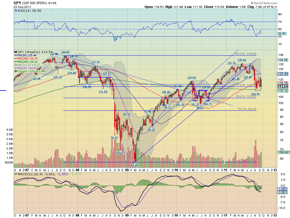
The SPY gapped lower out of its bear flag Thursday and then held that range Friday, at the closing low support since early August. The RSI is pointing lower and the MACD crossed negative on the daily time frame. All of the SMA’s are sloping lower on both time frames except for the 100 week SMA. The weekly chart also shows a bearish RSI but the MACD is diverging, starting to improve. It is not as certain of the flag break on the weekly chart. The bias is to the downside for next week with support below 112 at 110.26 and then 108 and 104. Any bounce above the gap level of 114 should see resistance within the bear flag and first near 116.

Rolling into the last week of the third Quarter, Gold and Oil are ready for more downside. The US Dollar Index and US Treasuries look to continue higher. The Shanghai Composite and Emerging Markets also look to continue their down moves. Volatility looks to remain elevated and possibly break higher. The equity Index ETF’s, SPY, IWM, and QQQ are all looking better to the downside. The QQQ again may be the key to holding the market together. If it loses support of the flag, the SPY and IWM could take the whole market lower. A spike in Volatility and continued moves higher in Treasuries and the Dollar Index should ensure it. Use this information as you prepare for the coming week and trade’m well.

See the original article >>

The 3 Most Vulnerable Sectors


These major market sectors are still looking very vulnerable and are likely to continue to underperform the S&P in the months ahead. Use careful risk controls to avoid big losing positions.

The late-in-session drop in the stock market after the Fed announcement was consistent with the deterioration in the technical outlook discussed yesterday. The McClellan Oscillator has broken below support, which makes a further drop very likely.

Three of the major sectors look most vulnerable to further selling and they are likely to underperform the S&P 500. Even though technology was also lower, it continues to show better relative performance, or RS analysis, which suggests the tech sector will hold above the August lows.

For the Select Sector SPDR – Energy (XLE), it is important to keep an eye on crude oil prices. As I have frequently pointed out, crude oil often leads the stock market on both the up and down side. November crude oil was down over $2 yesterday, and a break of key support would be a negative for the energy sector and stocks in general.

Chart Analysis: November crude oil completed its flag formation, lines a and b, on Monday, but so far, the short-term lows in the $84.65-$84.90 area are holding. The key chart support is now at $83.47.
  • There is further support at $79.76 and then at $76.61. The 127.2% Fibonacci retracement target is at $72.53
  • The on-balance volume (OBV) broke its uptrend, line c, on September 9 before rebounding sharply
  • Volume has been heavy over the past three days and the OBV now shows a pattern of lower highs and lower lows
  • Crude oil has resistance at $88 with stronger resistance in the $89-$90.63 area
The weekly chart of the Select Sector SPDR – Energy (XLE) shows that it is not far above the weekly uptrend (line d) and the 50% retracement support in the $59-$59.40 area. XLE completed a daily head-and-shoulders top formation in May.
  • The major 61.8% Fibonacci support stands at $54.50
  • The relative performance, or RS analysis, turned positive in October 2010, signaling that XLE was going to be stronger than the S&P 500. The RS analysis topped in May and is negative, as it is still below its declining weighted moving average (WMA)
  • The weekly OBV formed a negative divergence, line f, at the late-April highs. The OBV needs to break this downtrend to turn positive. The OBV is below its weighted moving average
  • There is initial resistance for XLE at $67.76-$69.90

The Select Sector SPDR – Industrial (XLI) has been one of the weakest sector ETFs, down 24.6% from the April high at $38.98. The daily chart shows a completed head-and-shoulders top formation, as the neckline (line a) was broken in July.
  • The daily chart shows next support at the uptrend (line b) in the $29.50 area
  • Major 50% retracement support stands at $27.40 with the downside target from the daily chart formation at $26.40
  • The daily uptrend in the RS (line c) was broken in May and still looks negative
  • Daily OBV confirmed the completion of the top formation when it dropped through long-term support at line d
  • Weekly OBV formed a negative divergence at the May highs and is still negative
  • There is initial resistance for XLE at $32.20 and then at $32.89
The Select Sector SPDR – Materials (XLB) closed below short-term support, line g, on Wednesday. This suggests it will continue to lead the market lower. The daily chart shows a completed top formation, lines e and f.
  • Major 50% retracement support is at $29.70
  • The daily chart formation has downside targets in the $28.50 area
  • The daily uptrend in the RS, line h, that goes back to the 2010 lows, was broken in early May. The RS is now dropping very sharply and XLB is acting weaker than the S&P 500
  • The OBV is in a solid downtrend, line i, though we may have seen a selling climax in early August
What It Means: These three key sectors have been the weakest over the past four months. The weakness in crude oil suggests it is ready for one more decline, but the longer-term technical analysis for crude oil suggests that this could complete a bottom formation. Therefore, the energy sector may bottom out first.

The industrials and materials sectors gave weekly sell signals in May (see “2 Key Sectors Top Out”). Both now look ready to lead the markets lower, and a resurgence of growth in the emerging markets is likely necessary before these sectors turn around.

How to Profit: I see no real profit opportunities at this time, but those holding stocks in these sectors should be sure to use stops on all positions to limit the risk. It is tough to come back from a 30%-40% hit in one position.

Dollar breakout ...

by Kimble Charting Solutions


Dow Reaches Lower Channel Line


The Dow has reached the lower parallel channel for the entire rally from the March 2009 low. The channel lines were created using the Andrew's "pitchfork" method with the November 2008 low as the origin and the January 2009 high and March 2009 low for the base. It is easy to see how well the Dow has followed the channel lines over the last two and half years. There is every reason to believe that some sort of intermediate term low is imminent near term based on this chart. A rally to the median line somewhere around 12,000 by late this year or early next year is the most likely next move.


I expect that after that rally the currently developing low will be retested by mid 2012. If that test is successful, another leg up in the stock market should follow. At the risk of sounding repetitious this process will last several more months. Be prepared for difficult choppy conditions and use more conservative trading targets.

Follow Us