Tuesday, March 11, 2014

'US is running out of soybeans' - Goldman

by Agrimoney.com

Goldman Sachs hiked its forecasts for soybean prices, and nudged higher expectations for corn and wheat prices, reflecting the impact of higher-than-expected exports in eroding US supplies.

"The US is running out of soybeans," the investment bank said, highlighting China's reluctance, so far, to cancel import orders from the US, as had been expected with a strong Brazilian harvest now in progress, and prices there cheaper.

"Shipments and export sales to China remain elevated despite a record large start to Brazil's soybean exports in February, and against our prior expectation for a slowdown," Goldman analyst Damien Courvalin said.

"The window for these [Chinese import order cancellations] to occur is shrinking quickly, given the continued strong pace of shipments in recent weeks.

"The fact that current strong US shipments are occurring despite lower South American than US cash prices, and sharply collapsing Chinese soybean crush margins, introduces a risk that the US over-exports soybeans, bringing domestic inventories to critically low levels."

Year of two halves

The bank forecast US soybean inventories ending 2013-14 at 139m bushels - 6m bushels below a forecast issued by the US Department of Agriculture on Monday, itself a downgrade of 5m bushels.

The estimate, which reflects ideas of US soybean exports hitting 1.565bn bushels, more than the USDA foresees, would leave stocks, as a proportion of use, at a historically low 4.2%, implying buyers will need to compete heavily for supplies and raise offers.

However, even upgraded by $1.50 to $14.00 a bushel on a three-month timescale, and by $1.00 to $10.50 a bushel in a year's time, the bank's forecasts for Chicago soybean futures prices remain below the levels the market is expecting.

The bank highlighted the potential for "record high" US soybean imports from Brazil this summer, more than the USDA is counting on, plus flagged the threat of porcine epidemic diahorrea virus (PEDv) to domestic demand, in stemming growth in the hog herd.

Further ahead, it cautioned that the "very strong Chinese soybean restocking" currently underway may be followed by slower purchases in 2014-15, when the US will face early-season competition from Brazilian soybeans left over from their record current harvest.

"We continue to expect that soybean prices will decline strongly in the second half of 2014," Mr Courvalin said.

Corn, wheat upgrades

For corn, Goldman raised its forecast for prices in the three-month horizon by $0.25 a bushel to $4.50 a bushel, prompting a "mechanical" upgrade to the estimate for Chicago wheat futures of $0.40 a bushel to $5.85 a bushel.

Prices of corn and wheat, as rivals for uses such as feed, typically show a good correlation.

Again, the bank cited better-than-expected exports in corn - plus a forecast of a "strong ramp up" in ethanol production next month as low inventories of the biofuel and healthy export demand underpin margins.

However, with the prospect of a strong harvest this year, pencilled in at 13.988bn bushels, a fraction above the USDA expectation, Goldman remained cautious over corn prices for next season.

"Our yield model based on trend yield growth and summer weather suggests that the US corn yield should reach 165 bushels an acre under average conditions this summer, bringing corn prices below $4.00 a bushel," Mr Courvalin said.

See the original article >>

Great Graphic: Emerging Markets' External Hard Currency Debt

by Marc Chandler

This Great Graphic was posted on Business Insider by Matthew Boesler. He got it from Nomura, who drew BIS and IMF data.  It looks the mix of foreign currency bonds. issued offshore, (red)) local currency bonds, issued on shore (gray) and cross-border loans (blue). 

Off-shore bonds are not picked up in the country-level balance of payments and capital account figures. The traditional national accounts are more interested in residency of the issuance not the nationality of the issuer.  Nomura estimates that since 2010, corporations, based in emerging markets, have issues about $400 bln in offshore debt, or about 40% of its total issuance.  The bulk is thought to be denominated in dollars. 

The bonds issued abroad potential currency-mismatch and need to be assessed on a company-by-company basis, but a relatively large amount of foreign currency borrowings is potential risk that is often not appreciated when looking at national accounts.   Russia has the highest amount of hard currency debt at about 12% of GDP.  In Russia's case this may sound more threatening than it actually is.  Consider a company that exports oil, gas, or industrial metals.  Its revenue is likely to be large in dollars.  Dollar income could be matched with a dollar-denominated bond. 

Other companies may not have achieved such a natural offset, but borrowed in dollars because it is cheaper. Such companies may be more exposed to adverse local currency movement.  As the local currency falls, such as the Russian rouble, the foreign debt increases, lifting overall debt as a percentage of assets. 

This lower chart was tweeted by  Niall  O'Connor, which he got from UBS.   It shows that in  several emerging markets, the external debt as a percentage of GDP is lower than 1996.   However, the take away might not be so benign as suggesting there is less risk of widespread currency mismatches.
First, only half of the eight countries selected show improvement (Thailand, Indonesia, Philippines and Mexico) and there are some considerations that suggest more than meets the eye. For example, 1996 was the eve of the 1997-1998 Asian financial crisis.  External debt in Asia was near a peak.  Mexico, for its part, was just getting out of its Tequila crisis.
Second, some countries have actually more external debt than previously.  The chart shows this is true for South Africa and, to a less extent, Turkey.   Third, even with small improvement, 20% external debt to GDP can still be problematic.  It is also important to understand the mix between public and private sector foreign debt.  It depends on the provisions, including whether hedging instruments are used and central currency reserves.   Risk is also a function of how much of the external debt is short-term and how much is long-term. 

See the original article >>

Seeing Through Emerging-Market Volatility

By AllianceBernstein

Stock markets in emerging markets (EMs) have gotten off to a rough start this year after a challenging 2013. Valuations have fallen and volatility remains high. So should investors add exposure to emerging markets—or is it better to steer clear?

In our view, it’s probably too early for a large tactical shift towards emerging markets. But we do think the time is right for investors who are underweight EMs—or who lack exposure altogether—to start rebalancing towards their strategic targets in developing-world stocks. While short-term caution is appropriate, we think EM stocks continue to provide a good long-term opportunity—especially for active managers.

New and Old Problems

EM stocks’ underperformance started with the Fed’s tapering talk, but now the spotlight is on endogenous problems. These include some that have traditionally plagued emerging markets, notably the troubles in the “fragile five”—Brazil, India, Indonesia, South Africa and Turkey—which depend on foreign investment flows to fund domestic deficits and are more at risk from currency depreciation. And as Russian stocks plunged this week in response to the Ukraine crisis, investors received a stark reminder that political instability is a fact of life in key emerging markets.

Newer threats are also worrying investors. These include China’s slowdown and the need for structural reforms in several large EMs, including the BRICs (Brazil, Russia, India and China), which could suppress growth. Fears of a credit crunch are also rife after a rapid credit expansion in many EMs; several banking systems—and large EM companies with heavy benchmark weights—could be vulnerable.

Reasons for Resilience

However, we think these concerns have also obscured some key reasons why most developing countries are likely to be more resilient than in past crises:

  • External independence—with the exception of the fragile five, most larger developing countries today have strong public finances and large foreign currency reserves
  • Low inflation—monetary policy should remain accommodative, except in countries with external deficits that are raising interest rates to defend their currencies
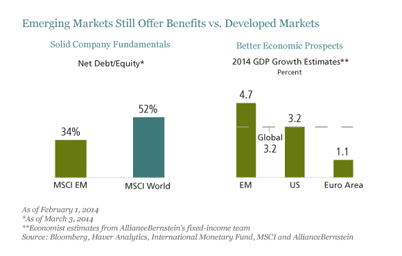
  • Company resilience—balance sheets of companies are typically strong and there is often more scope for margin improvement than in developed-market counterparts (Display, left chart)

Fay_EM-Equities_display1_d3

We also think worries about China are overdone. Although the days of double-digit growth are over, we expect growth to stabilize at about 7.5% a year. This still would represent a huge engine for demand from the world’s most populous country.

Why Maintain Exposure?

We believe that there’s still a compelling longer-term case for significant EM equity exposure within a diversified portfolio. Emerging-market equities can provide better long-term earnings growth from access to the rapid economic growth that is typically fueled by stronger productivity growth. In some countries, working age populations are growing much faster than in developed markets. And valuations today are once again significantly lower than in developed markets.

Diversification is another benefit. Although correlations between emerging and developed markets have increased in recent years, last year reminded us that they often still behave very differently. And within emerging markets, investors can diversify further by including smaller markets; stocks in the United Arab Emirates, Qatar and Vietnam markets have done very well this year.

Good Conditions for Active Management

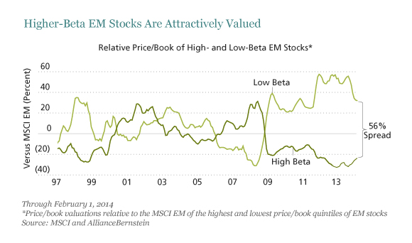
In today’s volatile conditions, we think stock picking is the best way to go. Spreads are unusually wide between higher-beta, more cyclically exposed stocks, and “safer” low-beta stocks (Display). While some of these stocks, for example in basic commodity sectors, may deserve low valuations, our research suggests that others look more promising, such as Indian cyclicals. There are also many high quality companies with solid fundamentals and high return on equity to be found.

Fay_EM-Equities_display2_d5

We’re wary of taking a passive approach and just buying an index. Since last year’s sell-off was not uniform, it has accentuated some already large pricing discrepancies that are creating rich pickings for bottom-up stock pickers. And the stocks that win in the years to come are likely to be very different from the winners in the last five, as the sources of growth in emerging markets shift. Meanwhile, macro risks vary widely by country and are not always fully reflected in pricing differentials; so, in our view, it’s especially important to discriminate in country exposure within a portfolio.

Emerging markets have always been volatile—but that’s one of the reasons why they have also delivered higher returns than developed markets over time. We think it’s no different today. In our view, investors with a long-term horizon should maintain their allocation to emerging-market stocks.

See the original article >>

The Fed Has Failed (and Will Continue to Fail), Part 1

by Charles Hugh Smith

The Fed's policies have been an unqualified success for financiers and an abject failure for the bottom 99.5% who have to work for a living.

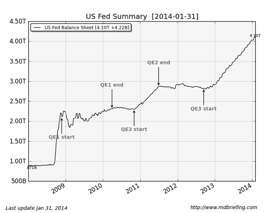
After five long years of politicos and the financial media glorifying the Federal Reserve's policies as god-like in their power and efficacy, let's take a quick look at the results of these vaunted policies: ZIRP (zero interest rates), (QE) quantitative easing, both of which are ways of shoving nearly limitless, nearly-free money ( a.k.a. liquidity) into the banking sector, where all this free money is supposed to filter into the global economy, working miracles of prosperity.
Let's start with a chart of the Fed's balance sheet, which reflects just how much money the Fed has created and pumped into the financial system. $4 trillion is larger than the entire GDP of Germany, and roughly 25% of U.S. GDP.


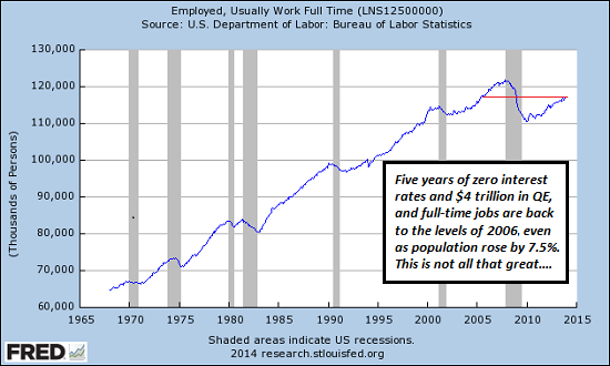
Next, let's look at the effect of the much-glorified Fed policies on full-time employment: If you call a return to the levels of 2005 (despite a 7.5% increase in population) a success, then what would you consider a failure?
Let's recall that the Fed's policies are unprecedented. Keeping interest rates near-zero for five years and pumping $4 trillion into the system are both completely off the scale of central bank policy in the U.S.


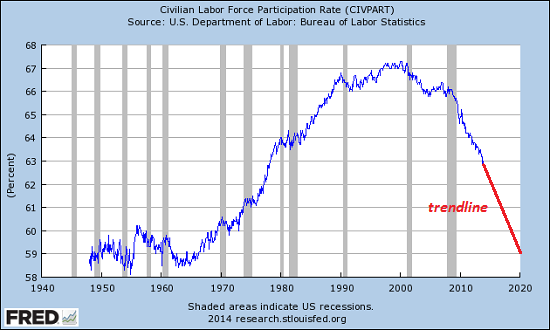
Next, let's look at the participation rate--how many people of working age who are actively in the workforce. The trend is ugly; the percentage of the civilian population who are working or actively seeking work is plummeting.


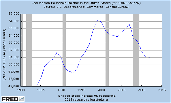
Next: real median household income: this is household income adjusted for inflation.Another ugly chart, as real median household income is back to the levels of 1990. Once again: if you reckon this a success, then what would you consider a failure?


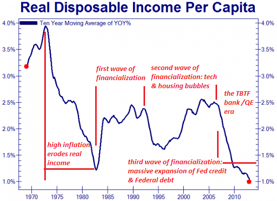
How about the annual change in disposable income? we can assume that "prosperity" and "recovery" mean disposable income are rising at a healthy clip, right? Alas, the rate of disposable income growth is sinking toward zero. The Fed's policies of bailing out "too big to fail" banks and QE/ZIRP have correlated to the most stunning drop in disposable income growth in decades.


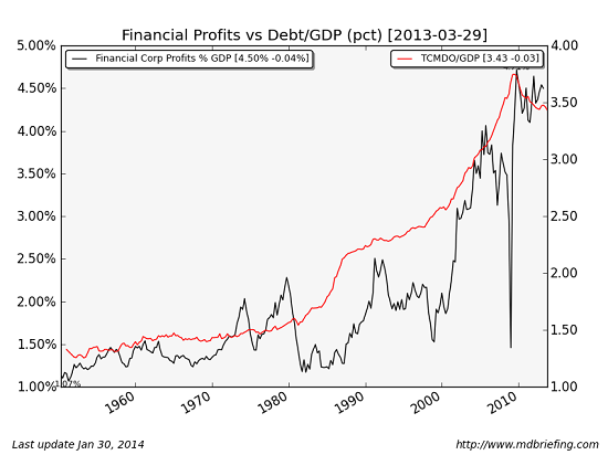
How about financial sector profits? Hey, now we're finally getting somewhere-- these are through the roof. We finally found something with a positive correlation to Fed policies--financial profits are hitting all-time highs. Yee-haw, we have a winner.


Last but not least, how about the stock market? Here is a chart of the Fed balance sheet and the S&P 500 since 2009. Ding-ding, we have another winner--stocks are also hitting all-time highs.

Source: Zero Hedge

The most charitable assessment we can make of Fed policy is that the "prosperity" it created is at best, ahem, grossly concentrated in the most parasitic and politically powerful sector: finance. Why should we be surprised that the Fed, itself a servant of the banking sector, should devise policies that enrich the bankers and financiers?
Let's be clear about one thing (to quote the president): the Fed's policies have been an unqualified success for financiers and an abject failure for everyone who has to work for a living. The Fed has not just failed to rectify the nation's obscene inequality in wealth and income; it has actively widened it by handing guaranteed returns to the banks and financiers while stripmining what's left of the middle and working classes' non-labor income, i.e. interest on savings.
Just as a refresher:

Tomorrow: how the Fed rewards imprudent parasites and punishes the prudently productive.

See the original article >>

10 Warnings Signs Of Stock Market Exuberance

by Lance Roberts

Imagine that you are speeding down one of those long and lonesome stretches of highway that seems to fall off the edge of the horizon.  As the painted white lines become a blur, you notice a sign that says "Warning."  You look ahead for what seems to be miles of endless highway, but see nothing.  You assume the sign must be old therefore you disregard it, slipping back into complacency.

A few miles down the road you see another sign that reads "Warning: Danger Ahead."  Yet, you see nothing in distance.  Again, a few miles later you see another sign that reads "No, Really, There IS Danger Ahead."  Still, it is clear for miles ahead as the road disappears over the next hill. 

You ponder whether you should slow down a bit just in case.  However, you know that if you do it will make you late for your appointment.  The road remains completely clear ahead, and there are no imminent sings of danger.  So, you press ahead.  As you crest the next hill there is a large pothole directly in your path.  Given your current speed there is simply nothing that can be done to change the following course of events.  With your car now totalled, you tell yourself that there was simply "no way to have seen that coming."

It is interesting that, as humans, we fail to pay attention to the warnings signs as long as we see no immediate danger.  Yet, when the inevitable occurs, we refuse to accept responsibility for the consequences. 

I was recently discussing the market, current sentiment and other investing related issues with a money manager friend of mine in California. (Normally, I would include a credit for the following work but since he works for a major firm he asked me not to identify him directly.)  However, in one of our many email exchanges he sent me the following note detailing the 10 typical warning signs of stock market exuberance.

(1) Expected strong OR acceleration of GDP and EPS  (40% of 2013's EPS increase occurred in the 4th quarter)

(2) Large number of IPOs of unprofitable AND speculative companies

(3) Parabolic move up in stock prices of hot industries (not just individual stocks)

(4) High valuations (many metrics are at near-record highs, a few at record highs)

(5) Fantastic high valuation of some large mergers (e.g., Facebook & WhatsApp)

(6) High NYSE margin debt

Margin debt/gdp (March 2000: 2.7%, July 2007: 2.6%, Jan 2014: 2.6%)

Margin debt/market cap (March 2000: 1.8%, July 2007: 2.3%, Jan 2014: 2.0%)

(7) Household direct holdings of equities as % of total financial assets at 24%, second-highest level (data back to 1953, highest was 1998-2000)

(8) Highly bullish sentiment (down slightly from year-end peaks; still high or near record high, depending on the source)

(9) Unusually high ratio of selling to buying by corporate senior managers (the buy/sell ratio of senior corporate officers is now at the record post-1990 lows seen in Summer 2007 and Spring 2011)

(10) Stock prices rise following speculative press releases (e.g., Tesla will dominate battery business after they get partner who knows how to build batteries and they build a big factory.  This also assumes that NO ONE else will enter into that business such as GM, Ford or GE.)

All are true today, and it is the third time in the last 15 years these factors have occurred simultaneously which is the most remarkable aspect of the situation.


The following evidence is presented to support the above claim.

Exhibit #1: Parabolic Price Movements

Kumar-IBB-030714

Exhibit #2: Valuation

Tobins-Q-Shiller-PE-111113

Excerpt from a recent report by David J. Kostin, Chief US Equity Strategist for Goldman Sachs, 11 January 2014

"The current valuation of the S&P 500 is lofty by almost any measure, both for the aggregate market as well as the median stock:

(1) The P/E ratio;

(2) the current P/E expansion cycle;

(3) EV/Sales;

(4) EV/EBITDA;

(5) Free Cash Flow yield;

(6) Price/Book as well as the ROE and P/B relationship; and compared with the levels of inflation; nominal 10-year Treasury yields; and real interest rates.

Kostin-Chart1-030714

Furthermore, the cyclically-adjusted P/E ratio suggests the S&P 500 is currently 30% overvalued in terms of Operating EPS and about 45% overvalued using As Reported earnings.

Reflecting on our recent client visits and conversations, the biggest surprise is how many investors expect the forward P/E multiple to expand to 17x or 18x. For some reason, many market participants believe the P/E multiple has a long-term average of 15x and therefore expansion to 17-18x seems reasonable. But the common perception is wrong. The forward P/E ratio for the S&P 500 during the past 5-year, 10-year, and 35- year periods has averaged 13.2x, 14.1x, and 13.0x, respectively. At 15.9x, the current aggregate forward P/E multiple is high by historical standards.

Most investors are surprised to learn that since 1976 the S&P 500 P/E multiple has only exceeded 17x during the 1997-2000 Tech Bubble and a brief four-month period in 2003-04. Other than those two episodes, the US stock market has never traded at a P/E of 17x or above.

A graph of the historical distribution of P/E ratios clearly highlights that outside of the Tech Bubble, the market has only rarely (5% of the time) traded at the current forward multiple of 16x.

Kostin-Chart2-030714

The elevated market multiple is even more apparent when viewed on a median basis. At 16.8x, the current multiple is at the high end of its historical distribution.

The multiple expansion cycle provides another lens through which we view equity valuation. There have been nine multiple expansion cycles during the past 30 years. The P/E troughed at a median value of 10.5x and peaked at a median value of 15.0x, an increase of roughly 50%. The current expansion cycle began in September 2011 when the market traded at 10.6x forward EPS and it currently trades at 15.9x, an expansion of 50%. However, during most (7 of the 9) of the cycles the backdrop included falling bond yields and declining inflation. In contrast, bond yields are now increasing and inflation is low but expected to rise.

Incorporating inflation into our valuation analysis suggests S&P 500 is slightly overvalued. When real interest rates have been in the 1%-2% band, the P/E has averaged 15.0x. Nominal rates of 3%-4% have been associated with P/E multiples averaging 14.2x, nearly two points below today. As noted earlier, S&P 500 is overvalued on both an aggregate and median basis on many classic metrics, including EV/EBITDA, FCF, and P/B."

Exhibit #3: Selling Of Company Stock By Senior Managers

Excerpt from a recent article by Mark Hulbert

"Prof. Seyhun - who is one of the leading experts on interpreting the behavior of corporate insiders - has found that when the transactions of the largest shareholders are stripped out, insiders do have impressive forecasting abilities. In the summer of 2007, for example, his adjusted insider sell-to-buy ratio was more bearish than at any time since 1990, which is how far back his analyses extended.

Ominously, that degree of bearish sentiment is where the insider ratio stands today, Prof. Seyhun said in an interview.

Note carefully that even if the insiders turn out to be right and the bull market is coming to an end, this doesn't have to mean that the U.S. market averages are about to fall as much as they did in 2008 and early 2009. The one other time since that bear market when Prof. Seyhun's adjusted sell-buy ratio sunk as low as it was in 2007 and is today, the market subsequently fell by 'just' 20%.

That other occasion was in early 2011. Stocks' drop at that time did satisfy the unofficial definition of a bear market, and the insiders' pessimism was vindicated."

Exhibit #4: Investor's Confidence

AAII-Bull-Bear-030714

AAII-INVI-Bearish-13wk-030714

Exhibit #5: Ownership Of Stocks As % Total Financial Assets

Flow-Of-Funds-Equity-TotalAssets-030714

The point my money managing friend wishes to make is simply that the ""warning signs" are all there. However, since the road ahead seems clear, it is human nature that we keep our foot pressed on the accelerator.   

As the Federal Reserve extracts liquidity from the markets, the "Bernanke Put" is being removed which leaves the markets vulnerable to a "mean reverting event" at some point in the future.  The mistake that many investors are currently making is believing that since it hasn't happened yet, it won't.   This time is only "different" from the perspective of the "why" and "when" the next major event occurs.

Of course, despite the repeated warning signs, the next correction will leave investors devastated looking to point blame at everyone other than themselves.  The question will simply be "why no one saw it coming?"

See the original article >>

Ukraine/Crimea – the Map That Explains Everything

by Pater Tenebrarum

What the Economy Needs

We want to briefly comment on the suggestions that the Ukraine – this is to say the government of the Ukraine – allegedly needs to “borrow at least $35 billion”. This has been reported in terms such as these:

“The political crisis has cost Ukraine economically as the country is facing a possible debt default. Ukraine needs approximately $35 billion in aid to improve its economy, according to the country’s finance ministry.”

The last thing a country needs to “improve its economy” is a giant loan to its government. Government equals waste, even if it isn't prone to stealing, which we suspect the new administration in Kiev definitely is. Why should it be any different from the previous 'Orange Revolution' government? It's the same people, only fortified by a bunch of extreme right-wing nationalists this time, who incidentally hold a number of important portfolios, including everything relating to police, defense, national security and even the post of prosecutor general. Germany's news magazine Der Spiegel, which is largely sympathetic to the new government, reports this most recent tidbit from Kiev:

“They [the Maidan activits, ed.] are afraid that the political profiteering of recent years will carry on, just with different beneficiaries.

[…]

Their concern appears to be justified. Last Monday, a high-ranking officer from Ukraine's customs administration contacted a newspaper to inform editors of a new deal pertaining to the "internal" allocation of unexpected customs revenues. No longer would confiscated money and valuables be given to Yanukovych's Party of Regions as they had been previously. Rather, they would go to the Fatherland alliance. Timoshenko, the man said, had personally approved the deal. Furthermore, the Communist Party, he said, had been handed the leadership of the customs administration so that it would support Timoshenko in the future.”

(emphasis added)

Just as we suspected a short while ago: meet the new boss, same as the old boss! The US and EU governments have done their tax payers no favors by opening up this new black hole to throw money into. They should have let Russia lend the $15 billion it was prepared to lend to the Ukraine, then their new arch-enemy Putin would be stuck with the bill.

As Ludwig von Mises pointed out:

“Investment and lending abroad are only possible if the receiving nations are unconditionally and sincerely committed to the principle of private property and do not plan to expropriate the foreign capitalists at a later date. It was such expropriations that destroyed the international capital market [this was published in 1949 and the destruction of the international capital market Mises refers to has since been largely rescinded, ed.]

Intergovernmental loans are no substitute for the functioning of an international capital market. If they are granted on business terms, they presuppose no less than private loans the full acknowledgment of property rights. If they are granted, as is usually the case, as virtual subsidies without any regard for payment of principal and interest, they impose restrictions upon the debtor nation's sovereignty. In fact such "loans" are for the most part the price paid for military assistance in coming wars. Such military considerations already played an important role in the years in which the European powers prepared the great wars of our age. The outstanding example was provided by the huge sums which the French capitalists, pressed hard by the Government of the Third Republic, lent to Imperial Russia. The Czars used the capital borrowed for armaments, not for an improvement of the Russian apparatus of production. They did not invest it; they consumed a great part of it.”

(emphasis added)

The problem with the Ukraine is precisely that it has so far not adequately protected the property rights of foreign investors. It is all dependent on political whim, and thus far, it has made no difference whether the Western or Eastern Ukrainian parties were in charge. Moreover, as Mises correctly points out, intergovernmental loans are for the most part wasted on consumption and are frequently used for the purchase of war materiel. The economies of the nations concerned cannot possibly be improved this way.

Unless the country develops reliable institutions and rids itself of graft (which is tantamount to the entire political caste resigning – perhaps introducing a lottocracy would help), it will remain an economic backwater, no matter how much money is thrown at its government.

The Conflict Explained by a Single Map

As the title to this post promises, here is a map of the Ukraine that explains best why the EU tried to get its foot into the door and why the US government egged on by the usual suspect neo-con circles financed the revolution. It also explains in one stroke why Russia believes that its vital strategic interests are under threat from the Russo-phobe ultra-nationalists now in charge in Kiev and their Western backers, and why it decided to grab the Crimea (and with it the all-important Sevastopol port) while it still could.

Mind, this does not alter the fact that Putin's moves are legally highly dubious. The excuse that he is merely following Yanukovich's invitation is really quite lame, although it is quite funny as well. Western countries usually don't wait to be invited before they bomb everything to hell in all sorts of places, and their pretexts are usually no less lame. At least the Russians haven't come charging in guns blazing, a difference that is noteworthy. Anyway, we merely want to explain motives, not debate the legal and moral fine points. Clearly, the people of the Ukraine remain way down on everybody's list of priorities anyway, all the sappy pronouncements to the contrary notwithstanding. And here it is – the map that explains everything:


_73340564_ukraine_gas_pipelines_624_v3

Pipelines and gas fields in the Ukraine, or the map that explains everything (source:BBC)

See the original article >>
Follow Us