Monday, March 10, 2014

Banks shedding asset management businesses

by SoberLook.com

Here is a chart showing the number of transactions that involve acquisitions of an asset management business by year. It tells us about a couple of trends developing in recent years.

1. Increasingly asset managers are bought by other asset managers in strategic acquisitions (and to a lesser degree by financial sponsors).
2. Banks have stopped acquiring asset management businesses. In fact what the chart doesn't tell us is that banks have been actively selling their asset management businesses (particularly alternatives) mostly to established asset management firms (which is where the trend in item #1 above comes from). Here are some high profile examples:

  • Blackstone buys secondary private equity fund called Strategic Partners from Credit Suisse (see press release).
  • Grosvenor (fund of hedge funds) buys private equity fund of funds named Customized Fund Investment Group (CFIG) from Credit Suisse (see story).
  • Aberdeen Asset Management buys Scottish Widows fund from Lloyds Bank (see story).
  • SunTrust sells RidgeWorth asset management business to Federated Investors (see story).
  • Credit Suisse blows out its mezzanine fund business called DLJ Investment Partners to Portfolio Advisors (see story).
  • Deutsche Bank to sell its asset management business (see story) - likely to Guggenheim Partners.
  • JPMorgan is still trying to sell its private equity business (see story), although the price tag has been a bit too rich for potential buyers (see story).

Why are banks selling these businesses? The obvious answer of course is the looming Volcker Rule. But these funds invest clients' money - why would it impact banks' balance sheets? The answer has to do with investors' requirement that banks that manage money put some serious "skin in the game". A typical general partner (fund manager) may put in say 1-3% into a fund it manages. A bank however is required to coinvest a much larger percentage with its investors. That's because investors worry that banks will stuff deals which are difficult to sell into their funds, focusing on lucrative investment banking deal fee income at the expense of performance. But the Volcker Rule only permits banks to commit up to 3% to their funds, making the business of managing funds untenable. That, combined with banks' relatively high cost structure and in some cases capital constraints, is driving them to shed asset management businesses.

See the original article >>

“Keynesian” Myths and Misunderstandings

By Cullen Roche

As an entrepreneur and capitalist, I read this critique of “Keynesianism” by John Mauldin with great interest.   John is a tremendous macro market thinker and someone who I’ve learned a lot from over the years.  In fact, few people have done more to bring macro views to the masses over the last ten years.  He deserves a lot of credit for that.  But I am afraid I disagree with substantial parts of the article he wrote this weekend.  In fact, I think pieces of it are based on important fundamental misunderstandings of the way our monetary system is designed and functions.

First of all, people should be careful with the term “Keynesian” (Wikipedia is not a great source, by the way).  It has developed a pejorative meaning in recent decades in what reeks of political overreach usually repeated by people who clearly have not taken the time to read the General Theory.   At its most basic level, Keynesian economics is a view of the world that states the following:

  • Investment (as in, spending, not consumed for future production and not stock market “investing”) is the primary driver of employment and involuntary unemployment occurs when investment is lacking (for whatever reason).
  • One of the primary drivers of investment is aggregate demand.  In other words, businesses make most of their investment decisions based on the demand they see from their customers.
  • The government can be used at points during the business cycle as a countercyclical tool to stabilize swings in aggregate demand and investment by implementing fiscal and monetary policy.  This means that Keynesians can favor both reduced government policies as well as expansive government policies depending on the state of the business cycle.

Unfortunately, Keynesianism has been boiled down to one simple and egregiously misleading myth:

  • Keynesians favor a permanent government takeover of the means of private production and that means they’re the same as socialists.

This is simply not the case.  A Keynesian can be in favor of large government, small government, monetary policy, fiscal policy and given its central tenet of investment, Keynesians understand the importance of private businesses.  It’s true that many Keynesians engage in their own form of political overreach (generally being in favor of big government all the time), but that doesn’t mean they represent the views of all Keynesians any more than Rothbard represented the views of all Austrians.

Mauldin continues by citing the famous Rogoff and Reinhart paper (a paper which I think is dangerously general in nature) arguing that government debt is necessarily unstable because the private sector controls interest rates:

“Secondly, as has been well documented by Ken Rogoff and Carmen Reinhart, there comes a point at which too much leverage on both private and government debt becomes destructive. There is no exact number or way of knowing when that point will be reached. It arrives when lenders, typically in the private sector, decide that the borrowers (whether private or government) might have some difficulty in paying back the debt and therefore begin to ask for more interest to compensate them for their risks. An overleveraged economy can’t afford the increase in interest rates, and economic contraction ensues. Sometimes the contraction is severe, and sometimes it can be absorbed.”

This is simply not true.  An autonomous currency issuing nation controls the interest rates on its debt.  A nation such as the USA, whose debt is denominated in a currency it can create, can always set the price of its debt.  This should be abundantly clear by now as the Fed has proven that bond traders simply cannot compete with its bottomless barrel of reserves.  If you think the private banking sector can move the Fed off its target rate then you’re simply not working within the realms of reality.  Granted, the Fed doesn’t control the economy or the rate of inflation (which could force the Fed off its target rate), but that’s a policy decision, not one that is imposed on the government by “bond vigilantes”.  Japanese bond traders have been making the same argument for the last 20 years.  Clearly, there are more moving parts here than just “bond vigilantes”.  (Please see here for a more thorough explanation on this point.)

I should also note that this is not necessarily a defense of government spending and government debt.  Government spending and debt could potentially be very destructive.  But there’s no need to create false arguments to make this point.  That’s just more political overreach.

Mauldin goes on to support government spending without actually knowing it:

“I would argue (along, I think, with the “Austrian” economist Hayek and other economic schools) that recessions are not brought on by insufficient consumption but rather by insufficient income. Fiscal and monetary policy should aim to grow incomes over the entire range of the economy, and that is accomplished by increasing production and making it easier for entrepreneurs and businesspeople to provide goods and services. When businesses increase production, they hire more workers and incomes go up.”

My consumption is someone elses’s income.  Therefore, it is a fundamental error to claim that a recession is caused by a lack of income instead of a lack of consumption.  They are two sides of the same coin.   Still, his resolution for boosting incomes is perfectly consistent with a Keynesian view of the world because the government, by definition, is increasing someone’s income when it spends more than it takes in (bear in mind, this can be achieved by lowering taxes OR increasing spending and often occurs endogenously as tax receipts decline or increase with the business cycle).  This is basic accounting.  The government’s deficit is someone’s else’s surplus.  When the government spends more than it brings in in tax revenues then it is increasing the dollar incomes in the non-government sector.  This increases business revenues via the income channel, especially when the funds go straight to business.  After all, one of the main reasons corporate profits are so high is because the government has spent so much more than its income in the last 5 years (again, the Kalecki equation shows this to be true).

Mauldin is dead right when he says this:

“Without income and production, nothing of any economic significance happens. Keynes was correct when he observed that recessions are periods of reduced consumption, but that is a result and not a cause.”

Production is crucial to the economy.  Keynes understood this.  That’s why he focused on investment.  But he also understood that production required consumption.  Again, two sides of the same coin.  Production matters.  So does consumption.  Firms need revenues to generate incomes so they can spend, invest, hire employees, etc.  This is a cornerstone of Keynesian economics.  Keynesian economics is not purely about boosting consumption all the time without the goal of boosting investment and production.

He continues arguing that it’s a “mathematical certainty” that you “can’t spend more than you make”.  This is another error in understanding.  In fact, in a credit based monetary system, households, businesses and even governments are just about always spending more than they make.  Again, a very basic exercise can prove this point.  If Person A spends $100 buying Person B’s widgets and saves that $100 then the total dollar spending is $100.  Total output for the period is $100.  Output = income.  If, in period 2, Person B then saves $50 and spends $50 on dinner from Person C then total income and output have fallen by $50.  If Person B had spent the total $100 then total income and output would have been $100 for period 2.  The same as period 1.  If, however, Person B had spent more than his/her income by borrowing $10 from the bank then he/she has spent more than his/her income and output/income has increased by $10.  This is an overly simplistic view of the credit based monetary system, but two important points should be noted:

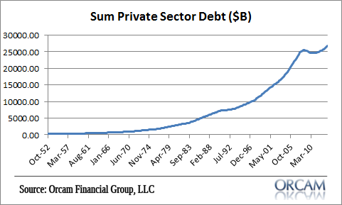
1.  You most certainly can spend more than your income and over time private sector debts will inevitably increase just as they always have.  In other words, as the economy grows, production expands and balance sheets improve output, income and credit will likely grow in tandem.   In fact, growth will likely rely on someone spending more than their income over the long-term.

pvt_debt

2.  We do not reside in a loanable funds based monetary system where we are all fighting over some limited pool of money.  The money supply, in a credit based monetary system, is elastic and can expand and contract as the supply of loans expands and contracts.   This is called endogenous money because the money supply is expanded endogenously by banks who create it “out of thin air”.   Banks do not compete in some loanable funds market to extend credit to their customers.

Mauldin then makes a similar error when he states the following:

“For those of you who were forced to endure Economics 101, you may remember that Savings = Investment. In any real-world economic system, you have to have savings in order to have investment in order for the economy to grow. “

I guess they don’t teach this until econ 102.  But saving does not necessarily finance investment.  Let’s say I spend $100 on your candy bar and you save that income immediately.  Your saving is $100 if even for the briefest moment.  In other words, your income not consumed is $100.  If you then consume $50 on dinner then you dissave $50 via consumption.  But that dissaving becomes someone else’s saving immediately.  In other words, your saving does not increase aggregate saving because your spending is someone else’s saving.   But let’s say a firm invests $100 in plants and equipment.    The firms has not dissaved.  The firm has invested.  In this case, the firm has $100 in plants and equipment and the seller has $100 in new income.   Indeed, it is often investment that creates saving.  I assure you Keynes understood this point even if he wasn’t technically a trained economist.

I understand John’s frustration with the current economic environment and even the state of what looks like a colossally ignorant government in the USA.  And as an entrepreneur and die hard capitalist I understand the desire to let capitalists and innovators do what they do best by not being chained down by an overly burdensome government.  But this argument against “Keynesianism” is based on a misunderstanding of what “Keynesian economics” actually is, and worse, tries to validate that erroneous position through misunderstandings of basic economics and the structure of our monetary system.

See the original article >>

Celebrating China's First Bond Default: Copper Limit Down, Yuan Crashes Most In Six Years

by Tyler Durden

It would appear the fecal matter is starting to come into contact with the rotating object in China. Worrying headlines are beginning to mount on the back of real economic events (an actual default and a collapse in exports):

  • *COPPER IN SHANGHAI FALLS BY 5% DAILY LIMIT TO 46,670 YUAN A TON
  • *CHINA YUAN WEAKENS 0.46% TO 6.1564 VS U.S. DOLLAR
  • *YUAN DROPS MOST SINCE 2008

Aside from that Iron ore prices are crumbling, Asian stocks are dropping, Chinese corporate bond prices aee falling at their fastest pace in almost 4 months, and all this as 7-day repo drops to one-year lows (as banks hoard liquidity).

Item #1: The forced unwind of massive rehypothecated copper lots related to concerns over shadow-banking defaults sparked by the fact that Chaori was allowed to actually default...

Pushing Shanghai copper limit down...

Item #2: Iron Ore prices collapsing for similar reasons (as borrowers rotated to Steel and by-products for collateral on their shadow bank lending facilities)...

Item #3: Corporate bond prices are dropping at their fastest in 4 months...

Item #4: Repo rates are at near-record lows as banks hoard liquidity...

Item #5: USDCNY is tumbling as PBOC efforts to unwind the massvley one-sided carry trade appear to be getting out of control...

Item #6: AsiaPac stocks are down by their most in almost 6 weeks...

Item #7: Even US equity futures are unhappy (with JPY carry having caught up and now dumping again)...

Bonus Item: Copper-to-Gold ratios are collapsing...

See the original article >>

An Overview of Recent Monetary Trends

by Pater Tenebrarum

US Monetary Backdrop

Last week we discussed the fact that China's money supply growth has slowed precipitously and also looked briefly at some long term euro area data. As we have mentioned on previous occasions, the annualized growth rate of US money TMS-2 has declined noticeably, but remains brisk in a longer term historical context. Between late 2008 and late 2012, the growth rate briefly dipped below 10% only once, as it was kept high not only via 'QE1' and 'QE2', but also the phenomenon of funds fleeing from euro-dollar markets into depository institutions in the US (in order to ensure financing of the dollar liabilities of European banks, these funds were partly replaced by the now permanent currency swap arrangements between central banks). The situation regarding euro-dollar deposits changed when the sovereign debt crisis abated; moreover, a blanket deposit guarantee for large scale deposits granted by the FDIC in the wake of the 2008 crisis expired, further reducing the advantage of holding such deposits in the US banking system.

Lastly, while 'QE3' has been both open-ended and has involved the largest monthly amounts of debt monetization yet in absolute terms (with the sole exception of the massive alphabet soup programs initially launched in late 2008), there are basis effects to consider: when 'QE2' was launched in November of 2010, the total extant money supply was still a lot lower than it was when 'QE3' began in late 2012. In addition, bank lending growth has steadily declined since early 2012, so there was little impulse from inflationary lending on the part of commercial banks (very recently, growth in bank lending has picked up a bit).

Note that 'Operation Twist' did not directly influence the money supply, as it merely amounted to an altering of the maturity structure of the Fed's securities portfolio.

The most recent data show that the true broad US money supply has by now expanded to almost $10 trillion, with the year-on-year growth rate ticking up again slightly in January, but still remaining below the y/y growth rate recorded a quarter ago and a year ago. In short, the downtrend in the rate of growth in evidence since the end of 'QE2' has not really been interrupted. That may change if commercial banks increase their lending at a faster pace than the Fed reduces its securities purchases.  While bank lending growth has indeed picked up since the 'taper' announcement, it is too early to come to conclusions about it, as it is a fairly recent phenomenon that may yet be reversed.

Note however that something along these lines actually happened in the UK: when BoE credit was expanded via 'QE', money supply growth actually declined initially. In the meantime however, there has been a big push in UK TMS growth, which briefly topped 10% last year. In this particular case it appears that various government interventions designed to restart the mortgage credit bubble have been quite effective in spurring lending, as the seemingly inexorable rise in UK property prices has resumed at full blast, with prices in London especially rising at a very fast pace.


TMS-2, latest (Jan 2014,7.75)yUS money TMS-2 – the 'parabolic' advance continues, but its growth momentum has actually decreased – click to enlarge.


TMS-2-y-o-y-growth rate-aTMS-2, year-on-year growth rate. From late 2008 to late 2012, the annual growth rate only once briefly dipped below 10%. Since the end of 'QE2', it has however been in a steady downtrend – click to enlarge.


total loand and leases, US banks, USD bn
Total loans and leases, all commercial banks. Note that the number is a bit distorted due to accounting changes introduced in 2010, but there has clearly been a push higher so far this year – click to enlarge.


total loand and leases, US banks, y-y growth

Since early 2012, the rate of growth in bank lending has been in a downtrend, but recently it has picked up a bit – click to enlarge.


The sector in which bank lending has increased the most are industrial and commercial loans, which have reached a new record high. Not surprisingly, the net debt ratio of US corporations is at a new record high as well. The aggregate cash position of US corporations has risen to a record high, but debt has increased even faster, leaving them in a worse net position than prior to the 2008 crisis. Don't worry, nothing bad can possibly happen, since no-one in policymaker circles currently thinks there are bubbles in sight anywhere.


commercial loans, US

Commercial and industrial loans are at a new record high, on the heels of record junk bond issuance in 2013 – click to enlarge.


commercial loans, US-y-y-growth

The annualized growth rate of commercial loans has picked up lately – click to enlarge.


Lastly, here is another look at the ratio of the industrial production indexes referencing business equipment and consumer goods production. We must stress that the comparison of such aggregate index values (the indexes employed are so-called Fisher indexes that involve a lot of estimates – for a backgrounder see here) only gives us a very rough idea of what is happening in terms of the economy's production structure, but history indicates that the ratio can be a useful guide. As one might expect, the main element causing it to gyrate is of course spending on capital goods production. The basic idea is that during times of heavy monetary pumping and suppressed interest rates, factors of production are increasingly diverted toward longer and more capital intensive production processes, even though consumers have not lowered their consumption and increased their savings. This results in the erection of a capital structure that does not properly reflect consumers' wishes and is therefore unsustainable. One could also state that it ties up ever more consumer goods in higher stages of production relative to the amount of consumer goods it releases. Experience shows that the ratio tends to expand during boom times caused by monetary pumping, while it contracts sharply during busts, as a more sustainable balance between production and consumption is restored and malinvested capital is liquidated.

After a while, renewed monetary pumping as a rule tends to arrest and reverse the process. Recently, the ratio has stalled out and begun to dip. It is too early to say whether this is already a meaningful signal or whether it is just a short term interruption in the trend, but it certainly bears watching:


ratio-capital-consumer goods production, bubble yearsAs the gray 'recession bars' show, this ratio tends to fall sharply during busts. Recently it has stalled out and turned down somewhat, but it cannot be stated with confidence yet that this constitutes a definitive trend reversal. It is definitely a 'heads-up' though – click to enlarge.


Japan and the Euro Area

Monetary growth momentum in Japan and the euro area has recently converged, via an acceleration in Japan and a deceleration in the euro zone. Note that we only employ narrow money TMS-1 in these cases, as contrary to the US, it cannot be argued that savings deposits are available on demand (things are handled slightly differently from country to country in the euro area, but there is no uniform custom). As a result, only currency and sight deposits are included in the data. This makes their growth rates slightly more volatile, in the case of the euro area extremely so.

In Japan, the BoJ's heavy 'whatever it takes' pumping has finally succeeded in pushing money supply growth quite a bit higher, and Japanese money TMS is now growing at a rate near the uppermost boundary of its post-1989 range. Note that the growth in money supply stalled out after the 2006 draining of funds that had been provided via previous 'QE' operations. It has begun to accelerate again from early 2010 under former BoJ governor Masaaki Shirakawa, who was actually the initiator of the current 'QE' program (Kuroda merely enlarged it greatly). The most important point though is that the rate of annualized growth has accelerated considerably, recently breaking out to a new high for the move.

One conclusion that could tentatively be drawn is that the happy days in the JGB market won't last much longer. At the moment the BoJ's heavy buying and the refusal of large domestic holders of JGBs to lower their exposure are helping the market to hold up, but with regard to the latter one must keep in mind that major decisions regarding the allocation of funds move at a very slow pace at many of these institutions. Should they decide to markedly alter their allocations, there could be some fireworks in the JGB market. As a friend recently remarked, this would ultimately likely be tolerated by the BoJ on the grounds that it would validate its 'inflation targeting'.


Japan, TMS approx

Japan's money TMS, total – click to enlarge.


Japan-TMS-growth y-y

The year-on-year growth rate of Japan's money supply has reached a new high for the move – click to enlarge.


JGB

10 year JGB, nearest contract, weekly chart. Will it finally succumb? - click to enlarge.


With regard to the euro area, last week we showed a long term chart of the euro area TMS total, in order to illustrate the extent to which it has been inflated in recent decades. Although it has continued to grow at quite a brisk pace overall since the 2008 crisis, its total growth since the beginning of 2008 amounts to only about 41% vs. the approximately 90% growth in US TMS-2.

In recent months, there is also the basis effect to consider, as well as the fact that ECB credit is actually declining sharply (due to banks paying back LTRO funds). While this doesn't affect money supply growth directly (reserve requirements are only 1% in the euro area anyway), it probably has at least some indirect effect. There has undeniably been a sharp acceleration in euro area money supply growth following the LTRO provision in early 2012, as banks embarked on a huge carry trade in sovereign debt. Concurrently, private sector credit growth has however declined. Recently there are some tentative signs that this trend may be on the verge of reversing, as tightening spreads between the sovereign debt of peripheral countries vs. Germany should be reflected in lower interest rate charges on private sector loans in the periphery as well (there has been a close correlation between them in the past). The main brake is probably credit demand,  as major structural economic problems remain largely unsolved. Also, even as the economies in the periphery are coming up for a little bit of air, France's economy continues to exhibit a lot of weakness in the wake of the policies instituted by the Hollande government.

Below is a chart showing the year-on-year growth of euro area TMS. As can be seen, following the sharp acceleration between late 2011 and early 2013, the growth momentum of euro area money supply growth has begun to decline, and is now only slightly above Japan's, although a slight uptick has been recorded in January.


Euro Area TMS-y-y-growthEuro area TMS, year-on-year growth – historically the current growth rate is actually on the low side. There has been extraordinary volatility in euro area money supply growth since 2008 – click to enlarge.


Almost needless to say, it is no coincidence that money supply growth fell to very low levels just ahead of the 2008 crisis and again ahead of the 2011 peak in the euro area's sovereign debt/banking crisis. Similarly the recessions of 1990-1991, 1994 and 2001-2002 were preceded by a sharp slowdown in money supply growth. This illustrates the extent to which aggregate economic activity as measured by GDP has become dependent on various bubble activities financed with money from thin air. Precisely the same consideration apply of course to the chart of the growth rate of US money TMS-2 depicted further above.

Conclusion:

Both in the US and the euro area, money supply growth is decelerating. At the moment, it is however still relatively high and the lagged effects of the strong growth rates recorded earlier are presumably still playing out. In addition, administered interest rates remain at rock-bottom levels. In Japan, money supply growth has accelerated to the highest level in more than a decade, which lends support to the Nikkei index and validates the weaker exchange rate of the yen to some extent.

All of this continues to keep numerous bubble activities going, which are erroneously widely referred to as 'economic growth'. The problem with this view is of course that measures of economic activity like GDP as such tell us nothing about the quality of this activity: capital malinvestment and government spending alike are thought to constitute 'growth', even though they actually waste and consume scarce capital.

The fact and extent of the waste is usually revealed as soon as money supply growth falls below a certain threshold. Then it is 'crisis time', and policy makers swing into action in order to repeat the same mistakes they have made before, only on an even grander scale.

As we have previously pointed out, we cannot say where the 'crisis threshold' will be this time around (i.e., to what level money supply growth rates need to decline to trigger an economic downturn that becomes clearly visible in the data). There is reason to believe that it may be higher than last time around, based on the fact that the recovery has been very weak and it probably won't take much to upset the apple cart. Keep in mind though that there are usually considerable lag times involved, which tend to vary somewhat from case to case.  We can also not be sure yet whether commercial banks will pick up the inflationary baton from the central banks, but all these recent trends need to be watched closely.

See the original article >>

Monetary Metals Supply and Demand Report: 9 Mar, 2014

by Keith Weiner

Gold went up and silver went down this week. It’s natural for most people to say, “gold went up”, but it’s the most unnatural phenomenon. The dollar is paper scrip issued by the Fed. The fine print tells you that it’s irredeemable, which is like a promise to give you a kilo of sugar that will never be honored. The quantity of this paper is rising while its quality is falling. Everyone knows that its value is unstable, and over long periods of time its value falls alarmingly. And yet we still presume to use this paper to measure the value of gold!

Amazing.

Anyways, in comparison to the undefined unit known as the dollar—which we don’t know if it moved up or down or sideways—gold moved up. Gold went up by fourteen pieces of paper, engraved with the picture of George Washington. Silver—by the moving and nonobjective reference point of copper clad zinc coins stamped with the image of Abraham Lincoln—moved even more. Silver went down, and now it can be bought with a stack of those copper colored slugs that’s 26 shorter than last week. We could as well say that silver went down by an inch and a half, because a stack of 26 pennies is about that tall.

Wouldn’t it make more sense to say that the dollar went down by about a quarter of a milligram of gold?

Here is the graph of the metals’ prices:


chart-1, prices
The Prices of Gold and Silver - click to enlarge.


We are interested in the changing equilibrium created when some market participants are accumulating hoards and others are dishoarding. Of course, what makes it exciting is that speculators can (temporarily) exaggerate or fight against the trend. The speculators are often acting on rumors, technical analysis, or partial data about flows into or out of one corner of the market. That kind of information can’t tell them whether the globe, on net, hoarding or dishoarding.

One could point out that gold does not, on net, go into or out of anything. Yes, that is true. But it can come out of hoards and into carry trades. That is what we study. The gold basis tells us about this dynamic.

Conventional techniques for analyzing supply and demand are inapplicable to gold and silver, because the monetary metals have such high inventories. In normal commodities, inventories divided by annual production can be measured in months. The world just does not keep much inventory in wheat or oil.

With gold and silver, stocks to flows is measured in decades. Every ounce of those massive stockpiles is potential supply. Everyone on the planet is potential demand. At the right price. Looking at incremental changes in mine output or electronic manufacturing is not helpful to predict the future prices of the metals. For an introduction and guide to our concepts and theory, click here.

Here is a graph of the gold price measured in silver, otherwise known as the gold to silver ratio. The ratio rose 1.44 points—2.3%. In other words, silver fell by about 11mg of gold.


chart-2-ratio gold-silverThe Ratio of the Gold Price to the Silver Price – click to enlarge.


The data has been showing for a long time that, while supply and demand in gold is slightly tight, it’s loose in silver. Speculators are stretching the silver price higher by several dollars. When will they let go and let it snap back down to neutral, or even overshoot? It’s hard to say, but the world seems to be in a credit contraction mode right now. There are ongoing declines in many currencies. Forget the Ukrainian hryvnia, Venezuelan bolivar, and Argentenian peso. It’s also happening in the Brazilian real, Russian ruble, Indian rupee, and perhaps beginning in the Chinese yuan (and in many others too).

We will get to the point where people are desperate to get gold and silver and dump paper. That buying frenzy—and accompanying collapse of almost everything else—is still ahead of us. In the meantime, we appear now to be firmly in a period of squeezing the debtors.

The whole point of using leverage to buy gold or silver futures is speculation. The speculators are trying to front-run the real buyers of the metals—the people who buy to take it home, and not sell regardless of price.

It may be due to the pressures of credit contraction. Or it’s possible that silver demand is falling relative to gold because it has a substantial non-monetary (i.e. industrial) use and gold is almost purely monetary. Either way, the demand for silver metal, relative to the demand for gold metal, is quite a bit lower than it was a few years ago. The current silver price under $21 only partially reflects this fact.

For each metal, we will look at a graph of the basis and cobasis overlaid with the price of the dollar in terms of the respective metal. It will make it easier to provide terse commentary. The dollar will be represented in green, the basis in blue and cobasis in red.

Here is the gold graph.


chart-3 gold basis-cobasis-and-dollar-priceThe Gold Basis and Cobasis and the Dollar Price - click to enlarge.


The cobasis went sideways while the dollar fell (i.e. the price of gold rose). This suggests buyers of real metal, not speculators, led the price action this week. The neutral price of gold went up another twenty-five bucks, to around $1470.

Now let’s look at silver.


chart-4-silver basis-cobasis-priceThe Silver Basis and Cobasis and the Dollar Price – click to enlarge.


Silver’s pattern still hasn’t really changed. We see a rise in the dollar price as measured in silver (i.e. a drop in the silver price as measured in dollars). And with this price move, we see the cobasis rise a bit. Silver futures were sold.

The cobasis is still quite negative.

See the original article >>

Weak Asian markets weighed on crop markets Sunday night

by Doane Advisory Services 

The crop markets are declining ahead of Monday’s USDA report. The crop markets ended last week by declining rather significantly as bullish interests seemed to take profits on previously established long positions. The markets saw more of the same Sunday night as the industry squared positions prior to the midsession release of the USDA’s monthly WASDE report. May corn tumbled 7.5 cents to $4.815/bushel early Monday morning, while December lost 5.25 to $4.795.

The soy complex was mixed to lower to start the week. As in the grain markets, soybean futures declined in apparent response to broad long liquidation in early Monday trading. Big losses in Asian equity markets and global metal and energy commodity futures may have added to the downward pressure. However, sustained palm oil strength boosted soybean oil futures, which probably limited bean losses (and possibly exaggerated those in the meal pit. May soybeans sank 8.5 cents to $14.495/bushel Sunday night, while May soyoil rallied 0.06 cents to 44.38 cents/pound, and May soymeal fell $4.5 to $453.3/ton.

The wheat markets also lost ground as the week’s trading got underway. Despite likely underlying support stemming from the uncertain Black Sea situation, wheat futures accompanied the other crop markets lower last night. As in the other markets, traders are almost probably reducing their exposure prior to the late-morning release of the USDA WASDE report. May CBOT wheat futures dropped 7.75 cents to $6.4625/bushel in early Monday action, while May KCBT wheat futures sagged 6.25 cents to $7.15, and May MWE futures slumped 7.75 at $6.9725.

Talk of persistent wholesale strength boosted cattle futures last Friday. News that cash prices had suffered a significant decline despite concurrent wholesale gains depressed cattle futures around midweek. However belated talk of persistent beef gains reportedly enabled CME prices to rebound as Friday passed. April cattle futures moved up 0.10 cents to 143.23 cents/pound as CME trading ended Friday, while August rallied 0.70 cents to 133.85. Meanwhile, April feeder cattle climbed 0.85 cents to 173.65 cents/pound, and August gained 0.65 to 176.07.

Hog futures remained quite strong into the weekend. Talk of sharply reduced hog slaughter last week and in the coming weeks greatly encouraged bullish hog traders. CME futures reacted well to the latest news Thursday night, but struggled to maintain their upward momentum into the close. April hogs advanced 0.60 cents to 113.00 cents/pound at Friday’s close, while June added 1.15 to 120.50.

Cotton futures are also beginning week feebly. Cotton futures posted a technical breakout last Thursday and seemed set to continue surging Friday morning. However, the market turned downward into Friday’s close, with the losses continuing last night. Long liquidation is probably weighing upon prices this morning, especially with Asian equities setting a negative tone for the U.S. markets and the WASDE report looming. May cotton began the week having fallen 0.46 cents to 90.81 cents/pound Monday morning, while December cotton slipped 0.06 cents to 79.26.

See the original article >>

Follow Us