Monday, July 8, 2013

Junk bonds outperforming other fixed income markets

by SoberLook

Here are the latest estimates of performance across the various fixed income markets over the past month.

1-month total return (including interest income)

High yield corporate bonds have been the best performer in this near-panic unwind. The reasons include low default rates and strong corporate balance sheets as well as relatively short maturities and relatively high current income (which is included in the performance numbers above).
A great deal of this outperformance recently though has been driven by the strength of the US equity markets. HY spreads tend to have a strong inverse relationship to stock prices.

And with HY spread being a significant component of the overall yield, strong equity markets have kept yield increases relatively modest. If equities come under pressure however, all bets are off for HY.

See the original article >>

Rupee's weakness may help exports but could do damage elsewhere

by SoberLook

Indian rupee's slide to record lows has been extraordinary. It's been driven by weakness across emerging markets and rising rates in the US. As foreign investors exit (accompanied by domestic accumulation of dollars), India's central bank has been reluctant to intervene in order to halt the rupee's slide.

USD/INR (rupees per one dollar)

While this is expected to help companies in service export sectors (IT services, etc.), it will compress margins for other firms. Weaker currency raises input prices for firms that import parts, materials, etc. who are often not in a position to increase their output prices. The divergence between input and output prices in India is already visible.

Source: JPMorgan

Moreover, firms such as Reliance and Bharti Airtel who borrowed in other currencies, are watching their liabilities rise when converted into rupees.
Perhaps the most troubling aspect of this rupee weakness is the chart below which shows Brent crude oil denominated in rupees. For India, oil prices currently stand at recent record highs (except possibly the oil India buys from Iran at a discount). Given that domestic petroleum is generally subsidized by the government, this spike is sure to put significant pressure on India's fiscal balance.

See the original article >>

David Stockman: Bubble Finance Personified

by AuthorWolf Richter

David Stockman, Budget Director under President Reagan and one of the architects of the Reagan Revolution, then partner at the private-equity firm Blackstone Group, is not only known for his razor-sharp insights but also for his pungent style – “vacillating in the gray area between rage and humor,” I called it in my review of his excellent eye-opener and bestseller, The Great Deformation: The Corruption of Capitalism in America. Its Chapter 23 is particularly relevant in these crazy times of ours: hence the fifth installment. For the fourth installment, see The Greenspan Put and the Deformation of M&A (with permission).

The Fed should have been embarrassed by the M&A frenzy, and Dennis Kozlowski was striking evidence of why. He had been Wall Street’s favorite 1990s deal maker and master builder of Tyco International Ltd., a confection of serial M&A deals which put AOL Time Warner, WorldCom, and the rest of the corporate deal junkies to shame.

On their face, Tyco’s facts were absurd. Between 1992 and 2002, for example, it completed upward of one thousand M&A deals worth a stunning $70 billion. The result was a motley hybrid: part deal machine, part closed-end mutual fund, and mainly a hodgepodge of cast-offs and orphans from throughout corporate America.

When this pell-mell acquisition spree caused Tyco’s reported sales to soar from $7 billion in 1997 to $34 billion by 2001, the 50 percent per annum rate of sales growth did not signify that underperforming business assets were being recycled to better and more efficient uses. Instead, it showed that Tyco was a whirling dervish of financial engineering that had no plausible business justification.

In fact, its real purpose was providing a vehicle for absorbing the powerful waves of Wall Street speculation unleashed by the Greenspan Fed. The hapless Dennis Kozlowski didn’t create Tyco International; Wall Street did, stampeded by speculators who had come to believe that the Fed would never let the party fail.

Indeed, the veritable explosion of Tyco’s stock price after the mid-1990s was proof positive that the Greenspan stock market bubble was rooted in a monetary deformation. Tyco was the very embodiment of an anti-dotcom enterprise: a prosaic assemblage of old-economy businesses which on an organic basis grew at less than 3 percent per year by the company’s own reckoning. Yet its stock price soared from $25 per share in early 1994 to a peak of $250 per share in January 2001.

This tech-style 10X gain in its share price was not due to a commensurate explosion of profits. What did explode was the company’s valuation multiple. The latter rose from 17X EPS in 1994, which was already too generous for an industrial conglomerate, to a peak of 67X in late 1999, which was pure madness.

At that point, the stock market was obviously turning a blind eye to the warning signs emanating from virtually every pore of the company’s balance sheet. Between 1994 and 2001, for example, the company’s $500 million of debt soared to $43 billion, meaning that its debt burden grew ninety-fold in seven years. Not surprisingly, its goodwill zoomed from $1 billion to $40 billion, reflecting the company’s chronic overpayment for acquisitions, while its tangible shareholder equity went straight south, reaching negative $20 billion by the end of 2001.

Kozlowski ended up the chump whose visage in the pantheon of America’s greatest CEOs was removed at a speed rivaling that of politburo portraits in Stalinist Russia. After a hurried do over by the financial press, Kozlowski was rechristened as the rogue CEO who stuck his shareholders with $6,000 shower curtains and a $2 million birthday party on Sardinia featuring an ice sculpture of Michelangelo’s David urinating Stolichnaya vodka.

The true sin in the matter, however, was a financial environment that carried Tyco’s market cap to $125 billion by 2001, when it was plainly a disheveled trunk of pots and pans from America’s industrial pawnshop, led by a crude schemer who couldn’t resist the bait. The bait, of course, was the kind of bull market hagiography which put him on the cover of Business Week in 2001 as America’s most aggressive CEO.

Needless to say, the deflation of Tyco’s wildly bloated stock value came fast and furious. By the time Kozlowski was forced out in June 2002, the company’s market cap stood at only $25 billion. More than $100 billion of market cap had vaporized in less than six months.

That kind of violent repricing does not occur on the free market, and wasn’t owing to the discovery that some of Kozlowski’s pay and perks had not been diligently vetted by the board. Rather, Tyco was the poster boy for Greenspan’s first stock market bubble and its sudden, violent demise was a wake-up call that was wholly ignored.

See the original article >>

U.S. Stock Market is Uptrending

By: Tony_Caldaro

After a gap up Monday to SPX 1627, the market pulled back to 1605 on Wednesday, then gapped up again Friday and hit 1632. For the week the SPX/DOW were +1.55%, the NDX/NAZ were +2.00%, and the DJ World index was +0.70%. On the economic front positive reports continued to lead negative ones. On the uptick: ISM manufacturing, factory orders, the ADP, the Payrolls report and weekly jobless claims improved. On the downtick: ISM services, the WLEI, the M1 multiplier and the trade deficit widened. Next week we get the FOMC minutes, the PPI and Consumer sentiment.

LONG TERM: bull market

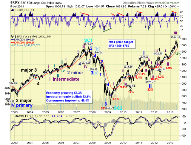
We continue to count this bull market as Cycle wave [1] of a multi-decade Super cycle bull market. Cycle wave bull markets are created by five Primary waves. Primary waves I and II ended in 2011, Primary III has been underway since then. Primary I divided into five Major waves, with a subdividing Major wave 1. Primary III is also dividing into five Major waves, but both Major waves 1 and 3 are subdividing into five Intermediate waves. Major waves 1 and 2 of Primary III completed by mid-2012, Major wave 3 has been underway since then.

Intermediate waves i and ii, of Major 3, completed by late-2012. Intermediate iii just completed in May, and Intermediate wave iv probably completed in June. It appears, although not confirmed, Intermediate wave v is underway to complete Major wave 3. When Major 3 ends, a Major wave 4 correction will follow. Then a Major wave 5 uptrend to new highs will end Primary wave III. After a Primary IV correction, a Primary wave V uptrend will likely end the bull market. We have been expecting the completion of this bull market pattern by late-winter to early-spring 2014.

MEDIUM TERM: downtrend probably bottomed

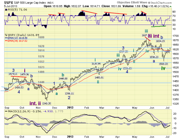
We were expecting an Intermediate wave iii uptrend high in May, then an Intermediate wave iv downtrend low in June. The uptrend had a price peak around mid-May at SPX 1687, then corrected in a complex abc pattern down to 1560 by late June. The entire downtrend declined 7.5%, which was in between the 4.5% to 9% correction range of previous Intermediate wave iv’s. Since that low we have counted a five wave pattern into Monday’s SPX 1627 high, then a pullback to 1605 by Wednesday. We had labeled the rally Minor wave 1 of Intermediate wave v, and the pullback Minor wave 2. With the rally off that low, to a higher high on Friday (SPX 1632), we have anticipated Minor wave 3 has been underway.

Technically we have observed a rise off a very slight positive divergence on the daily RSI, and the MACD cross higher for the first time since May. The SOX and R2K continue to uptrend from April, the SPX sector XLY has confirmed an uptrend, and the VIX confirmed a downtrend. The general market appears to be gathering upside momentum. With Minor wave 1 reaching our target of the OEW 1628 pivot, and Minor 2 bottoming higher than our projected SPX 1593-1599 range. We now expect Minor 3 to challenge the OEW 1680 pivot during July. Medium term support is at the 1628 and 1614 pivots, with resistance at the 1680 and 1699 pivots.

SHORT TERM

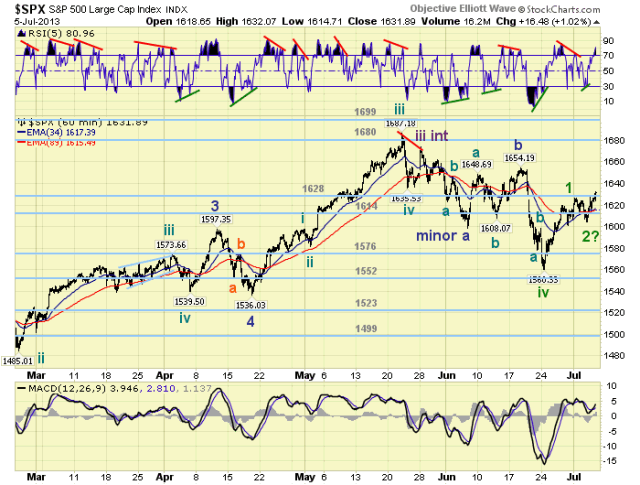
Short term support is at the 1628 and 1614 pivots, with resistance at SPX 1636-1640 and SPX 1648-1649. Short term momentum ended the week quite overbought. The short term OEW charts remain positive with the reversal level now at SPX 1615.

After counting a potential Intermediate wave iv low at SPX 1560 we counted a five wave structure for Minor wave 1 SPX: 1586-1573-1620-1606-1627. Then the market produced an abc structure for Minor 2 SPX: 1613-1624-1605. Now we are seeing another potential five wave structure underway for Minor 3 SPX: 1627-1615-1632 so far. The advance from the SPX 1560 low continues to look impulsive. Which is what we would expect during a new uptrend. At this point, only a drop below SPX 1605 would force a change in our short term wave count. Best to your trading!

FOREIGN MARKETS

The Asian markets were mixed on the week for a net gain of 0.1%. Only Japan is in a confirmed uptrend.

The European markets were mixed as well for a net gain of 0.6%. No uptrend confirmations yet.

The Commodity equity group was mostly lower on the week for a net loss of 1.6%. No uptrend confirmations here either.

The DJ World index is still in a downtrend, but gained 0.7% on the week.

COMMODITIES

Bonds are still downtrending and lost 0.8% on the week.

Crude is still uptrending and gained 7.3% on the week.

Gold continues to downtrend losing 1.6% on the week.

The USD continues to uptrend gaining 1.6% on the week.

NEXT WEEK

Monday: Consumer credit at 3:00. Wednesday: Wholesale inventories at 10:00, then the FOMC minutes at 2:00. Thursday: weekly Jobless claims and Export/Import prices at 8:30, then the Budget deficit at 2:00. Friday: the PPI at 8:30, then Consumer sentiment just before 10:00. FED chairman Bernanke gives a speech on Wednesday just after the market closes. Then FED governor Tarullo gives Senate testimony on Thursday at 11:00. Best to your weekend and week!

See the original article >>

Silver - The Precious Metals Bellweather? Possibly

By: Michael_Noonan

A shout-out to I M Vronsky and his crew, [Gold-Eagle], for reaching its 475 Millionth view since it began on 1 January 1997. Congrats!

This is a singular look at silver because of its current position on the charts that may be giving our first hint of potential bottoming activity. It is a "fashionable sport" for many to call a bottom, or a top, even though "they" are consistently wrong. No one can tell what has not yet happened, aka the future.

Charts speak the loudest, [admittedly, not always the clearest, but for a reason], and they never lie. Why do charts never lie? They just are. A chart is the true record of all buy and sell decisions executed, coming from the most informed to the least informed. Most of the problems lie with those who form an opinion, andhow they choose to impose it onto what any given chart "says."

We prefer to follow the message of a chart, not lead or predict what it may, or may not do. There is a high degree of logic in charts, and we try to draw conclusions from them, just not always successfully. As a road map, reading charts is superior to fundamentals, opinions, and mechanical technical tools which all use past tense information, impose it on the present tense, and expect it will divine the future tense.

It appears that silver is at a potential bottoming area, and very close attention to how price develops from today forward may provide key information from which one can profit. To start, everything in a chart is potential until it is confirmed. The adjective bottoming, as in ongoing, is used because a bottom of any market is a process. It does not happen in just one day, and it can sometimes take several months to reverse a down trend. Always keep that in mind, and let the market prove itself to prevent needless risk exposure for those insisting to be first.

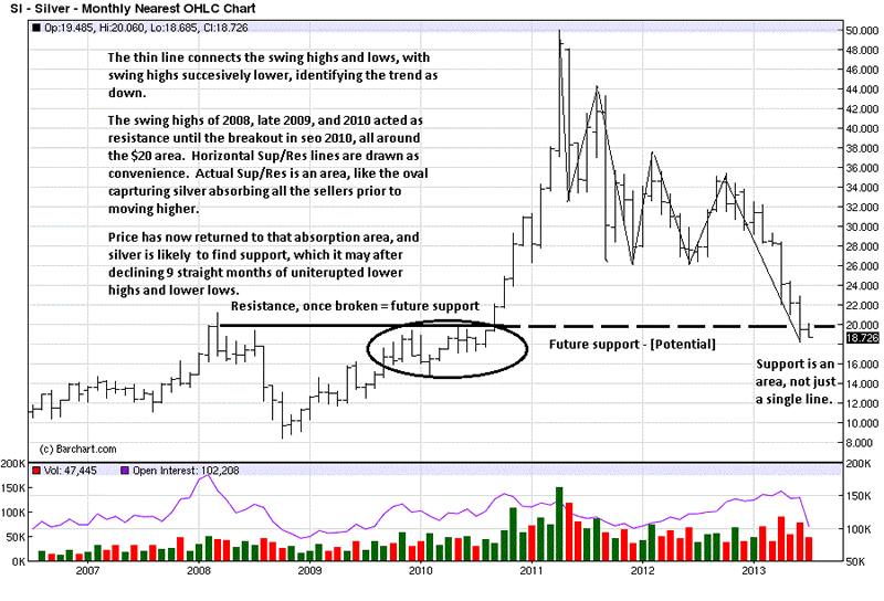
It can be seen from the Quarterly chart that the current correction has run deep, but price is nowhere near taking out the 2008 swing low, from which the bull move up began. Few ever look at a Qtrly chart, but the few who do are in the "smart money" category. Smart money does not care about daily charts,[ as most everyone else pays such close attention to them.], because they are only interested in major moves, and it is these longer term charts that show them best.
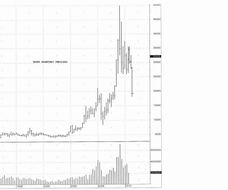
Longer term charts are used for context, to put a market into a perspective, ultimately for making a trade determination. Clearly, the trend in silver, and gold, is down. What we can learn from the monthly is the fact that price has reached an important support area.

The current price has entered the identified support, and we explain that support is an area, not just a specific line or price. Consequently, what becomes important, as the lower time frame charts provide greater detail, is to watch how price responds/reacts to the target area. What we are looking for are clues in a change of behavior, for it is a change in behavior that leads to a change in a trend.
The weekly more clearly shows the area of support at which silver has now reached. The daily reveals much more.
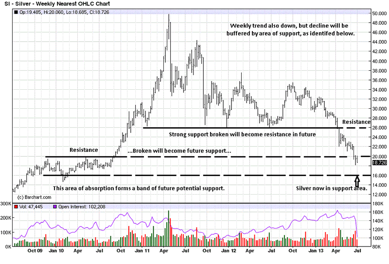
A support line was drawn only on the weekly to show the importance of the $26 level, but $26 shows up on each of the higher time frames, and from that, we know when $26 is retested, it should offer resistance, certainly the first time around. We also noted how the Ease of Downward Movement, [EDM], sliced right through it, once broken.

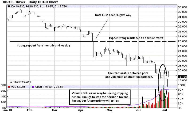
Price is always important, but when coupled with volume, it can be the most telling of all information, and it is always right up to date, for everyone to see as it develops. Whenever you see high volume moves, it is your key that smart money, [SM], is active in the market. SM moves in such volume, sometimes it just sticks out. For the most part, SM tries to hide its intent, but it is almost impossible to do at important market turns.

The public and speculators do not create high volume; they react to it. Everyone knows it is axiomatic that SM sells tops and buys bottoms. The public is always on the other side.

Here is where the logic comes in. Note the first high volume bar in June. [We were off one bar to the left when we drew it in]. Price is breaking under a small congestion area. The next highest volume bar, just to the left of the oval, is sharply higher than the first. It is when price broke under 21 and 20 on the same day. So many weak longs and stops were washed out. [Guess who was on the other side?]

Within the oval, there are four trading days to discuss. Red volume bars means the close on that day was lower than the day before. Compare the first red price and volume bar with the one 4 days earlier, when price broke under 21 and 20. The volume of the first bar within the oval is almost equal to the down volume bar from 4 days ago, but compare the size of the trading range. The first price bar in the oval is much smaller. Why?

Volume increased sharply, and the bar was smaller. What the market is letting us know is that buyers entered the market and were more than matching the effort of sellers. Were that not true, the price range would have extended lower.

The 2nd bar in the oval is much less subtle. Volume was greater than the day before, but look at the tiny price range. Buyers stopped sellers cold! It was like opening a basket at the 18.50+ area, and the buyers said, "We will take as much as you have to offer." For all of that increased effort, [volume], sellers were totally spent. Buyers were totally in control at a price level and trend that had been dominated by sellers. There is more!

Next day, the highest contract volume and highest volume in months produced a price bar that rallied and closed on the high, producing an Outside Key Reversal Day, [OKR]. This could be the bottom. It needs to be confirmed. If it is not the bottom, the market is telling us we are very close to seeing one. Either way, what we saw two weeks ago was an important change in market behavior.

If we were ego-driven and wanted to impress, we could say this is the bottom. It may be, but we still will wait for confirmation.

We are seeing a price change from weak hands into strong hands, [in the paper market]. The 4th bar in the oval was another up day. Volume was the smallest of the 4, and note how the price range narrowed, and the location of the close was under mid-range the bar. Buying had been expended is what that bar was saying, and we see price corrected right after. Most of the buying has been from short-covering.

The last bar on the chart shows a down day, wide range and high volume. While price did decline, it did not make a new low for the increased effort. We now get to watch more developing market activity that will confirm, or not, the logical conclusions extracted from the market itself. Now news. No opinions. No mechanical tools. Just price and volume that have combined to tell the story, straight from the market's mouth.

Silver stackers, these lower prices are a gift you should keep on taking. Stay tuned.
See the original article >>

Empirical Evidence of Employment Stagnation

by Aziz

Last week, I discussed the possibility that we had reached a depressed equilibrium, resulting in long-term or even permanent employment stagnation. I also discussed the possibility that the only routes out were large-scale technology shocks, geopolitical shocks or very large scale fiscal stimulus — events that drastically change broader market expectations.

Frustratingly, there are some superficial signs of recovery. Yet digging beneath the surface it is apparent that we are dealing with a depression in employment demand. These graphs produced by a blogger under the pseudonym Eugen von Böhm-Bawerk from Bureau of Labor Statistics data illustrate this well.

Since the recession, lots of part-time jobs have been created. Yet full-time jobs remain in much shorter supply:

fulltimeparttime

This has meant that the percentage of the population with a full time-job is just where it was after the recession:

percentofpopulationwithfulltimejob

There has been significant growth in low-pay jobs, but decline in high-pay jobs, again illustrating a weakening of labour demand:

highlowpay

The extent to which this is fixable and may fix itself is unclear. In the long run, the sea may be flat and the weather may be sunny. But what this trend has already led to is strong growth for corporate incomes, and a decline in labour incomes. If in the long run this trend does not reverse we will face a bifurcation of society between the capital-owning elites still thriving on rents, automated industry and foreign wage labour, and a squeezed middle deprived of the well-paying jobs and careers that once supported and grew the middle class and increasingly dependent on part-time jobs, temporary work and welfare. Without middle class job and labour growth, demand in the economy as a whole may remain depressed.

See the original article >>

Follow Us