Tuesday, July 2, 2013

Another Stock Market Pop-n-drop?

By: Anthony_Cherniawski

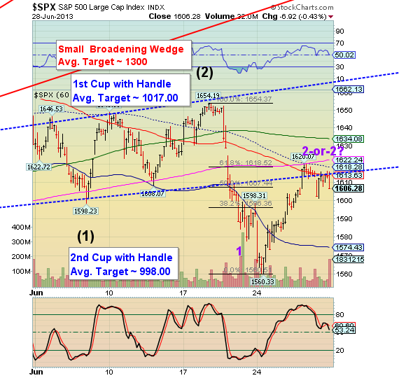
The commercials are doing it again. You may have noticed that there is a pretty regular ramp in the Pre-Market, then the market goes quiet during the day. At 3:00 or 3:30 the selling begins, with a huge red volume spike into the close. This is a distribution pattern that has continued for over a month, with a few exceptions. Through this method, stocks are being distributed to weak (retail) hands.

The Pre-Market shows a 6-7 point spike higher this morning, challenging the Lip of the Cup with Handle formation near 1614.00. Chances are good that the spike may stop there, but it could progress back to the declining hourly mid-Cycle resistance at 1618.28. In either event, I expect to see the decline resume today, possibly with some catalyst to break the 1560.33 low.

See the original article >>

U.S. 30 Year Treasury Bonds – A Rally To Sell?

By: Michael_Noonan

Trading opportunities arise every day, however, quality trades that offer an edge do not. We use developing market activity, as depicted in charts, to find trade potentials with a defined limited risk and greater reward potential. 30 Year Bonds appear to be advertising weakness and a shorting opportunity.

When seeking trades, we use the “If, Then,” approach. IF the market does this, THEN we do that. The latter is acted upon only if the former requirements are met. Following this scenario, there is no guesswork or predicting involved, and the emotional element is not in play, either. Discipline is required, but it leads to more profitable trading potentials, so it is worth the effort.

The first step is to put the market into a context, and that comes from assessing the higher, more controlling time frames. We start with the monthly..

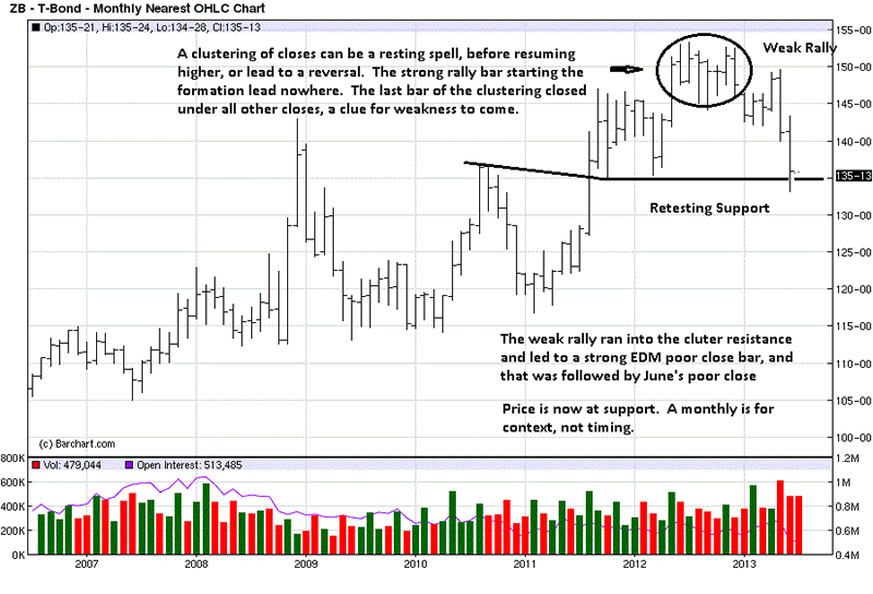
The most important first step is to always identify the trend within the time frame under consideration. We look for synergy amongst all time frames to increase the odds of accomplishing a successful trade. From the clustering of closes top formation, a low was established in March, 4th bar from right, a lower swing high two bars later, in May, and another lower low, at the end of June. This is the simplest definition of a downtrend.

Chart comments explain the weakened structure for Bonds since the high. June, the last bar, retested support from 2011 and 2012 lows. The weekly is used to refine the bars.

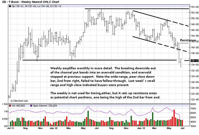
The weekly shows more of a trading range, and the second to last week was a strong move down with a poor close, the market telling us sellers are in charge. But were they? Price declined into support, and leaving the channel put price into an oversold condition. As a consequence, there was no further downside follow-through, as the last weekly bar shows.

The last bar gives added confirmation that support is likely to hold, at least initially. Why? Note how small the range was and the position of the close. The smaller range tells us that buyers were present, not only preventing sellers from extending the market lower, but the high-end close lets us know buyers overwhelmed sellers’ efforts. That is important to know. If short, it would be a good reason to cover and stand aside. This is how to use the information from the market as the best and most reliable guide.

With the trend down, within a larger trading range, it becomes a personal choice of one’s trading skill[s] whether to trade from the long side at this support. We choose not to, and instead look for a weak rally to sell.

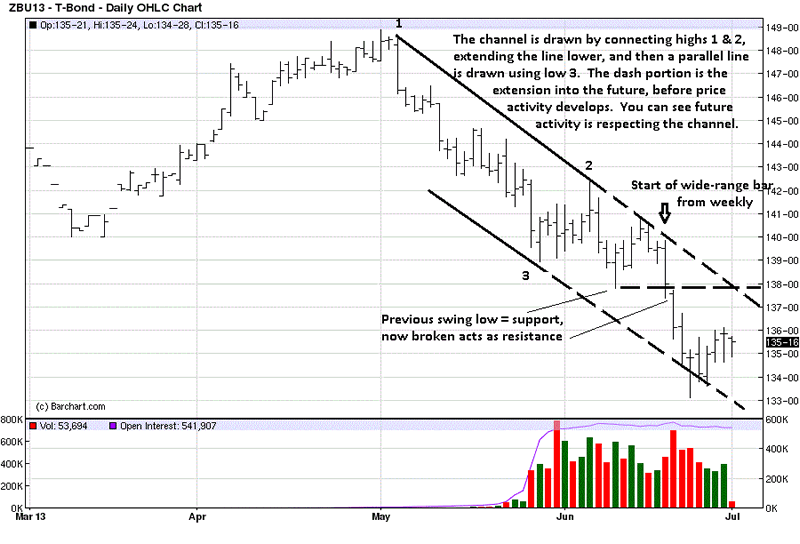
The last five bars on the daily comprise the last small bar from the weekly. While it looked like buyers were stopping sellers, it was more in the form of short-covering, after such a large drop in the weeks preceding. Short-covering is not the same as net new buying. In fact, the last five bars are relatively weak in an ability to rally higher, and that is what can be expected in a downtrend.

A rally against a wide-range down bar can meet resistance anywhere along the bar, from the low up to the high. The down arrow shows the high. However, bonds may run into resistance at where the mid-June swing low support was broken by that wide range bar. The dashed horizontal line from that swing low becomes future potential resistance.

What to look for, right now, is a weak rally. Small ranges up and less volume, relative to larger ranges down on stronger volume constitutes a weak rally, and they typically fail at an area of identified resistance.

If, then.

See the original article >>

Stock Market Forecast - Major Bull Market Cycle Top?

By: Chris_Vermeulen

Stocks managed their third session higher as of Thursday June 27th and its too late to jump onto that move. Major indexes and leading stocks have rebounded into resistance along with a few key moving averages. The next 1-3 days favor a pause or pullback at the least simply because of the selling momentum and multiple resistance levels being tested. It is only natural for traders and investors to pull some money off the table or short at these levels.

Stepping back seven days and looking at the overall stock market we have seen a substantial drop in prices across the board. A Ton of stocks have formed their first impulse thrust to the downside which is typically what happens when a stock market is in a topping process (Stage 3 Distribution). The type of damage we had cannot be fixed overnight. This will be a process if it is to resolve to the upside and price action will remain wild (volatile).

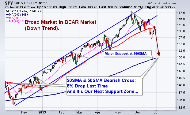
The odds from a technical analysis stand point using Price, Momentum, Cycles, Volume and Moving Averages point to lower prices still to come. Actually they point to another 5% drop from the current level.

Major Points to Be Aware Of:

1. 20 Simple Moving Average is crossing below the 50SMA. Last time this took place it triggered a 5% drop in the SP500.

2. Price has bounced for three consecutive days. This typically puts the odds in favor for a pullback.

3. Price bounced and hit it’s head on the 20 and 50 moving averages on Thursday (RESISTANCE).

4. Market Time Cycles are in a decline phase meaning there will be a negative bias and seller will be actively pulling price lower on bounces.

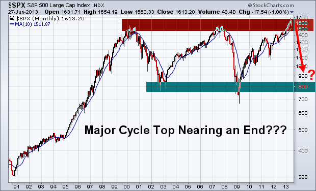
5. Major Long Term Chart looks favorable for a bear market to start which may last 12 months. If so this is just the beginning of some scary yet highly profitable potential trades in the coming year. Stocks fall 3-7 times faster than they rise…

Daily SP500 Trend & Analysis Chart:

Long Term SP500 Trend Chart:

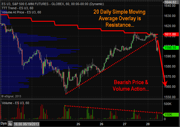
BEARISH SP500 Price & Volume – 60 Minute Intraday Chart:

Looking at these charts from a long term, intermediate and short term basis the odds are favoring lower prices. Being short stocks or buying inverse ETF’s is the current play for the market. But analysis and trends are subject to change depending on price and volume action each week. Do not get your heart set on the BIG picture outlook of a yearlong selloff. That could prove to be dangerous. We take this market one bar or candlestick at a time and trade based on current short term analysis.

See the original article >>

Why I Remain Bullish on Gold Even While Negativity Surges

By: Profit_Confidential

Michael Lombardi writes: Gold bullion prices are taking a hard hit. Headlines are blaring with negativity, and bears continue to say the precious metal is useless. Dear reader, they may have done a good job driving the gold bullion prices lower, but they haven’t changed my opinion on gold one bit. I continue to believe that gold bullion has a shining future ahead.
Regardless of the gold bullion prices declining on the paper market, I see demand for the precious metal increasing. It’s giving the average investor another buying opportunity just like they had back in 2008.

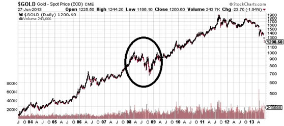
Look at the chart below and pay close attention to the circled area. In 2008, gold bullion prices went from above $1,000 an ounce in early 2008, to below $700.00 by end of the year. If I recall correctly, the sentiment from many notable economists was very similar to what we’re hearing today.

Chart courtesy of www.StockCharts.com

But smart investors are buying.
The demand for gold bullion at the U.S. Mint is higher than what it was in 2011, when the precious metal prices were at their peak. So far this year, until June 27, the U.S. Mint has sold 619,000 ounces of gold bullion in coins. This figure is almost 7.5% higher than the same period in 2011, when the Mint sold 576, 000 ounces in gold bullion coins. (Source: U.S. Mint web site, last accessed June 27, 2013.)
Demand from gold bullion–consuming nations like India is robust in spite of the Indian government imposing higher import taxes and its central bank telling Indian banks not to sell gold bullion coins.
The premium paid on the precious metal by Indian consumers doubled on Wednesday, June 26 as suppliers could not meet the demand. Harshad Ajmera, proprietor of wholesaler JJ Gold House in Kolkata, said, “We are unable to supply, though there is demand … we give deliveries after two to three days.” (Source: “Gold premiums jump as physical demand outstrips supply,” Reuters, June 26, 2013.)
On top of this, I see more central banks buying gold bullion than selling. According to data from the International Monetary Fund (IMF), central banks from Russia and Kazakhstan bought the precious metal for the seventh straight month in April. Central banks from nations like Turkey, Belarus, Azerbaijan, and even Greece joined Russia and Kazakhstan on their buying spree that month as well. (Source: Bloomberg, May 27, 2013.)
You need to keep in mind that central banks were net sellers of gold bullion not too long ago, and now they are buying.
So how low can the precious metal’s prices actually go with all the negativity?
It is certainly tough to be a gold bull these days, but what I know is that the greatest opportunities come in times of greatest uncertainty. Currently, gold bullion prices have come under scrutiny and even some of the most well-known gold bullion bugs are turning against the precious metal.
But I believe they’re wrong. While it can still go lower in the short term, the long-term trend still holds.
Michael’s Personal Notes:
A report from the National Institute of Retirement Security (NIRS) found that American households have a shortfall of anywhere between $6.8 trillion to $14.0 trillion when it comes to their retirement savings.
Looking at their assets only in their retirement accounts, 92% of working households in the U.S. economy don’t have enough savings to meet their retirement target. (Source: “The Retirement Savings Crisis: Is It Worse Than We Think?,” National Institute of Retirement Security, June 2013.)
Sadly, that’s just one part of the problem. The report also pointed out that as many as 38 million working-age households in the U.S. economy don’t have any retirement savings. In addition, for all working households, the median retirement savings is just $3,000. For those who are near their retirement, their median retirement savings are just $12,000.
About 67% of working households between the ages of 55 and 64 and with a minimum of one person involved in the jobs market earning income have saved less than the amount of one annual income. (Source: Ibid.)
How will this phenomenon impact the U.S. economy? The effects of a major shortfall in retirement savings can be many, but one of its main victims may just be the already struggling jobs market.
What we already know from the most recent jobs market report is there are almost 12 million unemployed Americans. Most of those who were lucky enough to find a job are working low-wage jobs, like those in the retail sector, or are working part-time.
According to the U.S. Department of Labor, in 2012, there were 284,000 college graduates who were working for minimum wage in the jobs market—a figure that has doubled since 2007, and has increased 70% from 10 years ago. (Source: Wall Street Journal, March 30, 2013.)
As the report cites, there is a significant number of Americans without sufficient savings who are closing in on retirement age. It’s likely that they will stay in the jobs market longer, because they don’t really have any other option.
The jobs market will feel a ripple effect as those who are already looking for work or those who are looking to enter the workforce find fewer openings.
Consider the college graduates working for minimum wage in the jobs market. If they have student debt, they will have troubles paying it off—which will lead to a higher delinquency rate on the already $1.0-trillion student debt load.
And those with lesser skills in the jobs market will have even more difficulties finding work compared to what they see now.
Dear reader, food stamp usage in the U.S. economy is at a dangerous level; and I can see it going even higher as more Americans are unable to find work due to those staying in the jobs market longer rather than retiring.
As we have learned, and similar to Japan’s mishap, printing more paper money helps the stock market and big banks—not the little guy. About two-thirds of U.S. gross domestic product (GDP) is dependent on consumer spending. If consumers are not spending, we have no GDP growth. If consumers pull back on spending, we have negative GDP growth. That’s why I’ve slowly been preparing my readers for another recession. And no stock market I know has ever risen during a recession.

See the original article >>

Egypt's return underpins world wheat trade hopes

by Agrimoney.com

World wheat trade prospects received a boost as Egypt, historically the top importer, returned to tender for the first time in four months, as second-ranked Indonesia was seen buying far more than has been expected.

Egypt's Gasc grain authority - which has historically tendered for wheat twice a month or so - on Monday revealed its first tender since mid-February after a hiatus attributed to the country's financial crisis, which has left it with little cash for foreign purchases.

The tender, for wheat for shipment between August 10-20, surprised investors, coming indeed only minutes after one broker, Brian Henry at Benson Quinn Commodities, said that "given the current situation in Egypt, I have to question just what wheat demand is going to be like from that country going forward.

"Ultimately they don't have many options to feed their people, but they're going to need plenty of help."

Stocks run down

The country has avoided imports by running down inventories and through purchases from the domestic harvest, which has proven a strong one, as in other North African importing countries such as Morocco and Tunisia.

The International Grains Council on Monday lifted by 400,000 tonnes to 9.4m tonnes its estimate for this year's Egyptian wheat harvest, representing a rise of 10.6% year on year.

Egypt's government, which a week ago said it had purchased 3.7m tonnes of wheat from local farmers so far from this harvest, has downplayed its need for imminent imports although Bassem Ouda, minister of supplies, two weeks ago did suggest that purchases might be needed before the end of June.

US Department of Agriculture staff in Cairo have cautioned over the thinness of wheat stocks, with the IGC on Monday forecasting a rise of 200,000 tonnes, to 9.0m tonnes, in Egypt's import needs in 2013-14 despite the bigger harvest.

Indonesia boost

The Gasc announcement follows a, small, victory for feed wheat exporters, after Morocco, a large importer of milling grain, confirmed that it had lifted restrictions on purchases of feed supplies too, although this market is only estimated at some 60,000 tonnes a year.

On a larger scale, Australia & New Zealand Bank on Tuesday flagged the potential for rising wheat imports by Indonesia, the second-ranked buyer after Egypt, driven by the soaring prices of other foods, including rice.

"High food inflation in Indonesia favours higher wheat consumption," Paul Deane, ANZ senior ag economist, said, noting that consumer price inflation is running at 11%, "driven by rising fruit, vegetable, fish and meat prices".

"With higher fuel prices and non-cereal food inflation sweeping through the Indonesian economy, consumers are likely to be particularly cost conscious, favouring consumption of wheat noodle at the expense of other items."

Rice vs wheat

This extends to a preference too for wheat over rice, which is some $425 a tonne more expensive - a gap the bank forecast increasing to some $500 a tonne as pressure from the northern hemisphere harvest lowers wheat prices.

"Seasonal factors should keep Indonesia rice prices supported while wheat prices are expected to still fall further," Mr Deane said.

As an extra boost to wheat import prospects, there is talk that Indonesia may extend a duty hike on flour imports in favour of protecting the domestic milling industry, whose capacity is expected to top 10.0m tonnes this year with the opening of two new mills.

Indonesia's imports will rise by 15% year on year, or some 1m tonnes, over the next 12 months.

The IGC forecasts Indonesian imports in 2013-14 of 6.8m tonnes, a rise of 200,000 tonnes.

See the original article >>

Developing Deflationary Major Forex, Stocks, and Commodity Market Tops

By: Rambus_Chartology

In this report I would like to show you some different currencies that are completing major reversal patterns that should be positive for the US dollar. By the looks of some of the base metals miners BHP, RIO and FCX they seem to be saying that deflation is on the horizon. These big miners look like the HUI before it broke down from its major H&S top pattern.

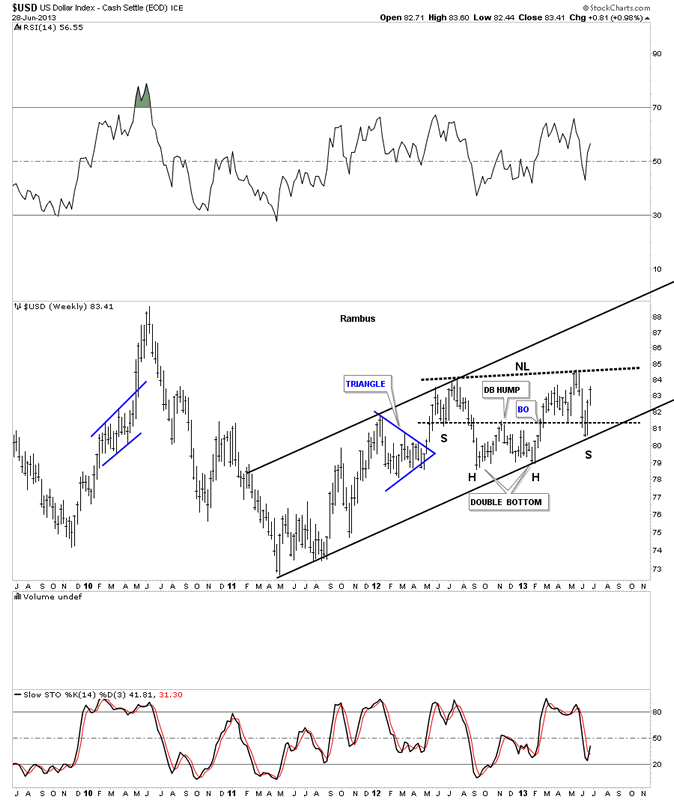
Lets start with the US dollar that has been rallying back after hitting its long term resistance rail last month in a sharp sell off. I think that was the shake out before the breakout. This first chart of the US dollar shows a nice H&S consolidation that is getting close to breaking the neckline to the upside. A break above the neckline will put the US dollar at a 3 year or so high.
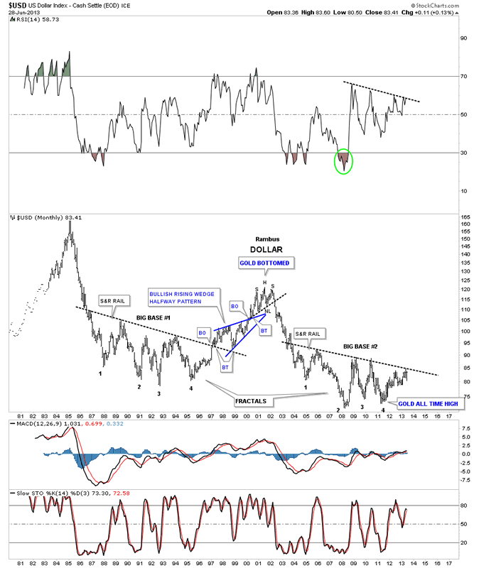
This next chart is a long term look at the dollar that shows the two fractal bottoms. After selling off in June the dollar is now approaching that all important top rail. Remember this is a monthly chart so things change very slowly compared to the minute charts.
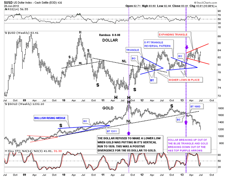
This next chart is a comparison chart with the US dollar on top and gold on the bottom. Note the heavy purple dashed vertical line where gold broke below its long term neckline and the dollar broke above its 5 point triangle reversal pattern. As the dollar has been trading sideways, in what is beginning to look like an expanding triangle, gold had been selling off.
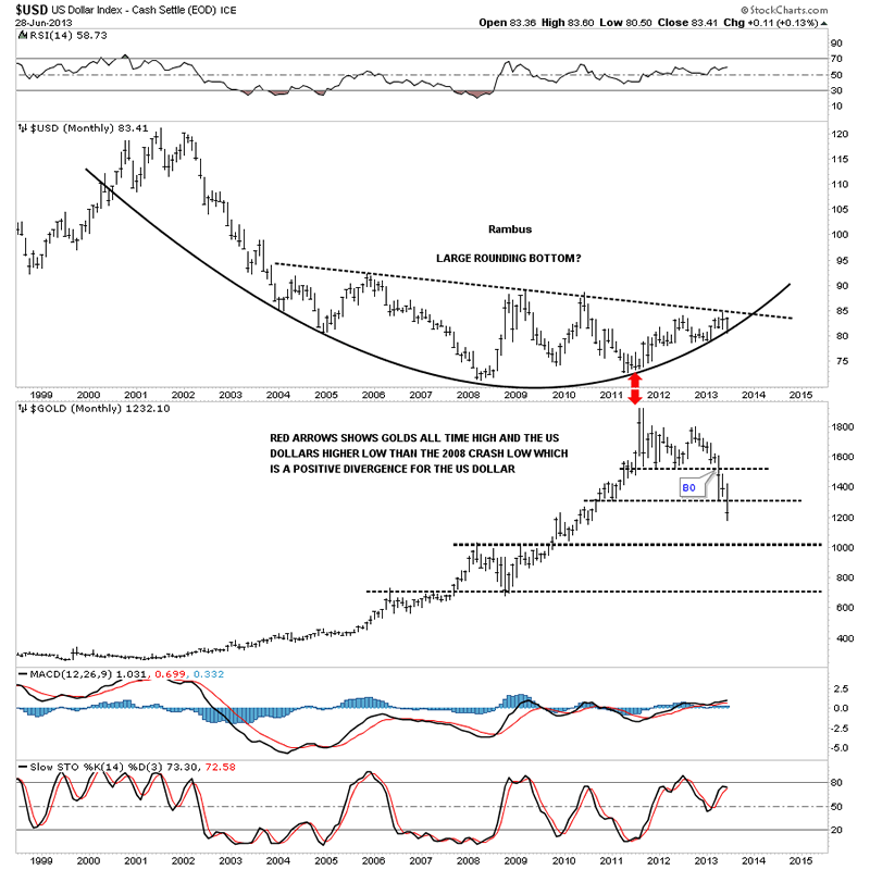
This last chart for the US dollar shows the nice rounding bottom with the price action now trading between the top rail and the bottom of the parabolic arc. The sell off we had in June found support just where we needed to see it come in, right at the parabolic arc. So far so good. Nothing is broken.
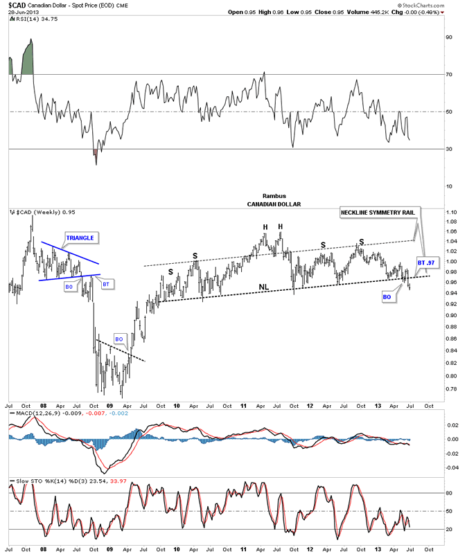
Lets now look at a few currencies that look like they are putting in some big topping patterns that are just now starting to breakdown. This weekly chart for the Canadian dollar looks an awful lot like the HUI before it broke down. Note the neckline symmetry rail that shows the top for the right shoulder.
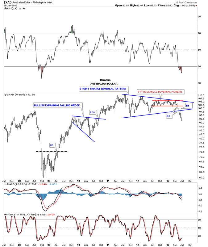
The Australian dollar shows a beautiful blue 5 point triangle reversal pattern with a 7 point rectangle reversal pattern that formed out toward the apex. After breaking out through the bottom rail of the blue triangle you can see one quick little backtest before prices started to fall in earnest.
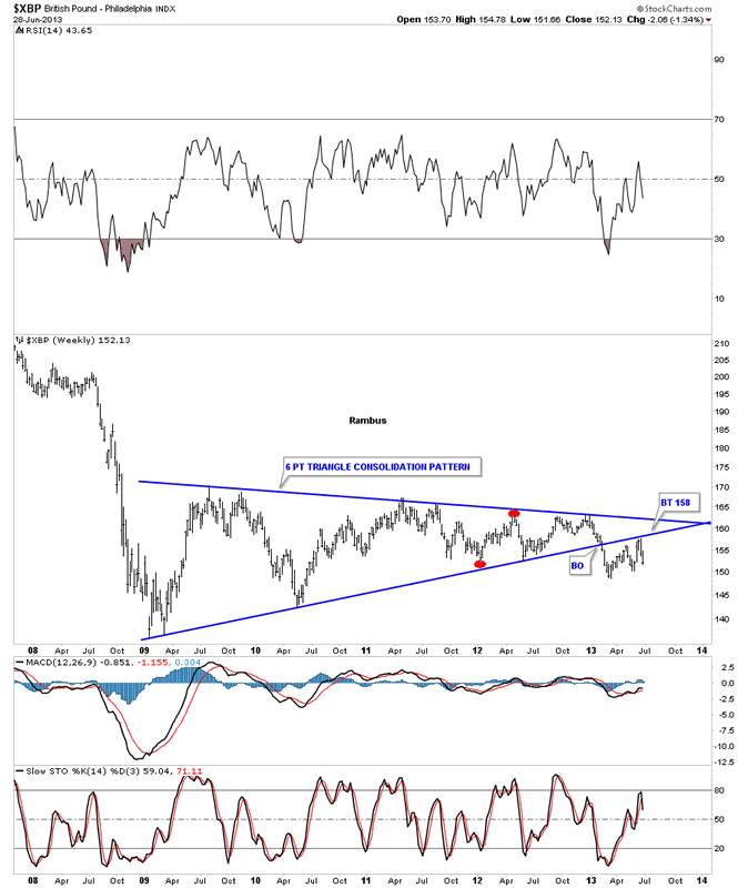
The British Pound has broken down from a triangle consolidation pattern and has had two backtest with the second one completing two weeks ago by the looks of it.
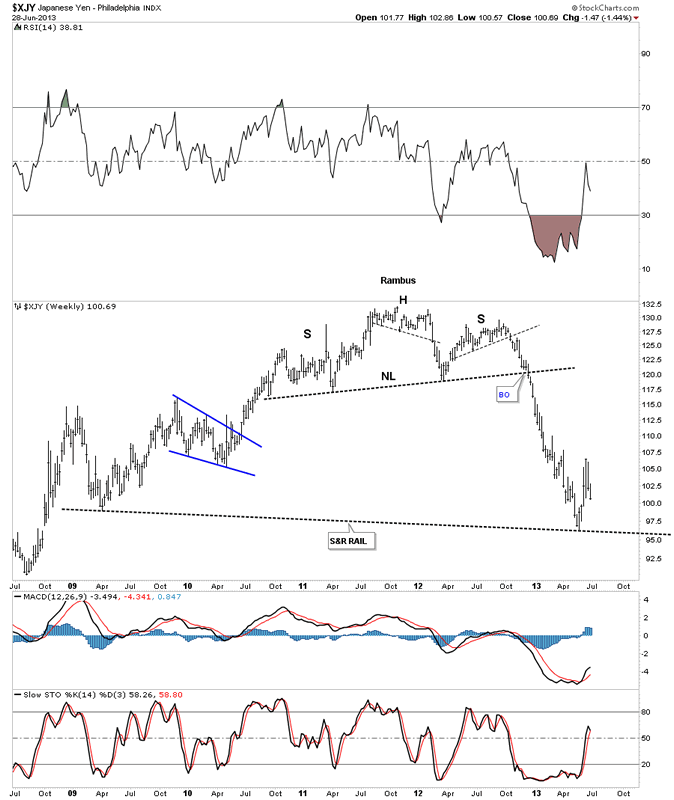
The Yen had a nice big H&S top before it broke down.
The XEU has been holding up pretty well compared to some of the other currencies. You can see the nice H&S top that has been forming for sometime now with the neckline symmetry rail holding resistance at the top of the right shoulder.
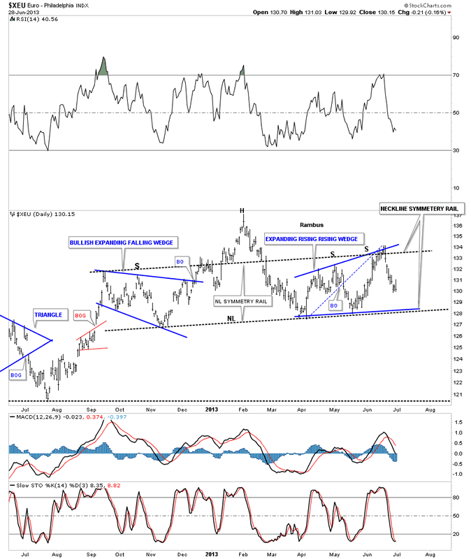
The Euro is the Last Component (and the largest) of the US Dollar Index to hold out . When / If this chart breaks, the deflation scenario will be baked into the Charts

…………………….

PART 2 :

In the second part of the Weekend Report I AM going to show you some charts for the risk off trade where commodities show weakness in a deflationary type setting. This generally happens with a strong dollar as I showed you in part 1 , with the strong dollar and weak currencies charts.

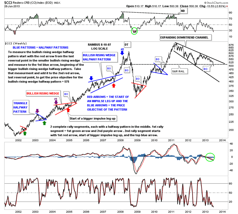
The first chart I would like to show you is the CCI commodities index that topped out in 2011 and has been in a slow downtrend that has taken on the shape of an expanding downtrend channel. Note the black dashed horizontal trendline labeled the S&R rail, support and resistance rail. Above is support and below it becomes resistance. As you can see by last weeks price action the CCI traded below that important S&R rail for the first time in a long time.
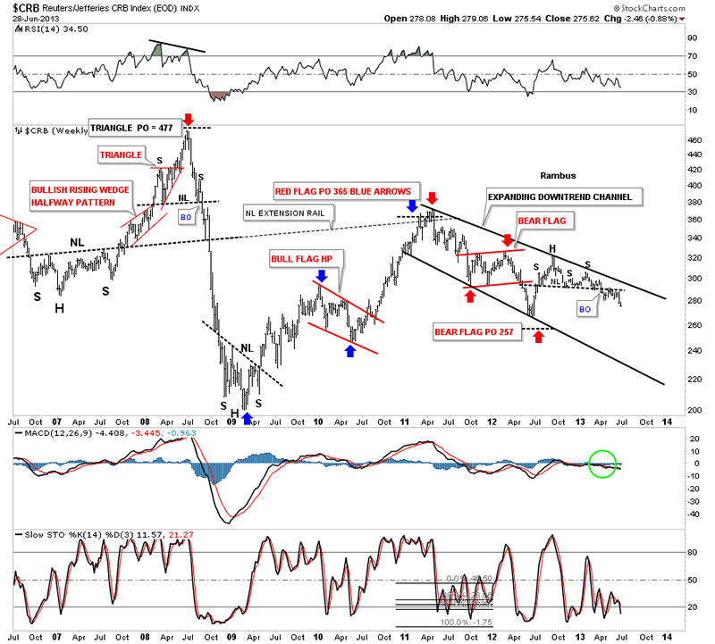
The old CRB index has been much weaker than the newer version of the CCI as it failed to make a new all time high back in 2011 and actually made a much lower high. You can see the H&S consolidation pattern that has formed on the right side of the chart that is now starting to breakdown after doing the breakout and backtesting move. It to is in an expanding downtrend channel.
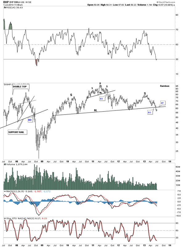
I mentioned last night that some of the big base metals miners are showing some big H&S topping patterns. BHP has a very similar looking H&S top that the HUI has, only the HUI has led the way lower by breaking its neckline back in February of this year a good 4 1/2 months ago. There could now be a backtest to the underside of the the neckline before the real move begins lower.
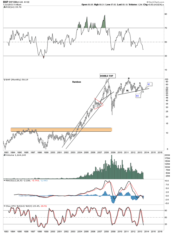
The monthly chart for BHP looks extremely bearish as that H&S top is sitting right at the end of the 2008 crash low rally. Remember this is a monthly chart that takes a lot of time to build out a big topping pattern, but when it is finally complete there will be a big impulse move down. Right now it’s all about patience to see if it does a backtest to the underside of the neckline.
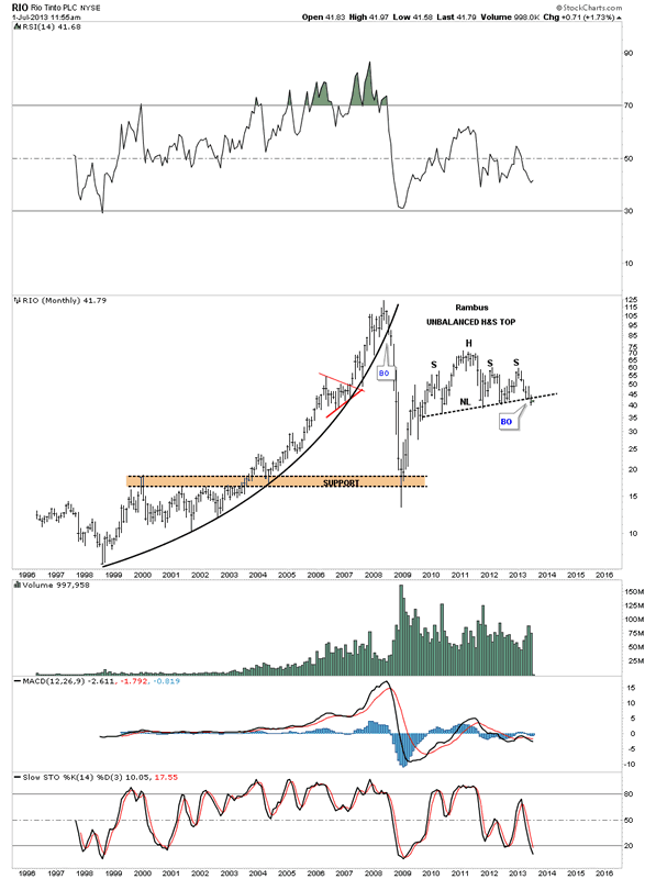
RIO is another big miner that shows a similar big H&S topping pattern with the breakout and now the possible backtest underway. Again, look at a 6 year weekly chart of at any of the precious metals stock indexes to see what awaits the completion of this big H&S topping pattern.
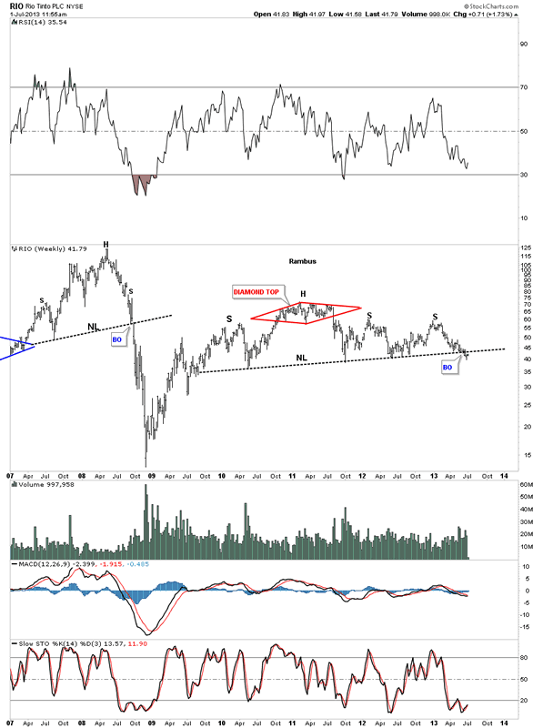
RIO monthly.
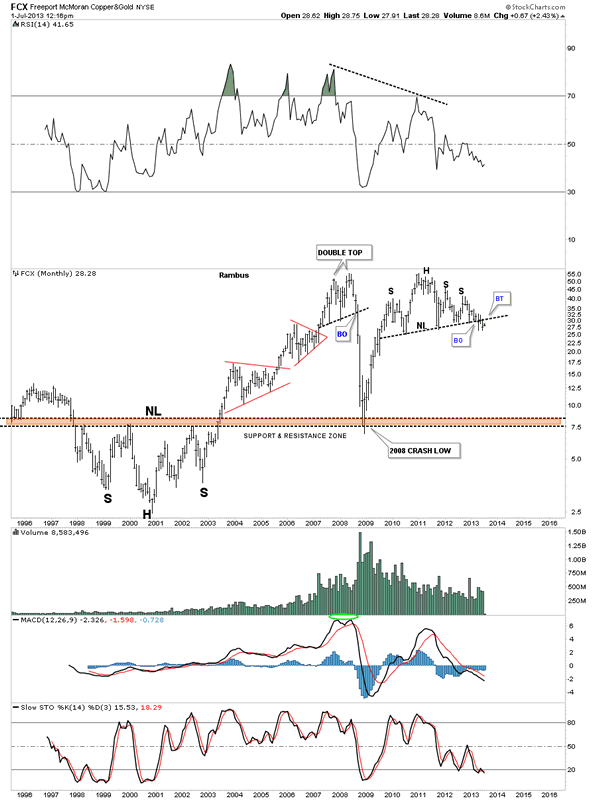
FCX has created a complex topping pattern that consists of an unbalanced H&S top with a 5 point triangle reversal pattern. It has been taking its sweet ole time breaking out and backtesting. There is a good chance it has finished the backtesting process. We won’t know for sure until the impulse move down starts in earnest.
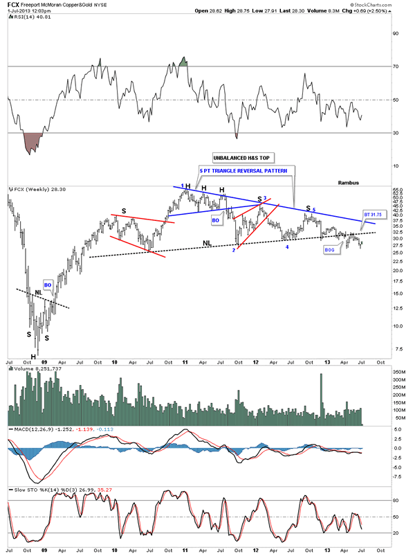
FCX monthly.
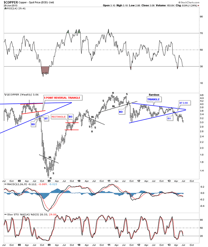
Lets take a look at copper as that commodity really crashed during the 2008 deflationary episode. As the weekly chart shows copper made a H&S top back in 2011 which broke to the downside followed by the 6 point blue triangle consolidation pattern which also has broken down.
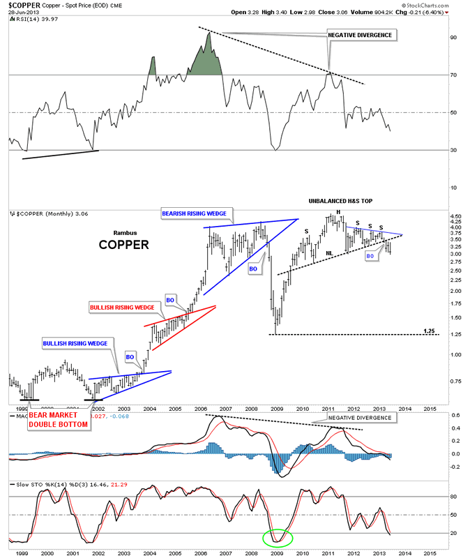
Notice the last bar on this monthly copper chart that shows it’s really close to making a multi year low with just a little more weakness. As you can see on the left side of the chart, impulse moves start when these big patterns finish building out. Chop chop chop and then bang.
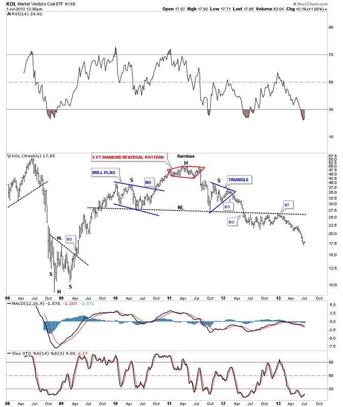
KOL is a coal etf that is now starting to move lower after a long drawn out breakout and backtest.
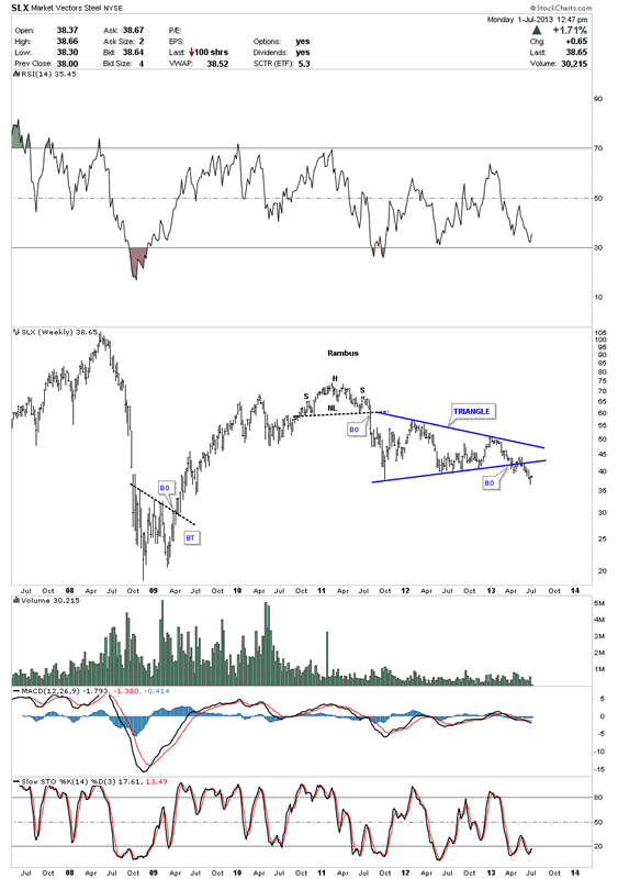
SLX is a steel etf that just recently has broken down from a triangle consolidation pattern.
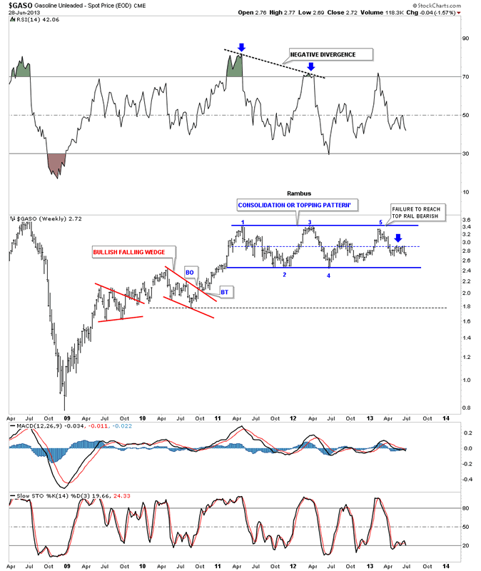
The GASO, gasoline chart, is still trading at the center dashed rail of a very large rectangle pattern. Many times a failure at the center of a rectangle will led to the breakout move.
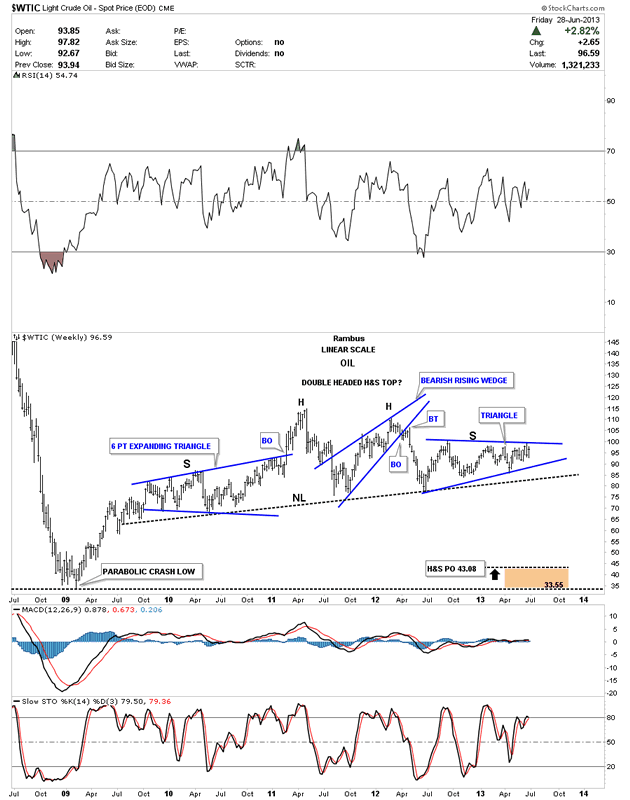
The oil chart shows a potential large H&S top pattern. The blue triangle on the right side of the chart that is trying to form the right shoulder and has done a little morphing lately breaking slightly above and below the top and bottom blue rails. So we wait for further developments.
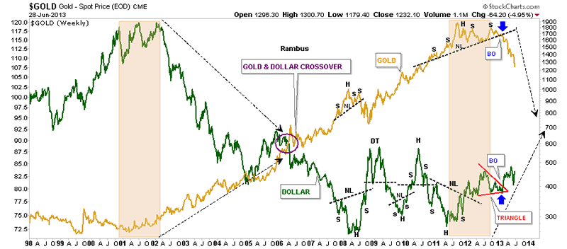
This last chart I’ve overlaid gold on top of the US dollar so you can see the inverse relationship between the two. It’s not always perfect but they tend to run opposite of each other. Notice the price action back in 2001 when the US dollar topped out and gold bottomed out. Now fast forward to our most recent price action where just the opposite is happening right now where gold is topping and the US dollar is bottoming. I’ve circled the area in 2006 where gold and the dollar crossed paths on their way to gold’s top and the dollar bottom. Is gold and the US dollar going to cross paths again in the not to distance future? Time will tell. It always does. All the best…Rambus
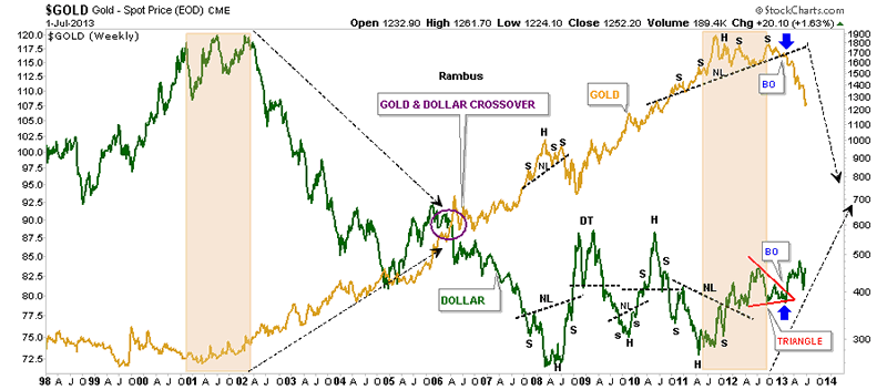
PS

These long term charts that I’ve been posting on the US dollar, currencies, and commodities are painting a picture of deflation IMHO. These are huge topping patterns that aren’t going to play out in weeks or months but possibly several years. I think the precious metals complex has been leading the way down with the currencies and commodities playing catch up at some point. We have to get the main trend right so we’ll know how to play this deflationary episode. That is 75% of the game. Trade with the big trend whenever possible. I think once the deflation period ends that is when we’ll see the real inflation picture take hold. We will know when the time comes by the bases that will have to be built just as these topping patterns are showing us the way lower now. Big trends don’t change on a dime, it’s like turning the Titanic around. At some point the US dollar and gold may cross each others path again. Maybe they will kiss each other and reverse back the way they came. We just have to watch the price action for clues. All the best…Rambus
See the original article >>
Follow Us