Monday, June 17, 2013

Can Bernanke Keep the Rally Going?

by Graham Summers

The markets are rallying today because Bernanke and the Fed meet on Wednesday and will announce their new policies (if any).

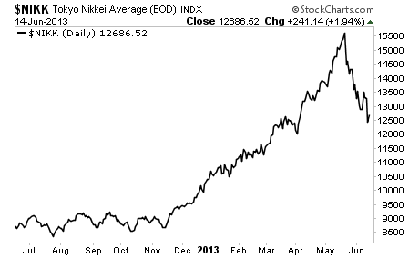
Someone might want to explain to them that the Nikkei just collapsed in spite of Central Bank policy. The bank of Japan announced it would buy $1.4 trillion worth of assets (roughly 25% of Japan’s GDP) in early April. The Nikkei has already wiped out almost all of the gains since that time.

Still, US bulls continue to hope that Bernanke will engage in even more QE, despite the fact the Fed has an $85 billion per month QE policy in place already, which comes to over $1 trillion in QE per year.

Given that the Fed’s balance sheet is already over $3 trillion and will be over $4 trillion within 12 months, one has to wonder just what Bernanke can do. His best bet is to retire in January and let someone else try and manage the mess he created.

So let’s see what happens on Wednesday. The markets will likely rally until then on hopes of more juice from Bernanke. But if he should disappoint at all (read: not announce something more or at least strongly hint at doing so) then buckle up.

See the original article >>

The VIX and the Pre-FOMC + Post-FOMC Trades

by Bill Luby

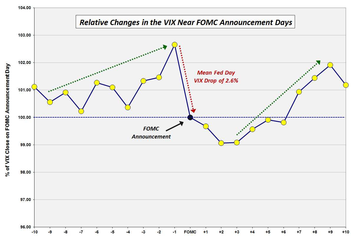
Back in December 2008, in VIX Trends Around FOMC Announcement Days, I posted a chart of the average movements in the VIX in the ten trading day leading up to and following “Fed Days,” otherwise known as days in which the Federal Open Market Committee (FOMC) makes its policy statement announcement. Several long-time readers who recall that chart – and an earlier incarnation from VIX Price Movement Around FOMC Meetings – have recently asked for an updated version. With all eyes on the Fed’s statement and Ben Bernanke’s press conference on Wednesday, this seems like a good time to revisit how the VIX moves in the days leading up to and following FOMC announcements.

In the chart below, I have normalized VIX data going back to 1990 to make it easy to compare the mean daily changes in the VIX in the ten trading days preceding FOMC policy statement announcements as well as ten trading days following those announcements. The quick takeaway is that the data from the last five years has been consistent with the data as of 2008. There are still three dominant features in this chart:

  1. a pre-FOMC VIX ramp in which the VIX tends to move up sharply in the three days leading up to the FOMC announcement and trend up more gradually 1-2 weeks in advance of the announcement
  2. a sharp decline in the VIX averaging about 2.6% on the day of the FOMC announcement, with a gradual decline in the VIX of another 1.0% or so in the two days following the announcement
  3. a sharp rebound in the VIX that starts three days after the FOMC announcement and persists until nine trading days after the announcement

Over the course of the past five years, the pre-announcement ramp in the VIX has been steeper during the three days prior to the announcement and more gradual in the week or so prior to that period. Also, recent history has seen the post-announcement decline in the VIX extending two additional days to now span four days following the announcement.

Of course there is no reason to expect that patterns which have persisted for the past 33 years to magically reappear for each FOMC announcement going forward, but I do believe that the historical pattern does say something about human nature, uncertainty and perceptions of risk.

It is worth noting that the biggest one-day jump in the VIX on a Fed day dates from February 4, 1994, when Federal Reserve Chairman Alan Greenspan surprised the markets by announcing a 0.25% increase in the federal funds rate, helping to lift the VIX 41.9% on that day. For comparison purposes, the next largest Fed day VIX increase was a 15.1% gain on March 15, 2011. While another VIX pop may be in the cards, history says there is a 72% chance the VIX will decline on Wednesday and that the decline should average about 2.6% or about 0.44 based on the current level of the VIX.

What is the trade here? While many will undoubtedly try to guess the direction of Wednesday’s move, the three other trades with a historical bias include:

  1. an increase in the VIX in advance of Wednesday’s announcement
  2. a continuation of any decline in the VIX from Thursday to Monday
  3. a new uptrend in the VIX beginning on Monday or Tuesday and running through the beginning of July.

[source(s): CBOE, Yahoo, VIX and More

See the original article >>

Percent of indicators at bearish extremes drops off for S&P 500.

by Chris Kimble

CLICK ON CHART TO ENLARGE

Shared the sentiment chart above last week with Members, reflecting that the percentage of indicators at bearish extremes was declining a good bit of late despite a small decline in the S&P 500. It was info like this that caused me to harvest gains in our international short positions we had.

Ironic the level of percent of indicators at bearish extremes happens to be nearing where a few market lows have taken place over the past couple of years. Will it be different this time or has too many investors become too bearish too fast again?

See the original article >>

Market relationships offer insight into recent turns

By Jeff Greenblatt

This is a market of relationships. For a long time we had an inverse working with equities and the US Dollar. In May 2011 the SPX hit a high while the Greenback hit its low. Since then both are closer to the top of the ranges. If I showed you a weekly chart you’d see a lot of flat weeks for the Dollar where the stock market didn’t decline. For instance, from February to May 2012 the Dollar was mostly flat while the stock market was straight up and had one of that aborted correction.

So it is the Greenback and Aussie Dollar both are in recent tailspins. This can’t last since the Aussie Dollar represents the risk on trade. Then we have the ultimate inverse relationship where we used to have the Greenback moving in opposite directions against the Gold market. But recently the Dollar fell hard but Gold has been unable to rally. This is a concern for Gold bugs mostly because the Gold market and later the XAU have exhibited some of the best Gann symmetry we’ve seen in recent memory. But in the economy, if the Dollar gets hit doesn’t that mean inflation? If we are too have a serious bout of inflation, why isn’t Gold going through the roof? What do we make of this relationship?

But the most important relationship we’ve had recently is the level of fear in the overall market compared to the 50 day moving average in the SPX.

We have the end of February, April 18 and now on both the SPX and VIX. What you see are 3 peaks in the VIX which is the same approximate fear or should I say complacency level as the equity index hits the 50dma. It’s just a market that’s getting used to the same old, same old. The VIX can’t break thru and the SPX refuses to break down. This is a classic buy the dip mentality and it’s becoming ingrained.

Last week I mentioned the buy the dip mentality and wondered out loud how many times they can go to the well without getting burned. It’s all becoming too predictable, easy. For a time this is the way markets are supposed to work. You are supposed to have a little butterfly in the tummy as you buy the 50. But now it’s like we’ve reached the point of the Wal-Mart red light special. So I’m satisfied that I’m getting my answer. The takeaway here is even if this market goes to new highs; we’ve already had a retest of the 50 only days after the original. This is a freight train market that won’t reverse on a dime. Fine, it doesn’t have to. But we are starting to see the cracks in the armor. I don’t have to look at an ADX to see the trend weakening. All I have to do is see that we are not getting a clean break away from the 50 like in the past.

There are a couple of reasons for this. First of all, the housing sector has shown some serious cracks as well. This rally is not going to survive without a good HGX. It doesn’t have to lead to the upside but it certainly can’t lead to the downside. So there’s your big relationship. If we can’t have a neutral housing market we are not going to have a rally.

Then we have the situation in Europe which has been leading to the upside since December. When our markets were wondering what would happen with the fiscal cliff, Europe didn’t seem to care. But the FTSE had a serious hiccup last week. Look at the chart, where’s the bounce? We didn’t have one. It’s amazing the US markets did as well as they did while European markets were dead in the water. Now it appears we could have what amounts to a 3rd wave low so I suspect this could be a neutral to decent week all the way around but here’s the next problem. If we bounce to start the week it opens the door for an inversion high as we hit the seasonal change point by Thursday. I’m almost rather see a wipeout the early part of the week because it would increase the probability we can have a real low as June 21 hits. But when I look at the situation in the SPX and VIX, it’s just not very likely to happen.

Let’s project is a little forward on the FTSE. What we have here is a test of the 200dma already looming in the not too distant future. They haven’t respected the 50 very much, have they? We have that 50/200 cross already working and you can see the 50 line rolling over. That’s trouble in anyone’s book. What does that do for our bigger time windows in the fall? It’s too soon to tell but if we manage to stay flat in Europe the time window later in the year could be a major inflection point one way or the other.

So as they wrestle to determine whether the SPX 50 day crumbles now or on the next spin cycle fear levels are going to have to rise above resistance here as well to get to an acceptable point where we can have a true bottom and a new sustainable move. I just don’t see it right now.

Finally, the EUR-USD had interesting calculations as it hit our target trend line. It has backed off the high but is only going sideways in what could be a triangle. We still can’t rule out one more high. We have a Fed meeting on tap to go along with the seasonal change point. I believe we have the capability of still being all over the map. We could still end up with a new high but when all is said and done, the real takeaway to this entire market is Europe not confirming whatever decent action in the US last week and the SPX not coming off the 50 in a clean manner. It might take some serious patience but I think we are going to see implications from this action sooner as opposed to later and quite possibly right after the seasonal change point. Simply put, I think it’s time for a bigger correction.

See the original article >>

Stock Markets Risks Unacceptably High and Rising

By: Brian_Bloom

Post GFC, US corporate profits have been very likely rising for reasons that are more related to cost savings and margin increases than to real revenue growth. These cost savings have now worked their way through the system and future US corporate profit growth will be more dependent on price inflation and/or sales volume growth.

US balance of payments may improve as a result of improved energy exports but, because the country is now oriented to a service economy, any growth in export volumes of manufactured goods is unlikely to impact significantly on the economy as a whole. In any event, with the rest of the world in recession, the likelihood of a growth in export volumes is low. With government spending sequestered, an implication is that employment opportunities will have to be driven by private enterprise.


With the above in mind, the fact is that employment has not been growing as a percentage of population. At best, it seems that employment growth is likely to remain close to population growth.

It follows that any price increases at the corporate level are likely to be offset by falls in volume. Further, because real consumer wage rates have been flat to falling, and because over two thirds of the US economy is driven by consumer spending, overall growth in nominal corporate revenues seems likely to be benign.

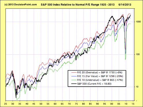
Finally, the reality is that the main impact of Quantitative Easing has been to drive up investment asset prices. This served to underpin an improvement in consumer and business sentiment which, in turn, prevented an economic collapse. However, Price/Earnings ratios are now once again in the “overvalue” range. A continuation of QE will likely push the P/E ratios to “bubble” levels which will be extremely counterproductive.

Overall, therefore, because overvalue P/E ratios can typically only be justified by high profit growth rate expectations and because US corporate profit growth is likely (at best) to be flat for the foreseeable future, the US equity markets are now looking extremely vulnerable. An adjustment to “fair value” P/E ratios will imply at least a 20% fall in the US stock market assuming revenue volumes do not decline.

Unfortunately, given that QE served to underpin consumer confidence because of rising asset prices, it follows that falling assets prices will likely serve to undermine consumer confidence and to increase savings levels. The flip side of this is that corporate sales volumes (and profits) will be experiencing downward pressure. The above reasoning leads to the overall conclusion that the US equity markets have probably peaked and may fall significantly in the foreseeable future.

***********

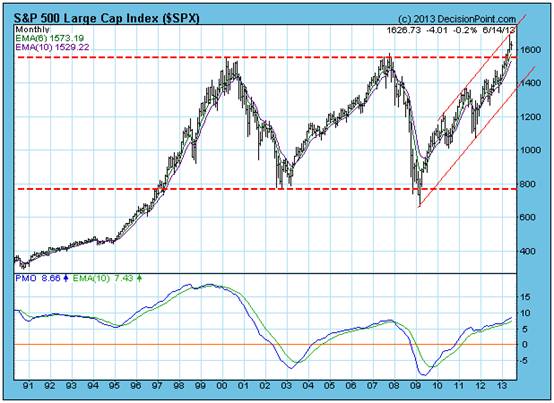
The monthly chart below of the SPX (courtesy decisionpoint.com) gave a technical “buy” signal when it broke to a new high a few weeks ago. But the core question is whether the rise from the low of 800 since early 2009 was a result of the Quantitative Easing. If so, then the latest technical buy signal may be false.

Chart #1 – Monthly chart of S&P 500Industrial Index
There is a limit to how far corporate profits can rise as a consequence of financial engineering. At the end of the day, profits flow from a simple formula:

Revenue – costs = profits

There is no doubt that corporate profits have been rising in recent times but the question that needs to be addressed is: What has been driving this rise?

1. Has it been falling costs or rising revenues?

2. If rising revenues, has this been driven by price (and margin) increases or by volume increases?

Common sense dictates that if profits have been rising for any reason other than increased volumes of sales, then continuing profit increases will be unsustainable.

Employment Costs

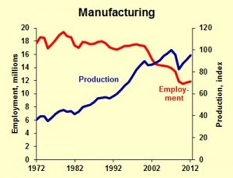
Historically, manufacturing productivity in the US has been increasing because of increasing automation

Chart #2: US Production output vs Employment numbers
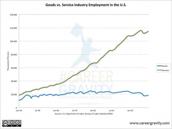
But the US is no longer a manufacturing oriented economy.

Chart #3: Goods vs Service Industry Employment in the US

Source: http://www.careergravity.com/goods-vs-service-industry-employment-trends-chart-of-the-week/
Employment in general in the US did not rise in May 2013 and the percentage of the population that is employed has generally been flat for the past 12 months.

Quotes:

· “Both the number of unemployed persons, at 11.8 million, and the unemployment rate, at 7.6 percent, were essentially unchanged in May.”

· “Total nonfarm payroll employment increased by 175,000 in May, with gains in professional and business services, food services and drinking places, and retail trade. Over the prior 12 months, employment growth averaged 172,000 per month.”

· “The employment-population ratio was unchanged in May at 58.6 percent and has shown little movement, on net, over the past year.”

(Source: http://www.lanereport.com/21880/2013/06/u-s-unemployment-rate-up-slightly-to-7-6-percent/ )

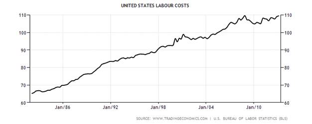
Importantly, labour costs are now back to where they were before the Global Financial Crisis.

Chart # 4: US Labour Costs 1982 - 2013

Source: http://www.tradingeconomics.com/united-states/labour-costs
Finally, there is an upward pressure on hourly labour rates – albeit fairly benign at present:

Quote:

· “In May, average hourly earnings for all employees on private nonfarm payrolls, at $23.89, changed little (+1 cent). Over the year, average hourly earnings have risen by 46 cents, or 2.0 percent. In May, average hourly earnings of private-sector production and nonsupervisory employees, at $20.08, changed little (+1 cent). (See tables B-3 and B-8.)”

(Source: http://www.lanereport.com/21880/2013/06/u-s-unemployment-rate-up-slightly-to-7-6-percent/ )

Interim Conclusion #1

Overall, corporate costs savings associated with lower labour costs post GFC has probably ended.

Cost of Capital

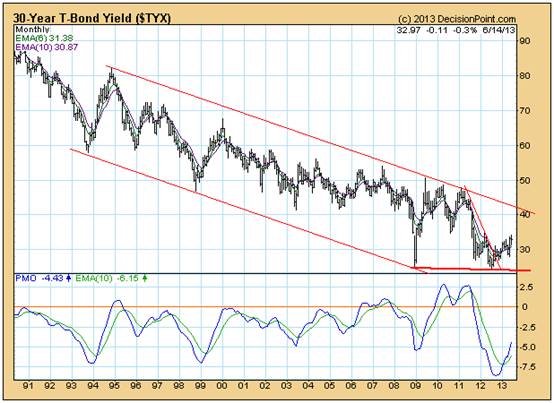
It seems clear from the chart below that interest rates have probably bottomed and that, therefore, corporate cost savings flowing from lower interest rates have probably ended.

Chart # 5: 30 Year Bond Yield

Source: Decisionpoint.com
Transport Costs

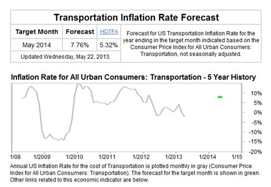
Corporate savings flowing from lower transportation costs post GFC have very likely ended, as can be seen from the following chart.

Source: http://www.forecast-chart.com/inflation-transportation-cost.html

Chart # 6: US Transport Cost Inflation
Energy Costs

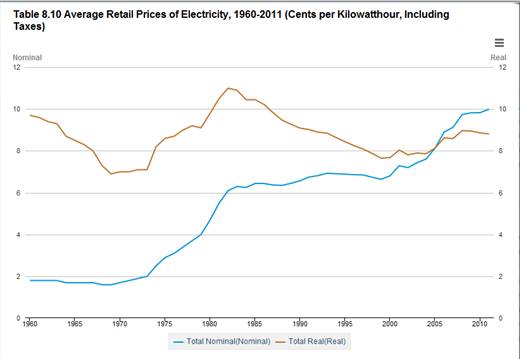
Although energy costs per kW hour have been falling in real terms, because US industry has become increasingly service oriented, these falling costs are likely to be more beneficial to consumers than to US corporations.

Chart #7: Average Retail Price of Electricity in the US

(Source: http://www.eia.gov/totalenergy/data/annual/showtext.cfm?t=ptb0810 )
Occupation Costs

Commercial real estate prices have been rising, which implies that any post GFC costs savings in this area have now ended and, if business conditions improve, there will likely be an upward pressure on occupation costs.

Chart #8: US Commercial Real Estate Prices

Source: http://www.td.com/document/PDF/economics/special/USCommercialRealEstate.pdf
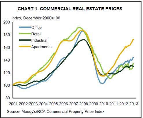
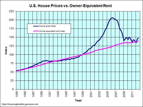
From a different perspective, it seems that any occupation cost benefits from falling domestic real estate prices have also worked their way through the system and consumer disposable incomes will be under pressure because of rising interest rates and rentals.

Chart #9: Domestic Real Estate Prices

Source: http://www.jparsons.net/housingbubble/
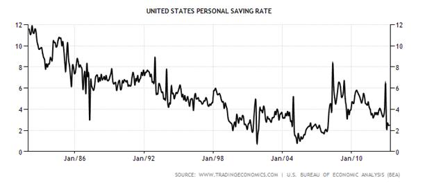
The chart below is noteworthy for the two spikes that have occurred post GFC. Although the savings rate is now just over 2%, the first spike took it to over 8% and the second took it to over 6%. The chart, overall, shows a “rounding bottom” formation, which implies that sentiment is turning. On balance, it seems that the US consumer – who has historically been the driver of sales volumes in the US economy – is now becoming conservative.

Chart #10: US Personal Savings Rates – 1982 – 2013.

Source: http://www.tradingeconomics.com/united-states/personal-savings
Finally, all the above needs to be seen in context of Price/Earnings ratios on the equity markets. The chart below shows that P/E ratios are in the overvalue range.

Chart 11: S&P Index relative to normal P/E Range

Source: DecisionPoint.com
Overall Conclusion

Flowing from Quantitative Easing, P/E ratios are in overvalued range which, in turn, suggests that investors have an exaggerated optimism regarding the future growth rate of corporate profitability. However, this optimism seems to be misplaced and US equity prices are vulnerable for three reasons in particular:

1. Because the US economy is service oriented and because export opportunities are limited by moribund offshore economies, and because government spending is now subject to sequester, US unemployment rates cannot be expected to fall significantly from current levels.

2. Average hourly pay rates have been flat and there is no reason to expect them to rise in real terms

3. There is evidence that consumers – who are the primary drivers of US economic activity - are becoming cautious about the future

Because QE had an artificially positive impact on the US economy, if share prices fall from this level this will very likely have an exaggerated negative impact on consumer confidence. In turn, this will place a downward pressure on corporate revenues and profits. In turn, it seems likely that we are facing downward pressure on Price/Earnings ratios.

Risks associated with equity investment seem unacceptably high and are rising.

See the original article >>
Fed and Flash PMIs Dominate the Week Ahead

by Marc to Market

The Federal Reserve meeting that concludes Wednesday is the most important event of the week. There are now few participants, if any, that expect the Fed to reduce its long-term asset purchases now or even next month. Many see the September as a more likely time frame and a recent poll found the median expectation for tapering to take place in October.

There are three aspects of the Fed's meeting that will garner attention. First is the statement itself. We suspect there will be little there to suggest change in QE. There are unlikely to be significant changes in the economic assessment. There may be some minor tweaks in the language. For example, the easing of price pressures may be noted in stronger terms that the last statement's recognition that inflation was "somewhat below" the FOMC's long-term objective.

Second, the Fed will provided updated forecasts. These may be more important than usual as it is part of the Fed's forward guidance. If the Fed is to taper off its asset purchases, ideally, it would be reflected in anticipation of quicker growth, a faster decline in unemployment, and/or high inflation. Yet, we expect little change in the forecasts, and, if anything, it may shave this year's growth forecast from the 2.3%-2.8% pace forecast in March. The unemployment rate was forecast at 7.3%-7.5% this year and in May it stood at 7.6%. We look for little change there. The core PCE deflator forecast was 1.5%-1.6%. In April it stood at 1.1%. There does seem to be scope for the Fed's forecasts to be shaved a bit.

Third, Bernanke will hold his post-meeting press conference. We expect his prepared remarks to avoid specifics about tapering, except to note that 1) tapering is not the same as tightening and 2) the Fed's decision is data dependent. We see the recent tapering talk as an effective exercise of forward guidance that succeeded in removing or at least diminishing the risk of asset bubbles being fueled by the Fed's continued purchases.

The ECB has also been engaged in a successful forward guidance exercise. The talk of being "open-minded" about a negative deposit rate appeared to have helped give the 25 bp refi rate cut greater impact insofar as it suggested the ECB can still do more. This week's main euro zone data will be the flash PMIs. They are expected to confirm an improving cyclical outlook.

The ECB also suggested it was looking at potential ways to help facilitate lending to small and medium sized businesses. Yet this increasing looks like something for the governments rather than the central bank. Before the weekend the four largest euro area members (Germany, France, Italy and Spain) agreed to look at mobilizing the European Investment Bank (EIB) that can channel funds through state development banks for SMEs.

Sterling is trading near four-month highs. It reports inflation figures this week and retail sales. They are both expected to tick up. CPI has been trending lower since late 2011, but is sticky in the 2.2%-2.7% range. Retail sales have been soft, declining five of the last seven months and three of the last four. Minutes from the MPC meeting early this month will be released, but given that Carney takes the reins in a couple of weeks probably denies the minutes of having much market impact.

The Reserve Bank of Australia also publishes the minutes from its recent meeting. While scope exists for additional easing, the market has moved away from a July cut. We anticipate an August rate cut and a rate cut in Q4.

In addition to the Federal Reserve's meeting, the Swiss National Bank and Norway's central bank meets this week. We expect both to announce no change in policy.

The G8 Summit kicks off today. The EU agreement before the weekend paves the way to launch a trans-Atlantic free trade talks. Moreover, with Europe moving away from its austerity thrust, this blunts a potential criticism. Ironically, the US, which has been critical of Europe's austerity emphasis, has the tightest fiscal policy within the G8 this year. Japan may come under pressure to implement structural reforms after Abe's "third arrow" was a bit of a dud, disappointing those who anticipated bolder action. However, it is politics, and especially responding to developments in Syria that may be the most divisive, though Russia seems isolated within the G8.

Japan reports May trade figures near midweek and another large trade deficit is expected. After improving on a seasonally adjusted basis in March and April, some widening is expected. While exports are likely to improve for the third consecutive month, import growth also continues. The weaker yen appears to be lifting the value of imports more than exports.

Among the emerging markets we note that India left rates steady today, as expected. Turkey's central bank meets tomorrow and no change is expected. South Africa reports CPI and current account figures on Wednesday. The flash Chinese PMI is due Thursday.

See the original article >>

Follow Us