Friday, June 28, 2013

Investor Cycle Low Looms For Bulls

By Poly

12

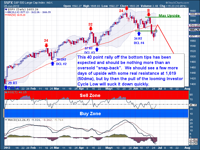
I’m still very comfortable with where the equity Cycle is headed.  Nothing about this action has me thinking any different; this 40 point rally off the bottom tips has been expected.   As I outlined over the weekend, this should be nothing more than an oversold “snap-back”.  Even so, I believe we should still have a few more days of upside with at least a test of the 50dma currently at 1,619.  From there we could see a “poke” above the 50dma to excite the bulls, so a rally that gets stopped within the 1,620-33 range would certainly be within my expectations.

It’s at that point that the pull of the looming Investor Cycle Low will suck it down quickly.  The first two drops this month were about widening the Bollinger Bands and placing the bulls on notice that the Cycle (sentiment) has turned.  It’s the next drop that should come quickly and fall without coming up for air.

As a precaution and so you’re aware that not all frameworks are always perfect, I’ve coded the chart below with the max upside line.  From a final Daily Cycle standpoint there is absolutely no reason for the S&P to be closing above that Day 8 high.  If it were to close there, then we must be careful as this Monday’s low could end up marking a Cycle Low.  Obviously I don’t hold much weight in this occurring, so it remains one of those items we need to just keep an eye on.   Trading without understanding both side of the equation is falling victim to bias.

This as is an excerpt from Wednesday’s  premium update from the The Financial Tap, which is dedicated to helping people learn to grow into successful investors by providing cycle research on multiple markets delivered twice weekly.

See the original article >>

What’s So Scary About Deflation?

By: MISES

Frank Hollenbeck writes: When it comes to deflation, mainstream economics becomes not the science of common sense, but the science of nonsense. Most economists today are quick to say, “a little inflation is a good thing,” and they fear deflation. Of course, in their personal lives, these same economists hunt the newspapers for the latest sales.

The person who epitomizes this fear of deflation best is Ben Bernanke, chairman of the Federal Reserve. His interpretation of the Great Depression has greatly biased his view against deflation. It is true that the Great Depression and deflation went hand in hand in some countries; but, we must be careful to distinguish between association and causation, and to correctly assess the direction of causation. A recent study by Atkeson and Kehoe spanning a period of 180 years for 17 countres found no relationship between deflation and depressions. The study actually found a greater number of episodes of depression with inflation than with deflation. Over this period, 65 out of 73 deflation episodes had no depression, and 21 out of 29 depressions had no deflation.

The main argument against deflation is that when prices are falling, consumers will postpone their purchases to take advantage of even lower prices in the future. Of course, this is supposed to reduce current demand, which will cause prices to fall even further, and so on, and so on, until we have a deflation-depression spiral of the economy. The direction of causation is clear: deflation causes depressions. You can find this argument in almost all introductory economics textbooks. The St. Louis Fed recently wrote:

“While the idea of lower prices may sound attractive, deflation is a real concern for several reasons. Deflation discourages spending and investment because consumers, expecting prices to fall further, delay purchases, preferring instead to save and wait for even lower prices. Decreased spending, in turn, lowers company sales and profits, which eventually increases unemployment.”

There are several problems with this argument. The first is that, regardless of how low prices of consumer goods are expected to fall, people will always consume some quantity in the present and in order to do so, they therefore need to spend in the present on investment to ensure the flow of consumer goods into the future. We can see that many high technology products have had brisk demand despite living in a deflationary environment. Apple has been able to sell its latest version of the iPhone, although most people expect the same phone to be much cheaper in six months.

The second mistake with this argument is that it assumes that we base our expectations only on the past. Falling prices makes us anticipate prices to continue to fall. Of course, our expectations are based on a multitude of factors, of which past prices is just one. I am sure that the economists at the Fed are surprised that we did not react to lower interest rates as we did after the dot com bubble of 2001. Human actions simply cannot be modeled as you would the reactions of lab rats in a biology experiment.

A third mistake is that if we are consuming less, we must be saving more. Investment must therefore be higher. Therefore increased saving that can lead to deflation does not reduce aggregate demand but simply alters the composition of demand. The demand for consumption goods will decline, to be replaced with demand for capital goods. If anything, this will lead to growth and more consumption goods in the future, since the economy has more capital to work with.

Growth lowers prices: that is a good thing. The period of the greatest growth in the U.S. during the nineteenth century, from 1820 to 1850 and from 1865 to 1900, was associated with significant deflation. In those two cases, prices were cut in half.

Let me explain this point with a very uncomplicated example. Suppose you have 10 pencils and $10. What is the price of a pencil? It can’t be $2 since we would have pencils that remain unsold, so the price would tend to fall. It can’t be 50 cents since people would have money and nothing to buy. Prices would be bid up. This would lead to equilibrium where pencils would be sold for $1 each. Now suppose we double the amount of pencils, so we have 20 pencils and $10. The price will fall from $1 to 50 cents. Other things being equal, including the stock of money, the price will be cut in half, falling prices here is very positive since our dollars now give us more goods and services. It reflects society’s ability to push out the bounds of scarcity. We can never conquer scarcity, or all prices would be zero, but falling prices shows that we are winning this crucial battle. More goods and services for all is a good thing and deflation reflects this additional abundance.

Now let’s talk about the deflation which causes such fears in so many economists. Suppose the production cost of a pencil is 80 cents. The rate of return is 25 percent. Now suppose people hoard $5 and stuff money in their mattress instead of saving it. The price of a pencil will again be cut in half, falling from $1 to 50 cents. If input prices also fall to 40 cents per pencil then there is no problem since the rate of return is still 25 percent. What economists fear is that input prices are sticky, and don’t adjust to output prices, so that firms produce at 80 cents and sell at 50 cents. This leads to bankruptcies, unemployment, and falling output, so now we may only be producing 8 pencils, which causes more hoarding, more bankruptcies, and so on, and so on. You get the picture. To avoid this, most economists advocate that the government print $5, keeping the price of pencils steady at $1, and avoiding a deflationary-depression spiral in the economy.

Of course, there are also some major problems with this little story. There is always a certain amount of stickiness in both input and output prices. You don’t want to have to constantly renegotiate your salary, nor do you want to constantly check on the hourly ticket price of the latest movie. So what is important is the lag existing between changes in output prices and input prices. If the lag is not long, then the policy solution described above may not be necessary and counterproductive. Also, entrepreneurs survive by forecasting output prices and then bidding for the inputs to be able to make a profit. This would suggest that the lag is probably relatively short.

Also, the printing of money is distortive. When the government adds $5 to the economy, it is not neutral. It initially benefits those that receive the money first, the government and banks, and penalizes the late receivers of the money, the wage earners and the poor. The printing of money and its associated price effect is the reverse of Robin Hood, taking from the poor to give to the rich. These early receivers, the rich, will spend the money in a certain way, altering relative prices in the economy.

Now what happens when the economy improves and people reverse their hoarding? We now have 10 pencils and $15. Other things being equal, prices will rise from $1 to $1.50, unless the government retires the $5 it put into the system. If they do, this will create another round of altered relative prices. The medicine is likely to be worse than the disease.

In a multiproduct world, inflation (including asset prices) from excessive credit growth causes changes in relative prices that induces unsustainable investments, like housing from 2001-2007. Deflation, in the bust phase, is a partial realignment of these relative prices closer to what society really wants to be produced. The printing of money simply interferes with this essential clearing process. The real solution is to end fractional reserve banking and central banking.

Inflation is much worse than deflation because it robs wage earners and the poor. Central banks are the primary cause of inflation and are the main reason for the growth of income inequalities, as the rich get richer and the middle class sinks toward poverty. This income trend has been self-evident and growing since the demise of the Bretton Woods system in 1971 and its replacement with fiat currencies. Central bank power depends on the ability to generate inflation.

This is why central banks have been so generous supporting economic research in so many academic institutions that serve to theoretically justify the central bank’s current inflationary policies. The common fallacy of “a little inflation being good” has been expounded by the media and economists for a reason. Inflation is theft as you sleep, since it robs the value of the dollars in your wallet. Two-percent inflation over 35 years reduces the value of money in your pocket by 50 percent. If anything, evil has a new face; it is called a central bank.

Many times deflation follows a period of central bank inflation. Deflation is part of the deleveraging process that is necessary following such an excessive policy by the central bank. As Austrian economists have always said, “fear the boom, not the bust.” Delaying the deflation by extending the bubble or creating new bubbles by printing more money only delays the adjustment making it much more painful.

The real solution is to end fractional reserve banking and central banking. A world without fractional reserve banking and central banks would be a world of gentle deflation, which should be hailed as indicative of one of mankind’s greatest achievements: the raising of living standards for all.

See the original article >>

The Two Big Summer Risks

by Tyler Durden

The opiate of investors has been central bank liquidity. The degree of stimulus has been unprecedented. But, as BofAML notes, never was so much invested, by so many, on the view that the Fed would stay "behind the curve". It seems - based on gold, credit, bonds, and EM - that no longer can be guaranteed (despite the ongoing anti-Taper jawboning by every Fed head and mouth-piece). It is clear that liquidity withdrawal will not be painless and will sustain higher volatility and BofAML sees two big risks this summer - a market event and/or a macro event.

Via BofAML,

We see two big summer risks to our core view:

Market event.

A marked deleveraging of bond positions driven by private clients, a new “LTCM” or EM central banks (driven by a Chinese credit crunch), which would likely have negative knock-on effects to risk assets until policy makers could once again be forced to intervene (QE4 to save Treasuries?).

The best barometers of such risk are funding measures such as Libor and the BofAML MOVE Index.

Macro event.

Rapidly rising rates are a risk to the US housing recovery, the lynchpin of recent US macro momentum. As the chart below shows, higher mortgage rates have arrested the recent improvement in purchase mortgage applications. This bears watching in our view.

Refi activity, as would be expected, has been negatively affected, but if purchase demand falters in coming weeks, that could be a more concerning trend.

See the original article >>

Citi: Are Gold And Silver Finding A Bottom?

by Tyler Durden

Gold and Silver appear to be in the process of finding a bottom; however, the price action could continue to be choppy in the coming weeks. Ultimately Citi's FX Technicals group, as the following charts suggest, expect both precious metals to move much higher in the long term with the potential for Silver to be the outperformer, as was the case from 2008 to 2011.

Via Citi FX Technicals,

Are Gold and Silver finding a bottom?

Gold and Silver appear to be in the process of finding a bottom; however, the price action could continue to be choppy in the coming weeks. Ultimately we expect both precious metals to move much higher in the long term with the potential for Silver to be the outperformer, as was the case from 2008 to 2011.

Our original target for this Gold correction was $1,260, which was the target of the double top. This would also have resulted in the same high to low move on a percentage basis as seen in March – October 2008.

Gold has overshot that target, though only slightly (the 2008 high to low correction was 34% while this one has been 36%). The bottoming process in 2008 can still serve as a template for what might still come for Gold:

  • After rallying through September-October 2008, Gold made one final push down to a low 7.4% lower than the previous one
  • After rallying through April, Gold has made a push lower and similar move to the last one in 2008 would suggest a bottom would be put in at $1,224. The low so far has been $1,221 and consolidation seems to be taking place.

Daily momentum is also at the most stretched level seen since the Gold correction in 2008

One important thing to note is that after posting the low of the correction on October 24, 2008, Gold did not immediately shoot up in a V-shaped bottom. Rather, it consolidated over the next 2-3 weeks and did not begin the next move higher until after turning off of the 76.4% retracement of the bounce off the lows and then breaking through the pivot. This suggests that if $1,221 is the low, we may still see some choppiness in the price action over the next few weeks.

Our only concern at this point is that the correction in Gold may be more like that seen from 1974-1976

The high to low correction during that time was 44% and a similar correction this time would suggest a Gold price closer to the $1,050 area. The timing would be closer in similarity as well as the correction in the 1970s took place over 1 year and 8 months whereas this one has already taken place over 1 year and 10 months (meanwhile the 2008 correction lasted only 7 months).

The most important thing to note is that whether we are seeing a pattern more like 2008 or the 1970s, we do not see this as just the beginning of a bear market in Gold; rather, this should simply be another correction in the upward trend. This would be similar to what we saw in both of those time periods (a deep correction setting up for the next move higher which would take Gold higher by multiples). We still remain of the bias that Gold will find a bottom soon and that in doing so it will form the base for a new leg higher which can take Gold to our target of $3,400 - $3,500 by 2016. Before we get there, though, we may need to see more stresses to riskier asset markets. As we have previously seen, moves higher in Gold are accelerated by either:

  • Global stresses - Europe and China come to mind as potential catalysts, with the possibility of another Euro crisis becoming more real as highlighted in Chart of the Week. The potential for tapering by the Fed has shown just how sensitive asset markets are and how easily panic selling can take place.
  • Increasing balance sheets of Central Banks / debt levels of governments - “taper talk” is still just talk and even when/should it begin, there is no plan to actually reduce the size of the Fed’s balance sheet; meanwhile, other major Central Banks are still in the process of accommodating or increasing their balance sheets. On the debt side, there is no indication that any major economy is actually reducing the size of outstanding debt any time soon. This might actually suggest that when Gold begins to rally again, the price change in other currencies may be greater than that in USD (a topic we will likely revisit in the future).

These dynamics continue to suggest to us that the long term trend of higher Gold prices is very much intact.

Silver should also follow suit as it attempts to find a bottom. Once it recovers, it may actually be the outperformer of the two…

As with Gold, we think the correction in Silver should end up being similar in magnitude to that seen in 2008. The 60% correction would suggest Silver bottoming around $19.75, though it has already overshot that level. However, as with Gold, our bias is that Silver is in the process of bottoming before a more aggressive move higher, such as that seen after the correction in 2008. That suggests a move in Silver to over $100 by 2016.

The Gold/Silver ratio shows that in the correction of 2008, Silver severely underperformed Gold (correcting 60% versus 34%). Then as both moved higher, Silver outperformed, rallying 488% versus 181% for Gold.

This correction again has seen Gold do better (less badly?) and the ratio is approaching resistance around 67, the 76.4% retracement of the 2009-2011 move lower. If Gold and Silver are bottoming, as we expect, than it would not be surprising for the ratio to begin to turn around the resistance area as well. This would mean Silver could once again be the outperformer over the next few years.

See the original article >>

David Stockman: How The Fed Got Cramer’d

by AuthorWolf Richter

David Stockman, Budget Director under President Reagan, then a partner and private-equity guru at Blackstone Group, and now bestselling author, graciously gave me permission to post the particularly relevant and prescient Chapter 23 of his book, The Great Deformation: The Corruption of Capitalism in America. Here is the second installment (for the first installment, see  When The Fed Capitulated To Financial Hoodlums).

The Fed’s abject surrender to the Cramerite tantrums in the fall of 2007 was rooted in ten years of Wall Street coddling. Mesmerized by its new “wealth effects” doctrine, the Fed viewed the stock market like the famous Las Vegas ad: it didn’t want to know what went on there, and was therefore oblivious to the deeply rooted deformations which had become institutionalized in the financial markets. The sections below are but a selective history of how the nation’s central bank finally reached the ignominy of being Cramer’d by financial TV’s number one clown.

The monetary central planners only cared that the broad stock averages kept rising so that the people, feeling wealthier, would borrow and spend more. It falsely assumed that what was going on inside the basket of 8,000 publicly traded stocks was just the comings and goings of the free market – and that this was a matter of tertiary concern, if any at all, to a mighty central bank in the business of managing prosperity and guiding the daily to-and-fro of a $14 trillion economy.

But what was actually going on in the interior of the stock market was nightmarish. All of the checks and balances which ordinarily discipline the free market in money instruments and capital securities were being eviscerated by the Fed’s actions; that is, the Greenspan Put, the severe repression of interest rates, and the recurrent dousing of the primary dealers with large dollops of fresh cash owing to its huge government bond purchases. This kind of central bank action has pernicious consequences, however. By pegging money market rates, it fosters carry trades that are a significant contributor to unbalanced markets. Carry trades create an artificially enlarged bid for risk assets. So prices trend asymmetrically upward.

The Greenspan Put also compounded the one-way bias. For hedge fund speculators, it amounted to ultra-cheap insurance against downside risk in the broad market. This, too, attracted money flows and an inordinate rise in speculative long positions.

The Fed’s constant telegraphing of intentions regarding its administered money market rates also exacerbated the stock market imbalance. By pegging the federal funds rate, it eliminated the risk of surprise on the front end of the yield curve. Consequently, massive amounts of new credit were created in the wholesale money markets as traders hypothecated and rehypothecated existing securities; that is, pledged the same collateral for multiple loans.

The Fed’s peg on short-term rates thus fostered robust expansion of the shadow banking system, which as indicated previously, had exploded from $2 trillion to $21 trillion during Greenspan’s years at the helm. This vast multiplication of non-bank credit further fueled the “bid” for stocks and other risk assets.

Fear of capital loss, fear of surprise, fear of insufficient liquidity—these are the natural “shorts” on the free market. The paternalistic Dr. Greenspan, trying to help the cause of prosperity, thus took away the market’s natural short. In so doing, he brought central banking full circle. William McChesney Martin said the opposite; that is, he counseled taking away the punch bowl, thereby adding to the short. Now the punch bowl was overflowing and the short was gone.

Speculators were emboldened to bid, leverage their bid, and then to bid again for assets in what were increasingly one-way markets. As time passed, more and more speculations and manipulations emerged to capitalize on these imbalances.

“Growth stocks” were always a favored venue because they could be bidup on short-term company news, quarterly performance, and rumors of performance (i.e., “channel checks”). During these ramp jobs, which ordinarily spanned only weeks, months, or quarters, traders could be highly confident that the Fed had interest rates pegged and the broad market propped.

Financial engineering plays such as M&A and buybacks came to be especially favored venues because these trades tended to be event triggered. Upon rumors and announcements, these trades could generate rapid replication and money flows. Again, speculators were confident that the Fed had their back, while leveraged punters were pleased that it had seconded to them its wallet in the form of cheap wholesale funding.

At length, the stock market was transformed into a place to gamble and chase, not an institution in which to save and invest. Since this gambling hall had been fostered by the central bank rather than the free market, it was not on the level. That means that most of the time most of the players won and, as shown below, the big hedge funds which traded on Wall Street’s inside track with its inside information won especially big and unusually often.

Needless to say, frequent wins and hefty windfalls created expectations for more and more, and still more winning hands. As the Greenspan bubbles steadily inflated—both in 1997–2000 and 2003–2007—these expectations morphed into virtual Wall Street demands that the Fed keep the party going. Wall Street demands for a permanent party, at length, congealed into the presumption of an entitlement to an ever rising market, or at least one the Fed would never let falter or slump.

Finally, this entitlement-minded stock market became a blooming, buzzing madhouse of petulance, impatience, and greed. Cramer embodied it and spoke for it. By the time of his rant, the Fed had become captive of the monster it had created. Now, fearing to say no, it became indentured to juicing the beast. After August 17, 2007, there was no longer even the pretense of reasoning or deliberation about policy options in the Eccles Building. The only options were the ones that had gotten it there: print, peg, and prop.

See the original article >>

History reveals path through US grain stocks data minefield

by Agrimoney.com

Brace yourselves.

Crop data from the US Department of Agriculture have a habit of moving markets, being taken as market standards, for grains and oilseeds especially.

But the USDA's quarterly stocks briefings have a particular knack for sparking volatility.

Witness the last report, in March, when the department's revelation that US stocks of soybeans, wheat and, in particular, corn were higher than investors had expected sent prices tumbling.

Corn futures tumbled 12.6% in two sessions in Chicago, on a front contract basis.

The previous stocks report, released in January, sent prices soaring, after inventories were seen falling well short of market expectations.

Friday's data will "going to set the tempo for a while, and influence how we are going to transition from a period of tight supplies to one where we think there will be ample supplies," Jerry Gidel, chief feed grains analyst at Rice Dairy, said.

'We hate this report'

"We hate this report," Rich Nelson, director of strategy at Allendale, the Chicago broker, told Agrimoney.com

Market estimates for US corn stocks, June 1

Average estimate: 2.845bn bushels

Highest estimate: 2.952bn bushels

Lowest estimate: 2.725bn bushels

Stocks as of June 1 2012: 3.148bn bushels

Stocks as of March 1 2013: 5.399bn bushels

Sources: USDA, ThomsonReuters

"You put out your numbers. But it is very difficult to know if they will turn out anything like what the USDA says. Futures prices may well go limit up or limit down."

And this is true especially for grains, for which there is a big unknown in the shape of so-called "feed and residual" demand.

For soybeans, data on the volumes crushed and exported, which are transparent, give a pretty good idea of how much of the oilseed is left in silos, so long as the figure for supplies at the start of the period was in the right ball park.

Big range

But for grains, especially corn, add up what you know has gone into industrial uses, such as making ethanol, into exports, seeds and any milling data that analysts can get hold of, and there is still a large vacuum of knowledge of how much as gone into livestock feed, yet alone what is put down to amorphous "residual" category.

In fact, during the last three years, during the March 1-to-June 1 quarter- the period that Friday's data will cover - feed and residual use of corn "has varied from 718m bushels in 2011 to 1.276bn bushels in 2010 - a 558m-bushel spread", Richard Feltes at broker RJ O'Brien noted.

That hardly reflects dynamics in the livestock herd alone.

Feed calculation

The average estimate for Friday of US corn stocks 2.845bn bushels, as of the start of this month, actually implies a figure of 830m bushels for feed and residual use, down from 858m bushels last year, which might seem a reasonable assumption, given some reduction in cattle feeding.

Market estimates for US soybean stocks, June 1

Average estimate: 442m bushels

Highest estimate: 500m bushels

Lowest estimate: 413m bushels

Stocks as of June 1 2012: 667m bushels

Stocks as of March 1 2013: 999m bushels

Sources: USDA, ThomsonReuters

Cattle on feed as of June 1 were down 3% year on year, as they were at the start of May too, data released on Friday showed.

"The major factor leading to reduced corn feed demand this season has been the weakness in cattle feeding," Chris Gadd at Macquarie said

"But at this point in the year cattle feeding is seasonally weak, so its influence won't be as sizeable on total demand."

In fact, "as we moved into the March-to-May period, lower corn prices caused a distinct improvement in margins across the feed sector, which will have been supportive of demand."

Report pattern?

Still, is it worth being quite so scientific when the stocks data have a habit of straying so far from expectations?

And especially when, with stocks so tight following last year's drought-hit harvest, any straying from the market consensus will have a large impact on supplies, and therefore on the prices that they can command.

"Even 100m bushels will be a big deal to the market," Mr Gidel said.

Allendale's Rich Nelson flags a different tack that investors can take, noting that with the stocks report for December 1 proving bullish, and the March 1 bearish, "if that pattern stays the same, we could have a mildly bullish report this time".

History lesson

Bill Tierney, chief economist at AgResource, takes this examination a little further, in looking at the trend of reports in the last six years, when their waywardness from investor expectations has taken off.

Market estimates for US wheat stocks, June 1

Average estimate: 745m bushels

Highest estimate: 781m bushels

Lowest estimate: 718m bushels

Stocks as of June 1 2012: 743m bushels

Stocks as of March 1 2013: 1.234bn bushels

Sources: USDA, ThomsonReuters

(This period coincides with the rise of the ethanol industry, viewed as one potential cause of the stocks surprises – but there are many theories doing the rounds.)

"If you look at the pairing of the June stocks report with the March stocks report, there is an inverse relationship," Mr Tierney told Agrimoney.com.

"If there is a surprise in March, the June report also tends to offer a surprise, but in the other direction."

Taken over a relatively short period, this "could be a spurious correlation. But that is what analysis of the data tells you so far", he added.

Sowings statistics

The inference is that investors could be in for a bullish report this time.

Still, investors have an extra important data point to factor in too, and that is the updated estimates for US plantings, expected to see a reduction in corn sowings and a rise in soybean area thanks to the wet spring.

(Soybeans are later sown than corn, providing an option for growers prevented by rain from seeding corn within the ideal window.)

Not that there appears to be such anticipation about the acreage data given that, being based on early June data when farmers were still in the thick of seedings this year, "it will not be the last word", Drax Wedermeyer at US Commodities said.

"I would not put much faith in Friday's numbers. USDA acreage numbers put out in August will be far more telling."

'Record basis, record inverse'

Nonetheless, if the two reports go a certain way, it is possible, Mr Tierney said, that "we could see a record inverse between old and new crop", meaning the size of the, atypical, premium between Chicago's old crop futures contracts, and the new crop ones.

Estimates for US 2013 sowings, March figure and (2012 final)

Corn: 95.313m acres, 97.282m acres, (97.155m acres)

Soybeans: 77.933m acres, 77.126m acres, (77.198m acres)

Wheat: 55.902m acres, 56.440m acres, (55.736m acres)

Includes spring wheat: 12.132m acres, 12.701m acres, (12.289m acres)

Sources: USDA, ThomsonReuters

"We could also see a record basis level too," the gap between cash and futures markets, if old crop supplies are seen thinner than thought, meaning more rationing is needed and thus higher prices.

Whether it is worth a bet, of course…

Waiting mode

Markets have been unusually quiet in the last couple of days.

The 3,000 lots that funds are estimated to have purchased in Chicago corn represented the smallest volume, buying or selling, in more than a month.

But given the extent to which hedge funds were caught out by the price slump following the March report, which some see as having accelerated an exit from agricultural commodities, a little caution is understandable.

See the original article >>

Follow Us