Friday, August 12, 2011

Gold Loves A Sovereign Downgrade


Don’t look now, but the holdings of the SPDR Gold Shares ETF (NYSE:GLD) are now within shouting distance of the all-time high set back in June of last year, some 24 tonnes added to the trust on Aug. 8, with a net addition of more than 100 tonnes over the last month.


Of course, the Bank of China has also probably purchased 100 tonnes or more in the last month – they just won’t tell anyone about it until about 2014 or so.

As for silver, it appears to be parting ways with the yellow metal and, based on the plunging premiums being paid over at the Sprott Physical Silver Trust, that trend may accelerate. Over 20 percent just a few days ago, the premium dropped to less than 15 percent on Aug. 8 as the metal looks to have become untethered from gold and latched onto industrial metals that have been in a virtual free-fall lately.

ChartMatters: Stock Market Volatility In Review


Let's review the recent volatility in the S&P 500. The first chart features an overlay of the index and the CBOE Volatility Index (VIX) since 2007. On Aug. 8, the VIX rose to 48.00, a gain of 50% over the previous close.


As the chart above illustrates, the correlation between the S&P 500 and the VIX is inverse but imperfectly so. The lower low in the summer of 2008, when the index nearly dipped to 1200, came with a lower VIX in the upper 20s. More significantly, the unprecedented surges in the VIX above 80 in late 2008 predated the actual index low by over three months.

A key to understanding the VIX is to realize that it can be far more volatile than the index to which it is attached. The next chart inverts the VIX values, which helps us see more clearly the greater degree volatility and the fact that the VIX tends to lead the S&P 500.


The spike in the VIX of late is a bit worrisome, especially because it has exceeded 30 level associated with high volatility. See also the markers at the bottom of both charts, which identify days on which the VIX spiked by more than 30%, something that's happened four times since the March 2009 low.

In particular, we can see the increase in volatility associated with the 16% correction that began in April 2010 and ended in early July. The immediate question is whether the spike in volatility during the past few days, which included two 30% plus spikes, is a leading indicator of additional market decline.

Signs of Dollar Strength Emerging


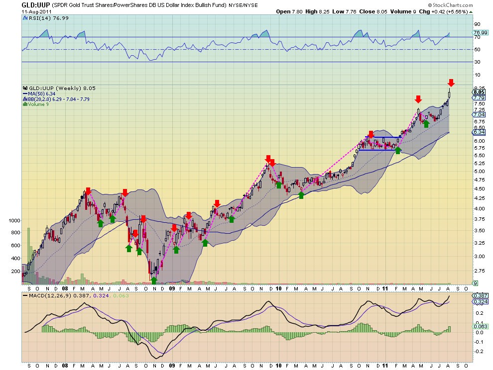
The US Dollar Index has been mired in a broad range between 73.50 and 76 for over 3 months. Looking at the chart of index itself does not show much to give a member of the Treasury Department any joy. Just more of the same. But the US Dollar Index ($UUP) measured against Gold ($GLD) and against US Treasuries ($TLT) is showing some signs of strength. From the ratio chart below of $GLD against $UUP on a weekly basis Gold is close to flashing a sell signal against the US Dollar that has been accurate for the last 4 years. Whenever the ratio breaks the upper

Bollinger band and the Relative Strength Index starts to fall after exceeding 70, it falls back to at least the mid line of the Bollinger bands. Next week could be the trigger.

From the weekly ratio chart of $TLT against $UUP the ‘W-V’ pattern has completed but now the it is the last two candles that draw attention to this pair. Both of these candles are out of the Bollinger bands and both have very long upper shadows, topping tails. If the weekly candle finishes here or

lower then it will print a shooting star. This is a possible reversal candle, but needs to be confirmed next week as well. The RSI on this pair is also into overbought territory, adding to the possibility of a pullback.

This US Dollar strength is important to watch to see if it expands to the point of creating early signs of weakness in Gold or Treasuries. A crack in Gold or Treasuries could confirm a bottom in the S&P 500 ($SPY) as noted in the article below on the correlation between $SPY and $TLT. Keep an eye in this space.

Global Banks Can Fall Further


Even after sharp recent declines, the chart patterns show that four of the most prominent global bank stocks still have more downside potential.

As if the US debt-ceiling debacle and credit downgrade wasn’t enough, now the market has shifted its attention to rumors swirling in Europe about the solvency of several large banks and even an entire country.

France has come under the gun, as it has invested heavily to help prop up Italy and Spain, putting its own credit rating at risk in the process. Though the French banks received most of the attention, it is important to look at some of the other major global banks.

By applying basic chart projection techniques, we can get a better idea of whether this is the beginning or the end of the slide.
chart Click to Enlarge

Chart Analysis: Banco Santander (STD) is a $56 billion bank that operates primarily in Spain, the United Kingdom, and other European countries. The stock was down over 9% Wednesday. The weekly chart shows that over the past few weeks, it has completed a flag formation (lines a and b) that was last highlighted in March. (See “Two Stressed Out Euro Banks.”)
  • After collapsing from the 2009 high at $17.89, STD slightly exceeded the 50% retracement resistance but stayed below the more important 61.8% resistance level
  • By measuring the width of the flag formation (line 1), you can subtract this distance from support at line b to get a downside target. This projects a drop to the $5 area (see arrow)
  • Volume has been heavy, dropping the weekly on-balance volume (OBV) below its support at line c
  • There is first strong resistance now in the $9.40-$10 area
Deutsche Bank (DB) looks ready to close below important weekly support (line e) this week. The rally from the 2009 lows hit a high of $77.49 in October 2009, but failed to reach the 50% resistance of the decline from the 2007 highs at $145.77. The stock dropped 11.5% Wednesday to close at $40.36.
  • There is next good support for DB in the $38-$35.50 area
  • The width of the weekly trading range (lines d and e) is $26, and this range can be used to give downside targets. This width (line 2) can be subtracted from the breakdown level at $45 (line e) to give a downside target in the $19 area
  • The weekly OBV dropped below its weighted moving average (WMA) in May and then violated more important support at line g. The daily OBV (not shown) is also negative
  • There is initial resistance in the $45-$46 area, which corresponds to last week’s lows
chart Click to Enlarge

Chart Analysis: Banco Santander (STD) is a $56 billion bank that operates primarily in Spain, the United Kingdom, and other European countries. The stock was down over 9% Wednesday. The weekly chart shows that over the past few weeks, it has completed a flag formation (lines a and b) that was last highlighted in March. (See “Two Stressed Out Euro Banks.”)
  • After collapsing from the 2009 high at $17.89, STD slightly exceeded the 50% retracement resistance but stayed below the more important 61.8% resistance level
  • By measuring the width of the flag formation (line 1), you can subtract this distance from support at line b to get a downside target. This projects a drop to the $5 area (see arrow)
  • Volume has been heavy, dropping the weekly on-balance volume (OBV) below its support at line c
  • There is first strong resistance now in the $9.40-$10 area
Deutsche Bank (DB) looks ready to close below important weekly support (line e) this week. The rally from the 2009 lows hit a high of $77.49 in October 2009, but failed to reach the 50% resistance of the decline from the 2007 highs at $145.77. The stock dropped 11.5% Wednesday to close at $40.36.
  • There is next good support for DB in the $38-$35.50 area
  • The width of the weekly trading range (lines d and e) is $26, and this range can be used to give downside targets. This width (line 2) can be subtracted from the breakdown level at $45 (line e) to give a downside target in the $19 area
  • The weekly OBV dropped below its weighted moving average (WMA) in May and then violated more important support at line g. The daily OBV (not shown) is also negative
  • There is initial resistance in the $45-$46 area, which corresponds to last week’s lows
chart

VIX Suggests Investors Don’t Believe Rally Is Sustainable

by Bill Luby

Back in 2007 and 2008 I had a shipload of posts talking about the SPX:VIX correlation, its implications for stocks and the like. I even came up with a plot that I called a “fearogram” to map how changes in the VIX relative to the SPX compared with historical norms and recently dove into the subject of VIX convexity and the movements of the VIX relative to the SPX in a June 2011 Expiring Monthly article, VIX Convexity.

I mention all this because in the recent downturn the VIX has moved much faster to the upside than the SPX has to the downside, given the historical rule of thumb that for every 1% change in the SPX the VIX moves approximately 4% in the opposite direction. For instance, from August 3 to August 8 the SPX lost 11% over the course of three trading days. During the same period the VIX more than doubled, gaining 105%, considerably more than the 44% or so one would have expected. One could argue that much of the move in the VIX over and above the anticipated 44% gain represented fear and irrationality flooding into the markets.

As I write this the S&P 500 index is up 5.2%. At the same time, the VIX is down about 11.8%, close to half of the anticipated -4x move.

So to recap, the VIX rose more than twice as fast as one would expect and is falling almost half as fast it has over the course of its history. That, in a nutshell, is the fear in the market. Another way of looking at the stubbornly high VIX is that investors do not believe the current rally is likely to be sustained, so options sellers are not marking down options prices with any sense of urgency, estimating that continued high implied volatility will persist.

NO ORDINARY SELL-OFF

By Rohan Clarke

Watching the panic pervade our market this week I was sorely tempted to pick up a few large cap stocks that were pushing pre-tax dividend yields of ~15%. In hindsight it might have been opportune to do so. Yet, I’m of the view that we haven’t seen the full extent of this unwind.

Exhibit 1 – The downdraft has been accompanied by high volumes. It could be argued that this is capitulation by the weaker hands, but for mine we haven’t traded low enough to attract ‘value investors’ (witness Jeremy Grantham’s latest tome – S&P 950). Rather the volume selling suggests that this selloff is different relative to last year’s correction.


Note too, that momentum is still reeling from the severity of the fall. Given the damage done to confidence and level of uncertainty in the market, it is likely that we will at least revisit the recent lows. Watch to see how the MACD responds should this eventuate.

Exhibit 2 – An old favourite, the McClellan Oscillator that measures market breadth has completely broken down. Again, we’d expect to see a divergence in this indicator when investors are starting to accumulate on market weakness:


At the risk of repeating myself, the playbook we’re following is one where we take our lead from government stimulus. Negative real interest rates are not sufficient in a deleveraging market. That is why QE3 in whatever disguise is more likely than not and also why Japan, the UK and any other sovereign state with their hand still on the monetary tiller will follow suit. In the absence of fresh stimulus we’ll wait for signs that the market has exhausted it’s selling impetus before leaping into the void.

Follow Us