Thursday, August 11, 2011

Pessimism Hits Record: 73% Of Americans, All Time High, Think US Is Headed In Wrong Direction


Perhaps someone should staple the following latest poll from Reuters/Ipsos to the office door of the Fed chairman in the Marriner Eccles building, according to which a record number of people or 73% of all Americans, believe the economy is headed in the wrong direction. This is the highest number measured since the poll started its survey in February of 2009. Only 21% believe the US is on the right track: we assume these are the few people who actually made money in the stock market in the past few months, in other words those long various precious metals [/sarcasm]. Additionally, 47% of respondents believe the worst is yet to come for the economy, the highest since the March 2009 low when the number was 57%. Furthermore, Obama's approval rating dropped from 49% to 45% over the past month. Perhaps it is time to kill Osama for the 3rd (or is that 4th?) time. Bottom line: pessimism is now at or near fresh all time highs. And this is the environment in which the true viceroy of the Americas, Goldman Sachs, has now decreed will proceed with QE3? If the American revolution was deferred back in November when QE2 was enacted, we fail to see how it will be avoided this time around when people realize that gasoline is headed for $9/gallon. Or roughly what Europeans pay today.

Visually:


See the original article >>

Silver May be About to Move


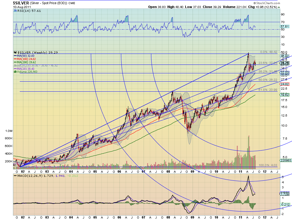
Gold has been flying on the global crisis in the markets. Moving over $200/oz in just a few days. But Silver ($SI_F) has not had the same positive performance. They do not always move together but a large move by one often trigger the other to move to get the ratio back to a reasonable level. And the charts for Silver look ready to make that move. Start with the weekly Fibonacci chart below.

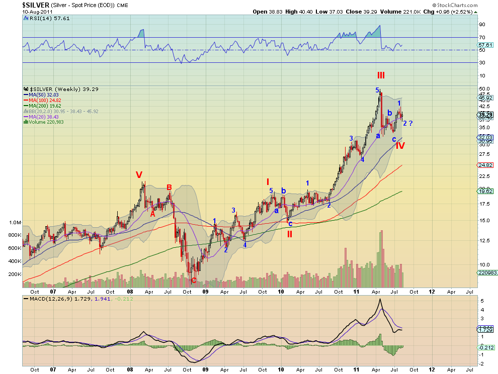
Support has held at the 23.6% fall back level at 37.94 well and is moving towards 40 again, with series of higher lows and higher highs. Positive on this view. And viewing the Elliott Wave chart below that Silver may be completing wave 2 within the wave V move higher. If wave 2 is in

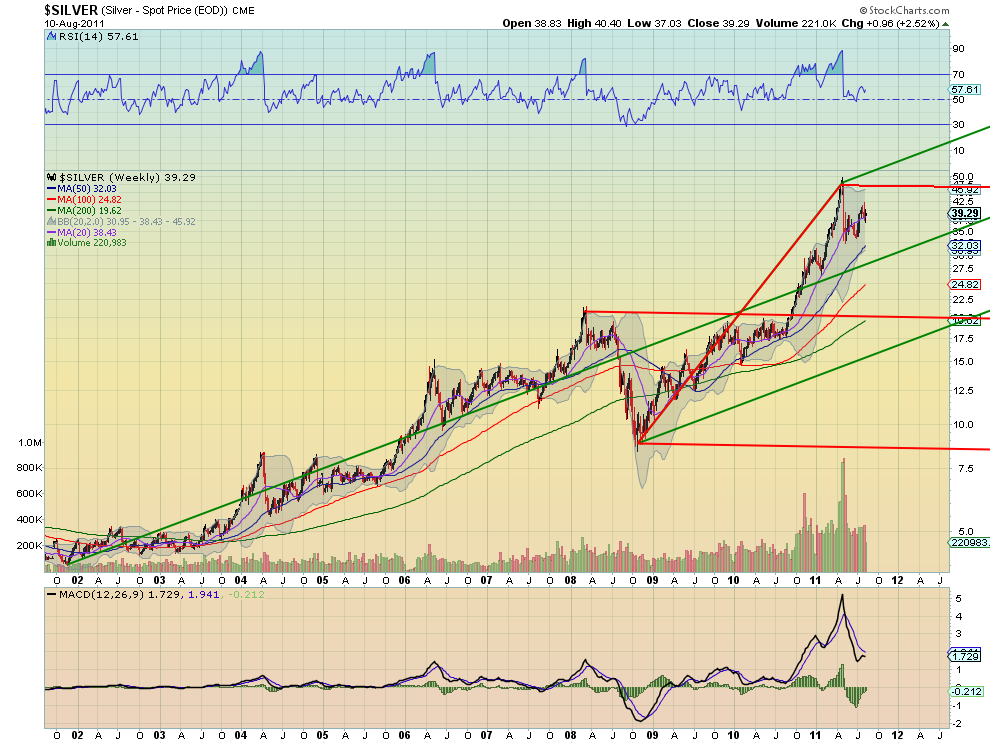
then it is in for a ride higher. And the Andrew’s Pitchfork analysis shows this may be the case as well. Notice that it is heading higher to the Upper Median line of the bearish Pitchfork near 46 and then there is the Upper Median Line of the bullish Pitchfork over 50 above that. This does not guarantee a move higher, but it looks like the final print on these weekly charts can give us the final word. Be prepared.


S&P 500 5-Day Average Hi/Lo Spread at 5.33%

by Bespoke Investment Group

Wow, the S&P 500 has averaged a daily hi/lo spread of 5.33% over the last five trading days. It's been a truly remarkable trading period, and efficient market theorists are currently in hiding. Even more remarkable, however, is that we're barely at half the 5-day average hi/lo spread that we saw back in October 2008, when it reached 9.97% on October 15th. While it certainly feels like this ridiculous back and forth action is like nothing we've ever experienced before, the fact is that we experienced it less than three years ago, and back then it was nearly twice as crazy!


DJIA Average Daily Change

by Bespoke Investment Group

"When in doubt blame it on the computers."

Nowadays, this seems to be the go to scapegoat for any market related problems. Over the last few days, numerous reports have said it is the computers to blame for the whipsaw trading the market has seen in recent weeks.

The explanation sounds plausible, but it is not necessarily borne out by the facts. Over the last 50 trading days, the average daily percentage move (up or down) in the DJIA has been 0.90%. Relative to history, the current level is far from the extreme readings we saw during the Financial crisis when the average daily change rose to 3.71%. Granted, the last few days have been extremely volatile, so if the recent trend continues, we will see the current 50-day average rise much higher.

One could still argue that computers were behind the big spike in volatility during the Financial Crisis, but what would explain the big spike in the 1930s, when the average daily change was also above 3%? Last we checked, there were no computers back then. While HFT and computer trading may be contributing to the recent surge in volatility, it isn't solely to blame. The reality is that when the market goes down, investors step to the sidelines, causing liquidity to dry up. In illiquid markets, price volatility rises.


Volatility Skew Indicates Further Selling Pressure

by Maceo Story

On a day to day basis the volatility skew is not a reliable signal for the direction of equities. What is reliable though is the trend and the charts below indicate that equities have further to fall within this current downtrend.

Skew VS SPX

The following chart is the skew (with no reference to the vix) versus the SPX. Notice the downtrending channel the skew is in.
Skew Vix Divergence VS SPX

A rather interesting similarity has formed with the current trend versus that of summer 2008 preceding the September / October slide.

S&P 500 channel support ...

by Kimble Charting Solutions


Follow Us