The Great Graphic was posted by Euromontior International. It depicts meat consumption on a per capita basis by country. While Euromonitor did not have information on most of Africa, it is interesting that the highest per capital consumption of meat takes place in middle income countries. US meat consumption per capita has begun slipping, while meat consumption is rising in many emerging market countries. China's meat consumption per capita is greater than Russia's.
Monday, September 9, 2013
Stock Market S&P Upside In Question. Watch The Nasdaq
By: Michael_Noonan
The point of reading developing market activity, as seen in charts, is to eliminate any need to “predict” what may develop next day, week, or month. There is no more reliable a source of information than the market itself. Everything one needs to know is found within price and volume activity, over time. If you know the market trend, and you have some solid rules of engagement, profitable success is almost assured.
The stock market has made historic highs, but there are questions regarding its ability to sustain the upward drive during the natural market-aging process. Last time, there was a discussion about rules and a need for caution, [S&P And NAS - Best Offense Is A Good Defense, click on http://bit.ly/1dAUwUB, if you missed it].
That has not changed within the question of, in the past week, has the market changed?
The answer has to be yes because there has been more activity, but recognizing how the market has changed did not get any easier. The purpose of first identifying the trend is to be in a position of knowing which trading rules to use as a guide. There are times when clarity is lacking, and it is best to wait for the market to confirm its intent before getting overly committed to the upside, or too defensive on the downside.
The overall structure of the weekly chart remains positive, and continuation higher should be the norm until there is something more to assess otherwise.
In trending markets, one wants to see synergy of various time frames, but it is not there in this daily chart, relative to the weekly. The daily trend has weakened. As an index, it is a warning for individual stocks that are not showing profits, a was discussed last week. For those stocks that are profitable, protective stops are still advised.
Friday was an important day for the up trend to reassert itself here. There was a lot of volatility, and at the end of the day, price was little changed from Thursday’s opposite performance of a very tight range. The close was in the upper half of the bar, a plus, but there needs to be follow-through on Monday because of where recent activity lies… just under 1670 resistance, and also under a 50% range rally from the recent high lot low. A market is considered weak when a rally cannot rise above a half-way correction area. These are negative signs and if not erased by upside activity, the market can correct even further to the downside.
Perhaps the best hope for the S&P lies in the stronger tech-oriented market, the NASDAQ. When price gaps up to establish is higher trading level, it is a sign of strength, and that gap has never been challenged. The entire market, since mid-July, has been consolidating and not correcting. The difference is a sign of relative strength, for a correction takes price lower in retracing recent gains from the last swing low.
Taken on its own, the NAS looks higher, and it may be the best barometer for the S&P.
Trade accordingly.
Is Gold Price Manipulation About to Begin Again?
By: Toby_Connor
The answer to the question above unfortunately is maybe. There are definitely warning signs springing up.
The first sign of trouble popped up last week when the miners generated a key reversal on huge volume, and on a day when gold was actually positive. Something about that day smells very fishy to me. It looks like big-money traders had advance notice that a false breakout to new highs was going to be manufactured to give insiders an exit after a two-month 40% rally. The high volume follow through the following day confirms that something is not right.
Looking at the weekly chart only confirms my suspicion. The last week of August was the highest volume week in GDX's history. When that kind of volume appears at the top of a two-month rally, after a 40% gain, there's a good chance its signaling smart money just snuck out the back door. We should only see this kind of volume at the bottom of a serious decline, not the top of a two-month rally unless something is wrong.
Another warning sign is the potential topping candle on the weekly charts of $GOLD followed by an indecision candlestick this week.
I'm starting to get quite nervous that this intermediate cycle topped on week nine and the bear raid is about to continue.
As most of you know I'm not a big conspiracy buff. Other than short-term stuff around options expiration, pretty much all of the pullbacks in this bull market can be explained away as normal corrective moves that happen in all bull markets. Unfortunately, this has not been the case since last December. Nothing about the decline after the QE 4 announcement has been natural.
First off, the intermediate cycle length was stretched ridiculously far, which would never occur during a down trend. During down trends intermediate cycles shrink, not stretch.
Secondly, sentiment extremes which would normally generate bear market rallies had no affect during this decline. The lack of any significant counter trend moves to relieve selling pressure during this bear market are another sign in my opinion that this was not a natural move.
And finally, the repeated massive volume take downs in the overnight and pre-market hours to push gold below significant technical levels thereby triggering stop loss orders would never occur if traders were trying to maximize profits. That 400 ton dump in the pre-market on April 12th to run the stops below $1523 was so far from a natural market event it's not even questionable that it constituted blatant manipulation.
There's no doubt in my mind that big-money knows gold is going to enter the bubble stage of this bull market sometime soon. What started out probably as an attempt to create a selling panic so Germany could get their physical bullion back, has now turned into a high-stakes game of let's see how far we can lower the starting point before the bubble phase begins.
I have noted before the difference in profit potential if the starting point of the bubble phase could be artificially lowered. I'm convinced that if allowed to trade freely the next leg up in the gold bull market began last summer as all assets started to respond to QE 3& 4. That rally had a starting point at about $1550. Assuming a minimum secular bull market top of at least $5000, the profit potential from that move beginning at $1550 is about 200%. However, if the starting point could be artificially lowered to $1000, the profit potential jumps to 400%.
Considering the warning signs from the mining stocks last week and this week, I'm starting to get extremely concerned that the bear raid is about to resume. The first goal will be to take gold back down to test this summer's $1179 bottom. If that bottom can be broken (and if gold gets anywhere near that level I think we can automatically assume we're going to see another massive contract dump in the overnight market to make sure it does get broken), gold will collapse in another waterfall decline that drops it all the way back to the prior C-wave top at $1030.
The next week or two are going to be dangerous in my opinion. If the bears can get some downside traction, traders need to get out of the way, get back to cash, and prepare to jump on board the bull at $1000 which I believe is probably the ultimate goal of this manipulation event that has been going on all year.
I advised subscribers to exit on Tuesday morning into strength based on these warning signals. We are now in wait and see mode in case the manipulation resumes. If it does, then we want to stay on the sidelines until the big-money is finished jerking the sector around, and we want to re-board the train at the bottom along with the insiders who have manufactured this whole criminal process.
I invite you to consider a $10 trial one month subscription to my daily and weekend reports. The topics covered (with charts) include analysis of the precious metals, miners, stock market, currencies, bonds, the Fed, sentiment and cycles.
A housing affordability index scenario caps housing prices and mortgage rates
We've had a great deal of movement in the NAR US Housing Affordability Index recently. The index is meant to measure homebuyers' ability to finance house purchases (discussed here back in 2011) and given some recent events, it's worth taking a look at what the index is telling now.
First of all, there has been a great deal of criticism of this index (for example here). The index clearly doesn't take into account factors such as credit conditions, while making some (over)simplifying assumptions (see description). It is certainly a blunt tool that uses the median house price, median household income and the latest mortgage rates. But its simplicity makes it relatively easy to get a picture of "affordability" over time (the absolute level of the index is not very meaningful - just the relative moves). More importantly it's quite easy to stress-test.
The Affordability index had peaked in early 2012 and has been declining rather sharply since, as home prices began to recover. Along the way however the declines were offset by falling mortgage rates - until recently.
The latest value available from NAR is as of July of this year, when the average mortgage rate used in the calculation was 4.13%. Things have changed since then (see chart). Based on the analysis performed by Deutsche Bank, the chart below shows where the index would be if:
1. we use current mortgage rates (rather than from July) and house prices remain unchanged;
2. 1% increase in mortgage rates and house prices remain unchanged;
3. 1% increase in mortgage rates and house prices increase another 10%.
Source: DB
Scenario #3 shows how sensitive affordability is to these adjustments. It takes use below the pre-recession affordability average - a shock that would be quite difficult to for the current economy to absorb. Some would say this scenario is unrealistic. Perhaps. But mortgage rates are up some 1.5% from the lows in just a few months and house prices (based on the S&P Case-Shiller Index) are up 12% from a year ago. Was such a scenario realistic last year?
The conclusion we can draw from this exercise is that with household income growth remaining weak (see post), there is a natural cap on this combination of rates and house prices. Another 1% jump in rates and a 10% increase in home prices and a significant portion of the US population gets priced out of the housing market, forcing prices to stall or even correct.
Beware the Dangerous Stretch for Yield
The US Federal Reserve talked in early summer about tapering its quantitative easing plan and raising interest rates—in part to stop investors from chasing yield into the arms of riskier loans. In the high-yield market, however, the conversation had exactly the opposite effect.
Afraid of Snakes? Perhaps You’d Prefer a Scorpion?
The shock of the Fed’s potential moves sparked a speculation-driven rise in interest rates in May and June. Because investors wanted to avoid losing money if rates head higher, they shifted from holding longer-duration bonds into holding more lower-credit-quality bonds. High-yield investors began buying CCC-rated “junk” bonds for their higher coupons.
And they’ve made money so far. But the bite from these junk bonds can be painful if the company issuing the bond runs into trouble: defaults often result in complete loss of value.
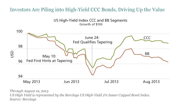
Here’s what happened. In early Maythe Fed first gave indications that it would step down its purchases—and investors immediately began selling. In late June, as investors grew increasingly agitated, Fed officials tried to calm the market with assertions that they wouldn’t act until the economy showed significant signs of strength.
That’s when CCC buyers began to make their move. Today, the yield investors require to take on CCC-rated bonds has dropped and the bonds’ value has risen versus BB-rated bonds. While prices stayed close until June 24, they diverged significantly afterwards, and from then CCC-rated bonds earned 1.5 percentage points more in total return through mid-August (display). So ironically, the safest sector of the high-yield market is now the cheapest.
Investors are thinking clearly in some respects: lower-credit-quality bonds generally improve in a rising economy and are less correlated with interest-rate movements. And in fact, CCC-rated bonds are among the few sectors to have made money in the recent fixed-income rout.
But stocking up on these lowest-quality bonds could be shortsighted in the long term. Here’s why: US companies got leaner after the 2008 crisis and reduced costs aggressively. When the recovery gained traction, they held the line on expenses. But, as the economy continues to move forward, companies will likely start to overreach, and some will get into financial trouble. So in the current part of the cycle, it’s prudent to start getting more conservative with credit, not less.
Too Much of a Good Thing May Not Be Good for You
Investors are also looking at bank loans as an alternative to long-duration bonds; their floating rates seem like a positive, but these loans offer investors little protection. And bankers are happy to turn the demand for high-yielding investments to their own advantage. In particular, the private equity market has seen an uptick in deals financed with very high-yield payment-in-kind bonds, which mean less cash is needed up front.
These can be dangerous structures in a recession or downturn.
When everyone is running away from duration risk and toward credit risk, doing the opposite may be wise. Especially in the current market cycle.
Longer-duration, higher-credit-quality bonds have gotten cheap and currently offer the best risk and return tradeoff for your money, in our analysis. And that’s a theme we’re seeing across the fixed-income world—not just in high yield.
Households On Foodstamps Rise To New Record High: More Americans Live In Poverty Than The Population Of Spain
by Tyler Durden
There was much discussion of Friday's "disappointing" non-farm payrolls goal-seeked, seasonally adjusted, X-13-ARIMA conceived jobs "number." The conclusion was that it showed an economy which one year after the start of QEternity was growing nowhere near where the Fed has projected and hoped it would be at this time. But in addition to the BLS jobs number, there was another just as important number that was released on Friday: the monthly foodstamp (SNAP) participation update. There was no discussion of this particular number and for good reason. If the NFP number was at least meant to show some economic stability, if subpar, the monthly foodstamp update shows month after month that the greatest depression is nowhere near ending for millions of American living in poverty (83% of SNAP households have gross income at or below 100% of the poverty guideline ($19,530 for a family of 3 in 2013), and these households receive about 91% of all benefits. 61% of SNAP households have gross income at or below 75% of the poverty guideline or $14,648 for a family of 3 in 2013).
To wit: in June, the number of households receiving foodstamps rose to 23.117 million, an increase of 45.9k in one month, and also a new record high. As for the average monthly benefit per household: $274.55, just off record lows.
At the individual level, in June an additional 125,059 Americans started using Foodstamps, i.e. entered poverty. However, the silver lining was that unlike at the household level, the increase to 47.8 million was not a record high. It missed that particular record, set in December 2012, by 31,771.
And while it is understandable why the media has been obsessed with Syria: after all the administration is in dire need of distractions from so many things having gone wrong, it is also understandable why no mainstream media outlet will show the following chart: the change of Americans on foodstamps and disability vs jobs since the start of the Depression in December 2007. The reason is that while over that time period the US still needs to generate an additional 2.2 million jobs to get back to breakeven (ignoring for a minute that the jobs created are mostly part-time or low paying jobs), the number of foodstamp and disability recipients has risen by 22 million!
SNAP and Disability vs Payrolls monthly:
And SNAP and Disability vs Payrolls cumulative:
Finally, putting it all into perspective, there are more Americans on foodstamps than the entire population of Spain.