Tuesday, July 30, 2013

Great Expectations

by Marketanthropology

As we mentioned before in the wake of the last Fed meeting, not quite an apples to apples policy comparison - per se,  but one could make an argument that the reflexive behavioral jockeying by the Fed is worthy of some contrast, between the markets anticipation of the Fed's first rate hike back in 2004 and talk of The Taper today.

Click images to enlarge

That being said, and as we have spoken to over the past few weeks - the SPX has so far taken the transition in stride. Back in 2004, the equity markets largely consolidated for the better part of the year as traders wrestled with the transition by the Fed.  Considering the recent talk of once again moving the goal posts even further back and lowering the unemployment rate threshold now tied to the Fed's 85 billion a month asset purchase program, perhaps the equity markets ignorance is bliss attitude towards credit have served them well once again...

We find it interesting nonetheless that although the SPX comparatives trend profiles have basically run across the grain, momentum has unfurled in similar fashion.  

Below are a few other asset comparatives with 2004. Like the SPX, they were all fit based on the 10 year yield profile.

See the original article >>

Great Graphic: Manufacturing PMI in US, EMU and China

by Marc to Market

Recent data suggests some moderation in the world's two biggest economies, the US and China, and some improvement in the weak sister of the major economies, the euro area. This Great Graphic that was posted on Business Insider captures this. 

At the same time, it is important to recognize that cross-country comparisons are misleading.  For example, China's flash PMI reading shows it the weakest of the three depicted in the graph, but China's overall growth is still faster than the US and the euro area put together. 

Arguably it is best to evaluate each in the context of their own recent performance.  The take away from the US is one of overall stability.  It may not be very inspiring, but it is stable.  China, by contrast, is soft and weakening.  The soft landing of 2011-2012 has given way new weakness, which, at least up until now, has the approval of the new Chinese government. 

The euro zone's recovery is the most impressive, though overall growth is challenging and Q2 may have been the seventh consecutive quarterly contraction.  Still, the ECB's anticipation of a stronger second half seems valid.  This would suggest new monetary stimulus is unlikely, but the central bank is likely to remain concerned about the continued contraction in private sector lending and the gradual decline in the excess liquidity (due to the repayment of LTRO borrowings) that had been consistent with the near zero Euronia rates.

See the original article >>

Great Graphic: New High in Margin Debt

by Marc to Market

The US equity market has fully recovered from the mid-May through late June swoon.  It has been aided by new margin borrowing.  We have not looked at margin use at the NYSE for a couple of months and it is continuing to trend higher as this Great Graphic from Pragmatic Capitalism illustrates.
Margin usage is now above the 1999 and 2007 peaks and this is drawing attention from industry and officials.  The Federal Reserve sets the margin rules and has not adjusted them since 1974, when it lowered it to 50% from 65%. 
Some observers see the increased use of margin to buy shares as a sign of potential vulnerability.  A downturn would force leveraged players to liquidate, exacerbating any correction or trend reversal.  We are a bit less concerned, and would attribute the equity market gains to a number of other factors as well, including companies borrowing to buy back their shares.  Share buy backs are running well ahead of last year's pace and not only lifts prices directly through buying, but also reduces the float. 

>">See the original article >>

Eyes On Income: A Big Week For Rates?

by Tom Aspray

The FOMC, Bank of England, and the European Central Bank all meet this week, which may make jittery bond holders even more nervous. In addition, as I outlined in the Week Ahead column there is a full slate of economic data that could also move rates.

Many bond holders are likely dreading their July portfolio statements as many who bought bond funds were focused only on safety and yield. The prospect of significant capital losses was not a concern then, but is now a real problem now for many.

The weekly bottom formation in T-bond yields outlined in the premier Eyes on Income column was completed before the end of May and pointed to higher yields. This formation took over 16 months to develop so rates could move higher for some time.

Of course markets and rates do not move straight up or straight down. There were signs in late June that rates had formed a short-term top but last week rates spiked so the yield on the 10-year T-note is still in its trading range. But this does not mean income investors should not take action, and there is one stock that I think should be added to the current Eyes on Income portfolio.

chart
Click to Enlarge

Chart Analysis: The weekly chart of the 30-year T-bond yield shows a reverse head and shoulders bottom formation.

  • The formation was completed on May 31 by the close above the neckline, line a.
  • This formation has upside targets in the 4.000-4.200% area.
  • The weekly starc + band was tested in mid-June, as well as early July and is now at 3.900%.
  • There is initial support in terms of yield at 3.498% with further at 3.400%.
  • The neckline is now in the 3.200% area and a retest of the breakout level is always possible.

The 10-year T-note yield shows that the yield hit a low of 1.624% in early May before rising to a high of 2.725% on July 5.

  • The daily uptrend, line b, was broken on July 19 and last week yields retested the former uptrend.
  • Yields hit a high of 2.634% last week before closing at 2.561%.
  • A close below the key support at 2.460% will complete the daily top formation.
  • The initial downside target is in the 2.300% area, which is the 38.2% Fibonacci retracement support.
  • The 50% support level stands at 2.173%.
  • The daily MACD formed a negative divergence at the recent highs, line a, before dropping below its prior lows.
  • The MACD-His dropped below the zero line on July 12 and is still negative.
  • The weekly MACD analysis (not shown) is positive so that daily sell signals indicate a pullback in yields that should be followed by another move higher.

chart
Click to Enlarge

The Select Sector SPDR Utility (XLU) hit a low of $35.80 on June 21 and closed last Friday at $39.35 as it has gained almost 10% from the low.

  • The next resistance is in the $40 area and the daily starc+ band.
  • The quarterly R1 resistance is at $40.47, which corresponds to the mid-May highs.
  • The 2013 high is $41.44 but XLU has an all-time high at $44.66 from late 2007.
  • The daily on-balance volume (OBV) moved through its resistance, line c, on July 11, which was a positive sign.
  • The weekly OBV (not shown) is also above its WMA.
  • There is initial support now at $38.48 (line a) and the 20-day EMA is at $38.68.
  • The quarterly pivot is at $38.13 with more important support in the $37.20-$37.60 area.

Exelon EXC +0.13% Corp. (EXC) is a $27.09 billion diversified utility company that has a current yield of 3.90%. Their dividend was reduced as part of its 2012 4th quarter earnings report. It has a current ratio of 1.12, which is positive regarding their dividend. The dividend cut was designed to spur future growth.

  • EXC reports earnings on July 31 and the latest short interest report showed an increase of over 14%.
  • This suggests that weaker earnings are expected by those on the short side.
  • EXC broke through its downtrend, line d, in the middle of July and rallied close to the quarterly pivot at $32.65.
  • The daily OBV did form a positive divergence at the lows, line e.
  • This suggests that shares were being accumulated as EXC was dropping to its low of $29.44.
  • The OBV turned positive by moving above its WMA on June 11 and is holding well above its rising WMA.
  • There is short-term support now at $31-$31.40.

What it Means: The stock index futures are lower early Monday as is the dollar, and the Nikkei 225 was hit hard on Monday’s session as well.

Rates are pretty much unchanged in early trading, but I am still looking for a further decline in rates over the near term but then higher yields longer term. There is still no conclusive technical indication of a change in the major downtrend.

A decline in yields will mean higher bond prices and give those whose bond commitment is too high a chance to reduce their exposure at better levels. If instead, yields close above 2.634%, it will indicate that the uptrend in yields has resumed.

Exelon Corp. (EXC), I think, is a good addition to the Eyes on Income portfolio (see below) if we get the right price.

How to Profit: For Exelon Corp. (EXC), buy $2500 of EXC at $31.38 or better and $2,500 at $30.72 or better, with a stop at $29.66 (risk of approx. 4.5%).

Portfolio Update: Per the June 10 column, I recommended buying $2,500 of Select Sector SPDR Utilities (XLU) at $37.88 or better, and $2,500 at $37.04 or better, with a stop at $34.88. Use a stop now at $36.36. XLU paid a dividend of $0.3705 per share on June 21.

See the original article >>

Hedge Against Japanese Hyperinflation – Buy the Nikkei

By Cullen Roche

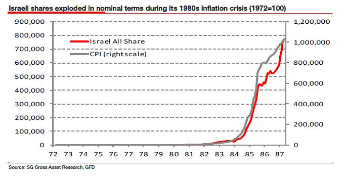
Here’s a good case of hedging your bets.  So let’s say you really think hyperinflation is coming to Japan.  How would you position for that?  Maybe you’d short JGBs or short the Yen.   But would you think to buy the Nikkei?  Probably not.  And that’s what Societe Generale analysts say might be the play in case of a Japanese hyperinflation:

“In real terms equity prices fell (chart above), failing to keep pace with the rise in the CPI. But in nominal terms they exploded rising by a factor of around 6,500 over the period, in keeping with experiences of nominal share indices in Argentina, Brazil or Weimar Germany during their inflationary crises. A couple of clients have told me they think the trigger for a forced BoJ monetization of the government’s balance sheet can only occur when Japan starts running current account deficits, pointing out that sovereign defaults have only occurred in current account deficit economies. So long as Japan maintains its current account surplus it will be safe. But I’m still not convinced why this must necessarily be the case just because it has been in the past. Current account deficits would be critical for government funding if the swing government bond investors were from overseas, which they nearly always are. But in Japan today they’re not. The households effectively are. Why should the current account deficit even be relevant to what is effectively an internal issue?

Reinhart and Rogoff say that one of the tell-tale early signs that governments are struggling to maintain market confidence is when debt maturities decline. This is what is happening in Japan today. And the BoJ announced last week (to loud acclaim) that it was going to adopt a more Anglo-Saxon style of quantitative easing. The process is arguably underway. My concern is that once the door to QE has been passed through, it slams shut behind. The truth is we can’t know when this will happen. We suspect only that the writing is on the wall, and the further out we look, the bigger and bolder that writing becomes. But if Japan was to follow a similar trajectory to Israel’s, the Nikkei would trade at around 63,000,000 (63 million) by 2025.”

Japan

Now, I don’t buy the Japan hyperinflation story, but I guess if I was a hyperinflationist this is the way I’d hedge my bets.  If the Japanese economy booms then equities go up and you were right.  And if the dooms day hyperinflation story occurs then you can say you were right either way.  Of course, equities don’t go up in real terms during hyperinflation, but no one will care once your hyperbolic prediction is right.

Then again, if you’re like me and you see a declining population, structural headwinds and a Bank of Japan that appears to be trying to turn the Nikkei into a casino, then you might be a bit more prudent and say “no thanks, I’ll play in another sandbox.”  But that’s just me.

See the original article >>
The Fed’s Dual Mandate is Bull Sh*t

By Cullen Roche

Pardon the title.  But I didn’t know of a much more succinct way to say it without emphasizing the point.  The thing is, I am tired of hearing about the Fed’s “dual mandate” of “price stability” and “full employment”.  President Obama was discussing this in a NYT interview this week.  But how often, during the history of the Fed, have we actually had “price stability” and “full employment”?  Let’s take a look.

If “full employment” is anything under 5% unemployment and “price stability” is core inflation below the Fed’s 2% target rate then the Fed has achieved its dual mandate a whopping 3.5% of the time since 1957 when core inflation was first tracked.  Yes, you read that right.  THREE POINT FIVE PERCENT OF THE TIME.*  That means the Fed has failed to simultaneously achieve both its mandates 96.5% of the time.  I wouldn’t call that failure.  I’d say they’re not even trying. And maybe they’re not?

Now, I’m fairly well versed in the structure of our monetary system.  And I think it’s helpful to understand precisely what the Federal Reserve is in order to put the dual mandate into context.  The Fed is really just a special bank with unique legal abilities given to it by Congress.  But it’s a bank that exists primarily to help the other banks operate more smoothly.  The Fed was created after the panic of 1906 precisely for this purpose – to oversee the private banking system and create some stability within the system.  It does so primarily by acting as lender of last resort and regulator of the banking system.

Perhaps most importantly though, the Fed serves as an overseer of the payments system. The interbank system or reserve system is crucial to a smooth operating payments system where private competitive banking is involved.  Before the Fed we basically had rogue banking.  If JP Morgan didn’t trust Bank of America’s ability to meet its obligations then the system froze up and a whole lot of people would get fired just because companies couldn’t access the money system all because two banks were worried about one another’s solvency.  The interbank market brought clearing into one place and helped reduce the risks in that system.  The Fed is the entity that makes sure it all works smoothly.

Today, the Fed does more than just regulate the banking system and oversee the payments system.  The Fed is actively involved in “monetary policy” and altering interest rates and influencing the banking system in various ways to try to achieve its dual mandate and hit economic targets.  BUT ALL OF THIS WORKS THROUGH THE BANKING SYSTEM!  So, before the Fed can ever even think of achieving some form of strategic monetary policy it MUST ensure the banking system is healthy.   Said differently, the Fed is really an entity that exists first to ensure healthy banks and second, to ensure that that there is price stability and full employment.  Of course, the Fed just about always succeeds in enriching the banks when problems occur.  But it rarely, if ever, succeeds in actually meeting its dual mandate of price stability and full employment.

I honestly don’t understand why we obsess over the Fed hitting its “dual mandate”.  It seems to me that the Fed is really just a bank servicing entity masquerading as something that can do much more than its history proves it’s capable of.  To those of us who understand the monetary system it’s obvious that the Fed really has one mandate – make sure the banks are healthy.  So maybe we should stop pretending the Fed is capable of achieving things it really can’t – like its dual mandate.

* The Fed’s “dual mandate” has evolved over time so it’s somewhat harsh to judge the Fed entirely by these figures. 

See the original article >>

Follow Us