Friday, August 19, 2011

Stock Market Sure Looks Like 2008


"He observed that human emotions collectively had major impacts on the on stock prices and the patterns seen in the Stock Markets in general." ~ From a book on the teachings of Jesse Livermore

When you think of it in the short term markets are nothing more than a group of people trying to process data and understand what others are doing all under the stress of losing personal wealth. They are trying to solve a problem that in may ways is not solvable unless one can adapt. Similar to a group of Navy SEALs on a mission. They are successful only if they can adjust to the changing situation. There's a reason few are SEALs and few are successful in this business.

At times like these markets are more about human psychology and less about technical and or macro data. That is why I wrote about the 2007 topping pattern as compared to the market in June and July. The macro data in both instances was deteriorating yet equity markets refused to listen to falling bond yields, falling commodity prices and countless credit products. Then the recession hit, the data deteriorated fast and ill prepared markets were forced to catch up.

Now I believe it is time to fast forward to the fall of 2008. Once again the 2008 market is a road map of how human emotion reacts when credit events happen. When economic data deteriorates at an exponential pace. When the unthinkable becomes reality.

The volatility skew relative to the vix captures market sentiment very well. Overlay any such chart with the SPX and the similarities are without question. So for all those pundits who say this is not 2008 I present the following chart. Once again markets are pricing in the unthinkable. In 2008 history witnessed the failure of Lehman, AIG and the GSEs. Today history is bearing witness to sovereign nations on the brink of failure. In 2008 there was the threat of bank runs. Today there is the threat of currency runs. In 2008 there were government bailouts. Today there are central bank bailouts.


Through it all market participants have not changed. They are still a group of individuals trying to process data and understand what others are doing all while real money is on the line. As history has proven once again they will get it wrong. Once again leverage will destroy balance sheets. Denial will get in the way of rational thought. History truly does repeat and the patterns are present in the charts.

See the original article >>

How High can a Dead Cat Bounce?


The standard answer to this question goes something like “it depends on how high it falls from from”. So is this a Dead Cat Bounce or something else? How can you be sure that the market has settled and is ready to move higher, or that the next leg down is about to occur? There will be plenty of prognosticators preaching in each camp. All I can guarantee is that come September or October about half of them will be right and half will be wrong.

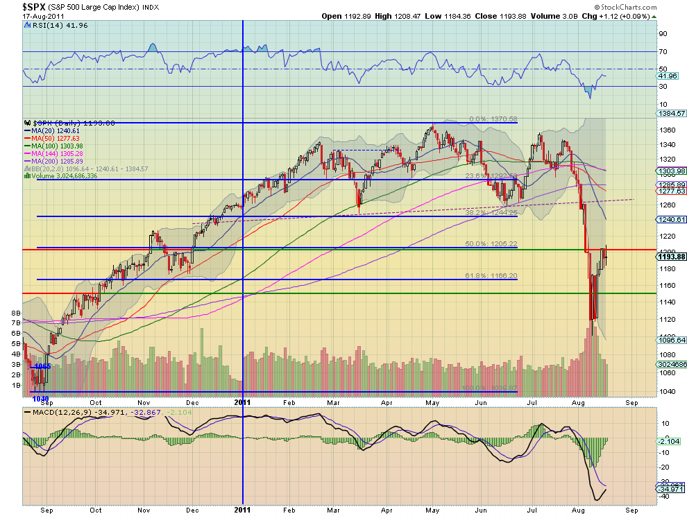
What I do have to offer is that from the daily chart of the S&P 500 ($SPX) below, there are signs of a move about to happen. First the last three daily candles, culminating in the long legged doji Wednesday, have been finding resistance and consolidating at the 1200 level. This can be expected as it is near the 50% Fibonacci level at 1205 from the move that started in September to the top May 2nd. As it has bounced off of the bottoming last week at 1120 the volume has declined

back to the average level from before the increased volume of the move lower. But from a relative basis the move higher has occurred with declining volume. The Relative Strength Index (RSI) has moved off the bottom strongly but now appears to be have topped in the mid 40′s and may be turning back lower. But the Moving Average Convergence Divergence (MACD) indicator is moving towards a positive cross. Also price is still extended from the 20 day Simple Moving Average (SMA), but all of the SMA’s are rolling lower.

The preponderance of information from the daily chart sets up for a move lower, but the MACD diverging throws a monkey wrench in the analysis. If it does head lower there is support at 1166, 1150 and 1120. Below that 1100 is the key to whether it continues down to 1065 or 1040, where the move form September higher began. If it can close over 1210 then the bulls have a chance to push it higher. As I write this Thursday morning the futures suggest that the day will be lower and a test of 1166 or 1150 will come. The future is still murky for the S&P 500 despite lower volatility and volume back to the normal range, so stay nimble or stay out.

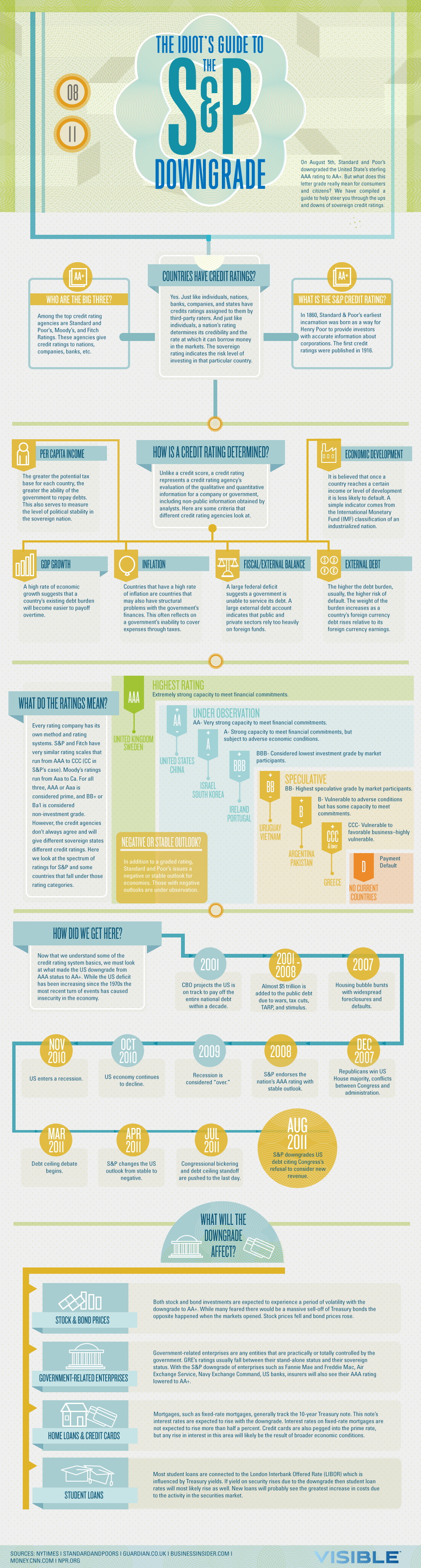
The Idiot’s Guide to the S&P Credit Downgrade


Click To Enlarge Infographic:

Source:
The Idiot’s Guide to the S&P Credit Downgrade
Visible, August 17, 2011

Bear Sell Offs, Bull Recoveries & Regaining 2007 Highs

By Barry Ritholtz

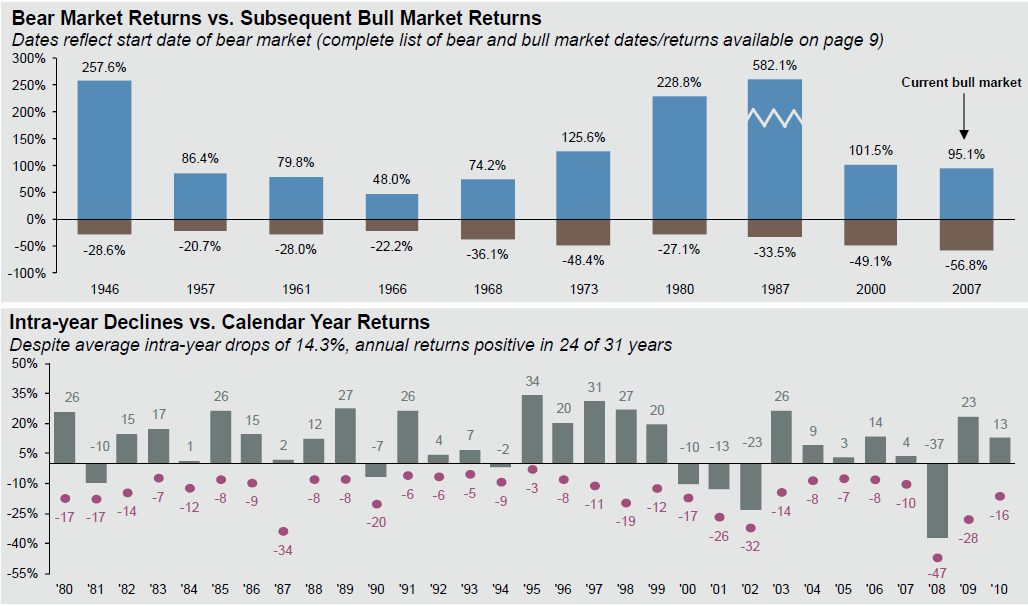
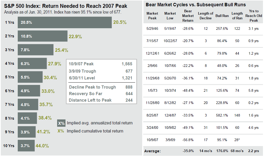
Two interesting long term charts to help put today’s action into a bit of perspective: Both of these are sourced from JP Morgan funds:

The first chart shows various US Bear markets since 1980, and the Bull markets that followed. That may be cold comfort to people who are caught leaning the wrong way today, but its a reminder that “This too, shall pass.”

The second chart shows what it will take to recover the 2007 peak (note this is dated June 30th, and thus is from higher levels. Add 10% or so to the numbers).
>

~~~~

Source: BLS, FactSet, J.P. Morgan Asset Management.
Data reflect most recently available as of 6/30/11.
Source: JP Morgan funds

Counter-Trend Rally Coming, Then More Selling

by Jeff Pierce

I meant to talk about this VIX chart in video but I ran out of time. I wanted to point out as crazy as the market has been in certain metrics, there is room for volatility to run more.

One of my proprietary indicator made new lows today and is suggesting more downside in the coming weeks. 

Often times the market trades counter-trend for a day or two after such a move, and then has a big reaction in the primary direction of the markets.

If you want to be notified first when my timing signal does turn upward or of any other significant moves I may observe, be sure to sign up for my free newsletter here.


See the original article >>

Echo Volatility and Another VIX Double Top


Back in 2007, I wrote extensively about the phenomenon I dubbed echo volatility, in which large VIX spikes are frequently accompanied by a second spike of similar size in the month or so following the initial spike. Following the twin VIX spikes over 80 in 2008, I reprised this them in a post I titled The Significance of Double Tops in the VIX.

Lo and behold, here we are in another volatility storm and we have what looks like it was a VIX top of 48.00 on August 8th followed by a spike to 45.28 today – a nine day span between VIX spikes.
 
Of prior instances of VIX double tops, certainly the most dramatic comes from 2008, when the VIX hit an all-time high of 89.53, pulled back more than 45 points, then spiked all the way back up to 81.48 some 20 trading days later. The timing of these VIX spikes was eerily reminiscent of the 1998 Long-Term Capital Management fiasco, when the VIX hit 48.06 on September 11th, then exactly 20 days later hit a crisis high of 49.53.

In addition to those 20-day periods between VIX spikes, there is also precedent for a 9-day twin top going back to 2002, coinciding with the WorldCom bankruptcy filing. Here we saw a top of 48.46 on July 24th and a secondary spike to 45.21 nine days later.

In sum, of the top seven highest VIX spikes recorded to date, four of these have seen two separate spikes in which the VIX exceeded 45, with those spikes falling from 9 to 20 days apart.

Clearly there are fundamental factors that can trigger another VIX spike above the 45 level before the current volatility storm has passed, but if history is any guide, two is likely to be the lucky number.


Follow Us