Friday, August 19, 2011

Finacial Transactions Tax Stupidity Reigns In Europe


Just after the European equity markets had begun to climb of the post capitulation floor, the Euro Zones most powerful leaders produce another plan of intent that has “European Farce” written all over it.


From their hastily organized pow wow in Paris, the leaders of France and Germany, namely President Sarkozy and Chancellor Merkel decided to announce they’ll press for closer Euro Zone economic integration coupled tougher deficit rules and more rigorous supervision to stamp out the debt crisis. They also rejected € bonds and expanding the €440Bn rescue fund.

Firstly no one believes a word that is said about imposition fiscal discipline for such measures run through the Council of Ministers, heavily populated by French & German officials.

In past times when both France & Germany broke the fiscal rules any attempt to fine them was voted down.

In later years when a vote to actually impose a fine on Portugal and Greece was passed, the fine was never collected. So sorry to say, no believes a word they say now.


However, all this useless proposal passing is insignificant when compared to the rank stupidity that comes in the guise of seeking to reintroduce a financial- transaction tax, (FTT), which was rejected in 2010.

Can they see the utter folly in seeking to impose an FTT? Be in no doubt it is a tax on trading in financial assets such as bonds, equities and futures. It will lead to decline in market efficacy as trading volume will fall. Major European banks that still look to their investment banking operations will see a decline in commissions and trading profits and spreads will rise.

But enough pussy footing… this is a declaration of war on high frequency traders whose only crime is to have used the market to fairly price the debt of wasteful Euro Zone governments and the banks that have blindly accumulated position in the sovereign junk.

Markets will be less efficient and governments will in the long run find access to market capital more costly.


I have not one good word for the leadership of France and Germany. They hail from political parties that are meant to champion the free market, and yet they seem to do all they can to thwart the capital market wealth creators.


It simply shows that politicians are incapable of recognizing that one of Europe’s best resources is its free to trade capital market place. They cannot bear the fact that distressed debt is being priced poorly for the simple reason that it is poor. They cannot bear the fact that the great Euro project that feeds and fills an calendar of gatherings and conferences is falling apart.

It is falling apart not because the market is forcing it to do so…rather it is because it is hopelessly flawed and on virtual permanent life support.

That is why Europe’s so called big two, have nothing other that stupidity to offer.

Saturday, August 13, 2011

Macro Week In Review/Preview August 13, 2011


Last week’s review of the macro market indicators looked interesting on many levels. Gold appeared ready to consolidate, if only for a couple days within the uptrend while Oil could consolidate before continuing the fall. The US Dollar Index looked to drift higher in the 73 to 76 range while US Treasuries pullback. The Shanghai Composite appeared headed lower toward support and Emerging Markets might consolidate or bounce a bit before doing the same. The spike in Volatility looked to have more room to the upside but showed signs of pulling back at least early in the week. The Equity Index ETF’s SPY, IWM and QQQ appeared set to bounce early next week, but the SPY and IWM charts look broken on many timeframes and headed lower. The QQQ was a bit of an enigma as it had maintained a hold at support. The QQQ’s continuing to hold and move higher would be a signal that the broad downturn may be ending. On the other hand if the SPY and IWM continue lower as expected in the intermediate term the QQQ will likely join them lower.

The week began with a bang as S&P downgraded the US debt late last Friday, removing the expected consolidation. On Monday Gold moved higher quickly and Crude Oil fell. Treasuries ran higher with the added catalyst of European fears and the US Dollar Index held steady but printing wide range doji days. The Shanghai Composite fell and Emerging Markets followed. Volatility spiked and the equity indexes SPY, IWM and QQQ pushed lower fast. By Wednesday morning a lower support area was forming for equities and Oil with higher resistance for Treasuries and Gold. Thursday began the reversal for all which then continued Friday in a narrow range. What does this all mean for the coming week? Let’s look at some charts.
As always you can see details of individual charts and more on my StockTwits feed and on chartly.)

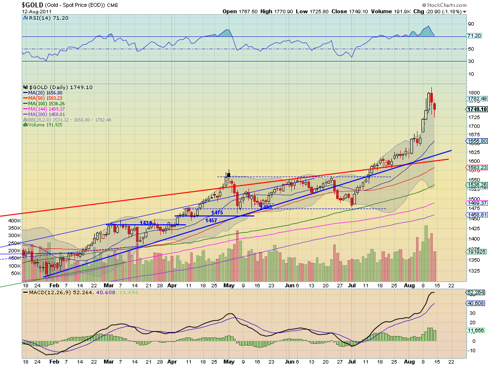
Gold Daily, $GC_F

Gold Weekly, $GC_F

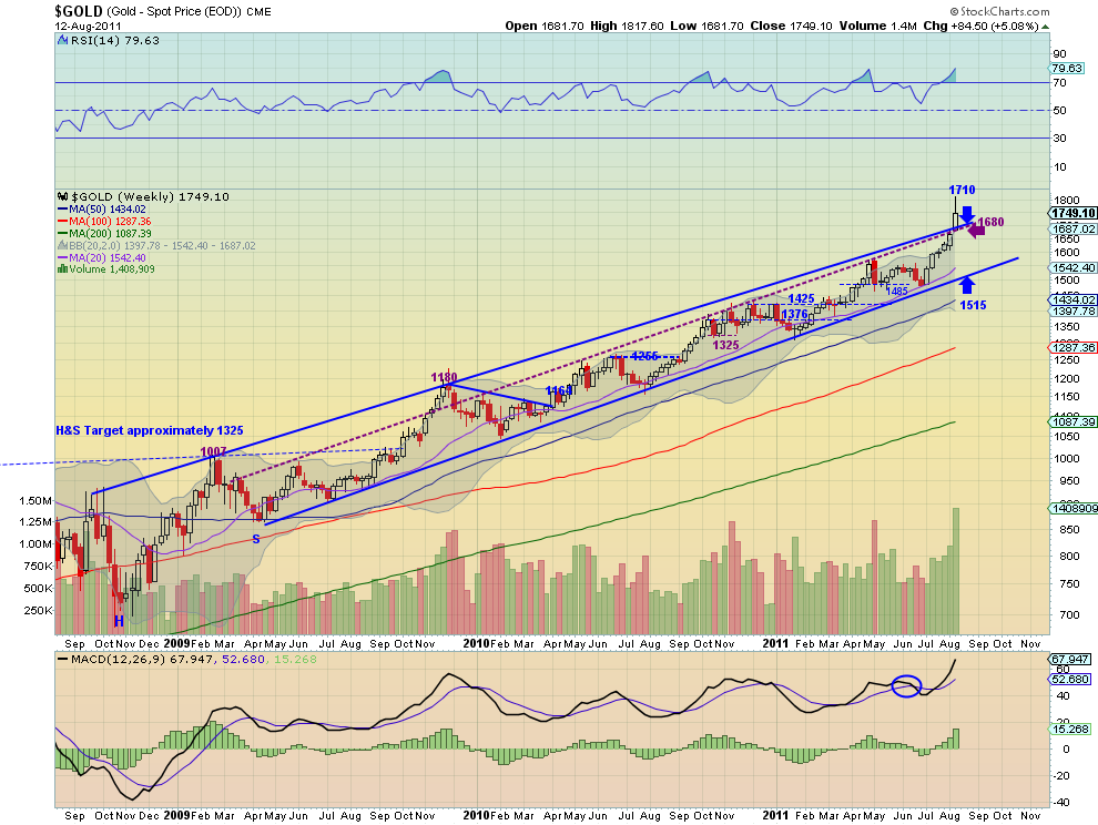
Gold gapped higher Monday and ran through the end of Wednesday, closing outside of the Bollinger bands each day. Then it pulled back to support at 1748. The Relative Strength Index (RSI) on the daily chart has moved from overbought to near the 70 line and the Moving Average Convergence Divergence (MACD) has come off of its peak as the price is retreating towards the 20 day Simple Moving Average (SMA). The weekly chart shows the first breach of the rising channel from 2008 to the upside. The RSI is at levels where it has retreated from the last 3 times it has reached and the MACD is high. The shooting star print closing out of the Bollinger bands adds to the possibility of more downside. Look for more of a pullback in the uptrend in the coming week with support at a back test of the weekly channel at 1710 followed by 1700 and 1680. A hold at 1748 could lead to another move to 1800 and higher.

West Texas Intermediate Crude Daily, $CL_F

West Texas Intermediate Crude Weekly, $CL_F

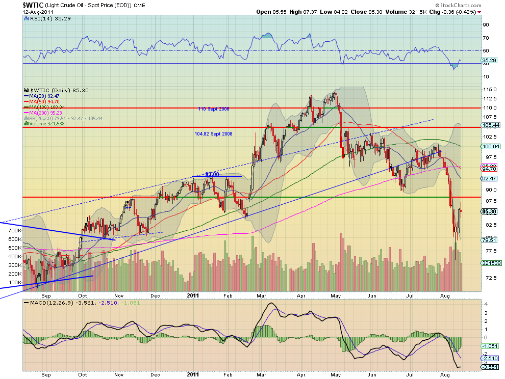
Crude Oil broke the doji from last Friday lower and drove to a test of support at 81. By the end of the week it was retesting that doji area with another doji. The daily chart shows the RSI bottomed in the 20′s and is moving higher again, and the MACD has been improving since Wednesday. The weekly chart shows a fall out of the rising channel but a promising Hammer candle after a retracement to the 38.2% Fibonacci level of the move off from the 2008 high to the 2009 low at 76.99. The RSI is still falling and the MACD has is growing more negative again on the weekly chart. The combination suggest a short term move higher but there is resistance at the channel at 87 and then the support/resistance at 88.50, but more downside in the intermediate term with support at 81 and 77.

US Dollar Index Daily, $DX_F

US Dollar Index Weekly, $DX_F

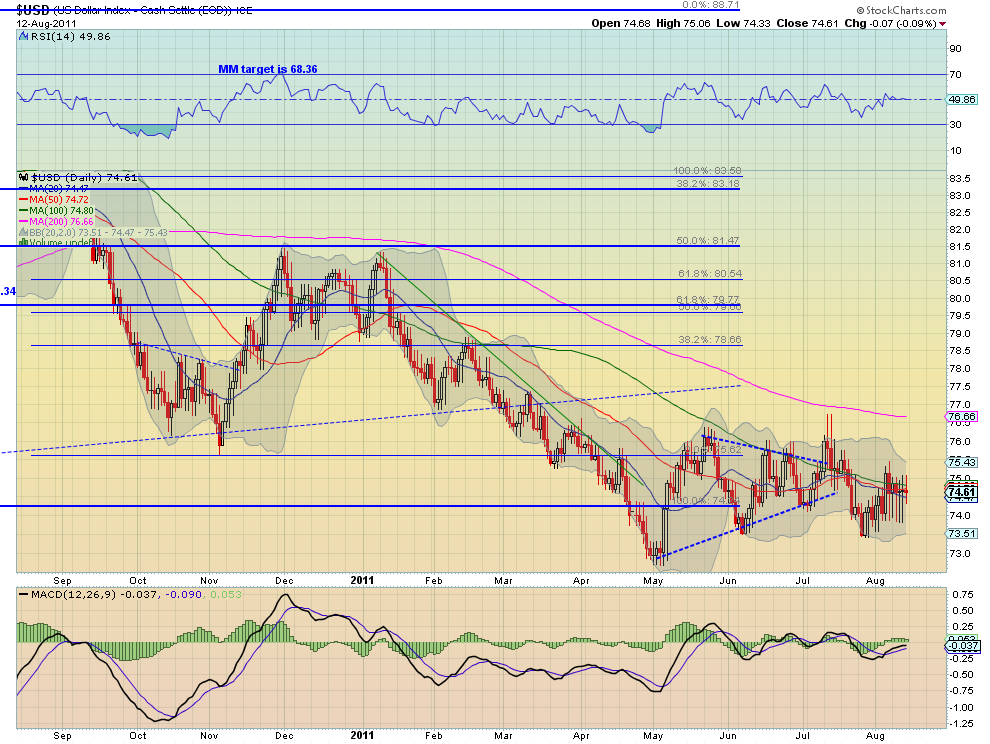
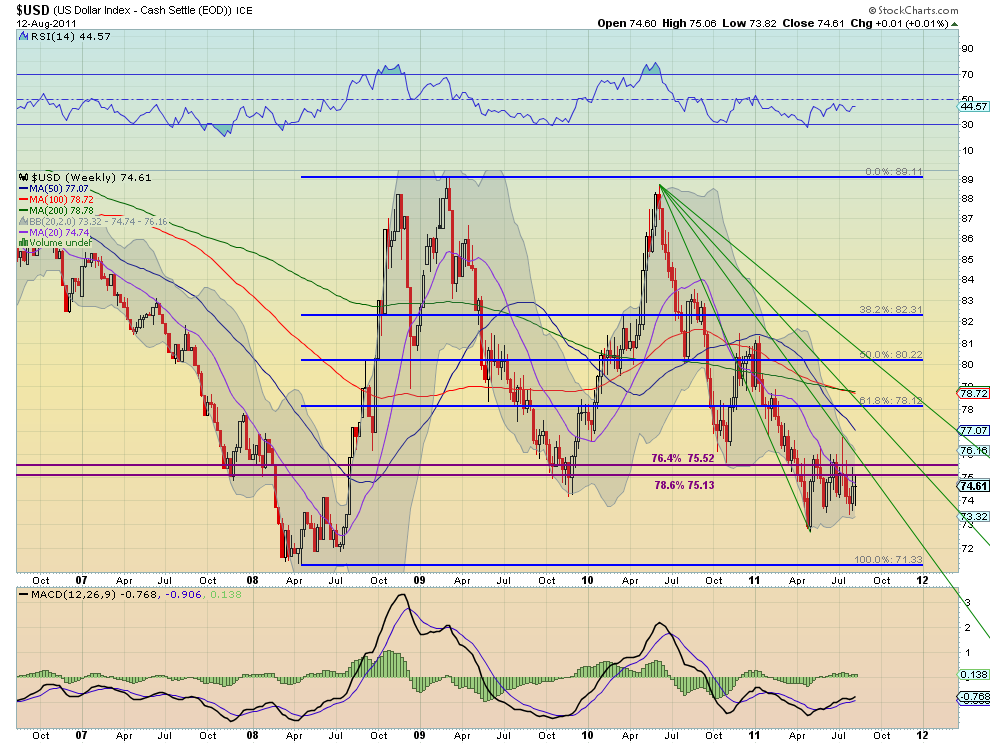
The US Dollar Index continues to move sideways in the upper end of the consolidation range from 73.50 to 76. Despite the daily range being bigger the real body’s of the candles have been shrinking, suggesting indecision coming to a head. The RSI and MACD on both the daily and weekly time-frame continue to provide little information about the next move. The weekly time-frame shows that the upside resistance at 75.13-75.52 coincides with the Fibonacci levels retracing from the move higher from 2008 to 2009. On this time-frame the trend continues to be down. Look for more sideways action in the 73.50-76.00 range in the coming week as it approaches the Fan line in September.

iShares Barclays 20+ Yr Treasury Bond Fund Daily, $TLT

iShares Barclays 20+ Yr Treasury Bond Fund Weekly, $TLT

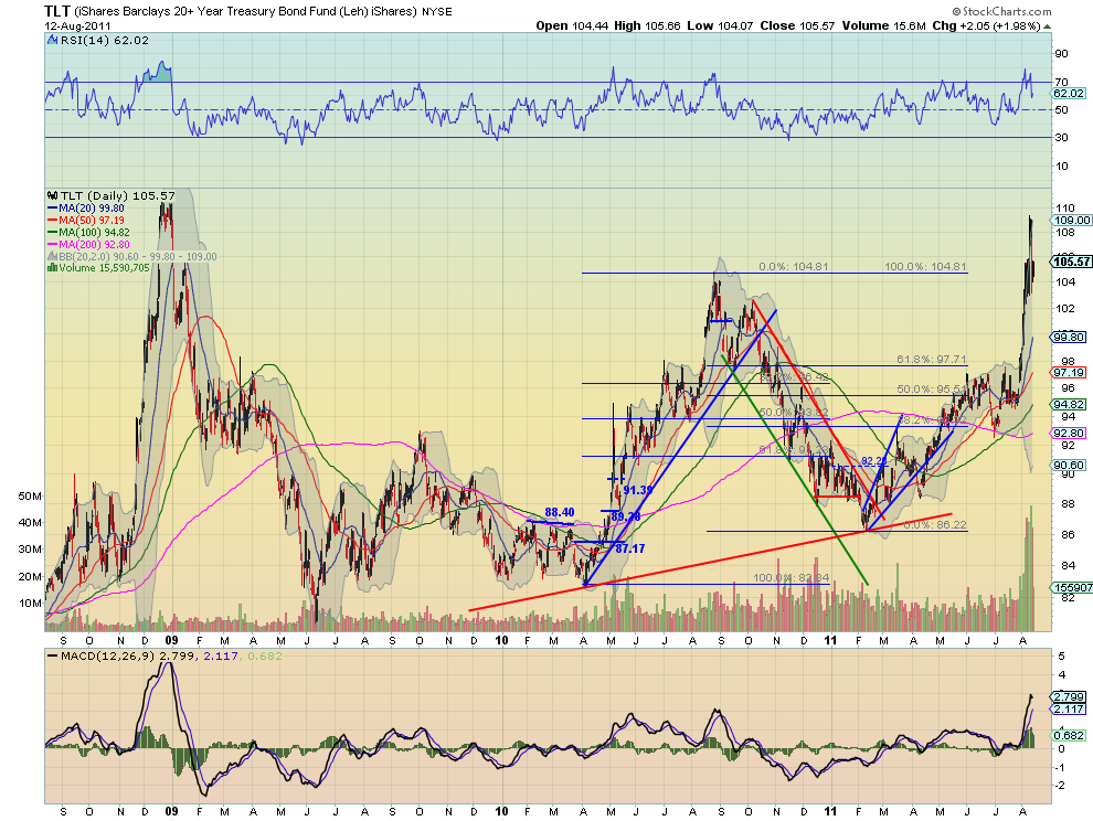
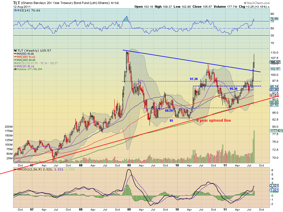
Treasuries, as measured by the ETF $TLT, had a massive week up over 3% even after selling off by over 3.5% from the top. Friday found support at the 104.80-105.20 area, the August 2010 high, but the RSI and MACD on the daily chart are diverging and suggest more downside. The weekly chart shows a shooting star print out of the Bollinger bands that launched on a break of the symmetrical triangle. The RSI is pointing higher and the MACD is growing on the weekly time-frame, and volume on the move higher has been very large. This combination suggests that we may see a retest of the triangle upper rail or lower before a move higher on the intermediate time-frame. Look for support at the 104.80-105.20 area or at 102 and 100 lower to hold to continue the upside. A move above 110.65 confirms a target on the triangle pattern at 136.

Shanghai Stock Exchange Composite Daily, $SSEC

Shanghai Stock Exchange Composite Weekly, $SSEC

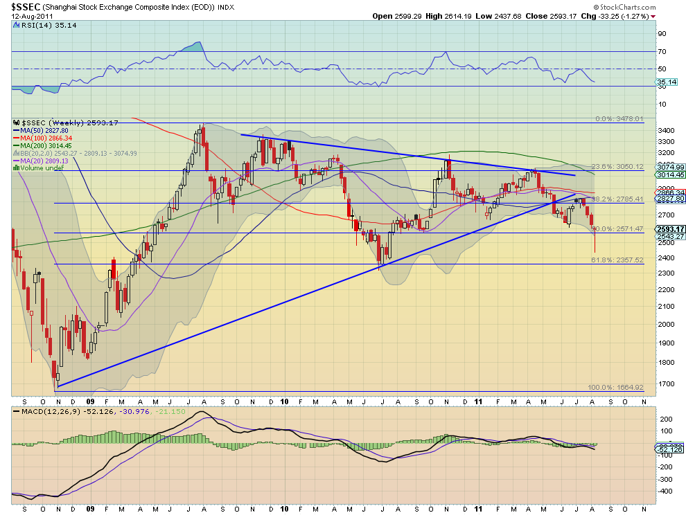
The Shanghai Composite found support at the 2500 area after testing lower. The daily chart shows the RSI bottomed and sloping higher with the MACD moving steadily towards the zero line, while price now tests the bottom of the late 2010 channel between 2590 and 2695. The weekly chart printed a near Dragonfly doji with a long shadow, but with the RSI still falling and the MACD flat-lined. In the end this is at least a lower low after a lower high, still a down trend. Look for next week to continue the short term move higher with resistance above at 2695 and then 2800, with a move above 2840 negating the down trend. A move lower sees some support at 2500 and 2450.

iShares MSCI Emerging Markets Index Daily, $EEM

iShares MSCI Emerging Markets Index Weekly, $EEM

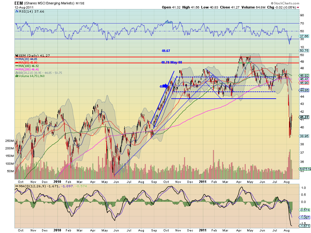
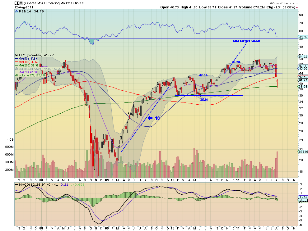
Emerging Markets, as measured by the ETF $EEM, crashed Monday and then consolidated for the week in a range between support at 39 and resistance at 41.50. The RSI on the daily chart bottomed and is now headed sharply higher while the MACD has been improving toward the zero line. The chart printed a hollow red Hammer, bullish intra-week activity within the move down. It is extremely out of the Bollinger bands and under the longer term resistance at 42.54. Like the Shanghai Composite though the RSI and MACD on the weekly time-frame suggest more downside. Look for Emerging markets to continue the short term up move in the coming week with resistance above 42.54 at 43.70. A move lower finds support at 38 and then 35.91.

VIX Daily, $VIX

VIX Weekly, $VIX

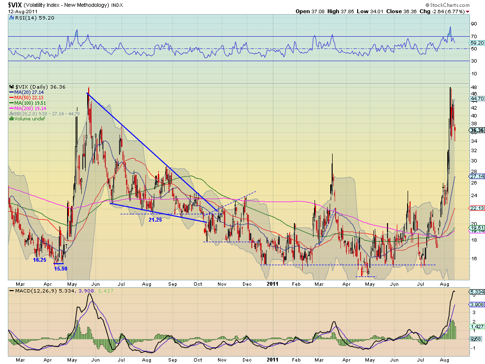
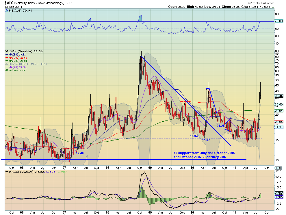
The Volatility Index spiked to the 48 level where it stopped in May 2010 before pulling back as the week progressed. It did find support though at the 34 level that has been important in the past. With the RSI moving lower and the MACD declining this time-frame suggest that volatility will fall in the short term. The weekly chart printed a shooting star with the RSI rising but reaching the overbought level where it has sold off 4 of the last 5 times. The MACD is still rising on this time-frame. With the weekly chart also out of the Bollinger bands look for Volatility for the week to continue lower. If it does not break 34 then all bets are off and the markets are in big trouble.

SPY Daily, $SPY

SPY Weekly, $SPY

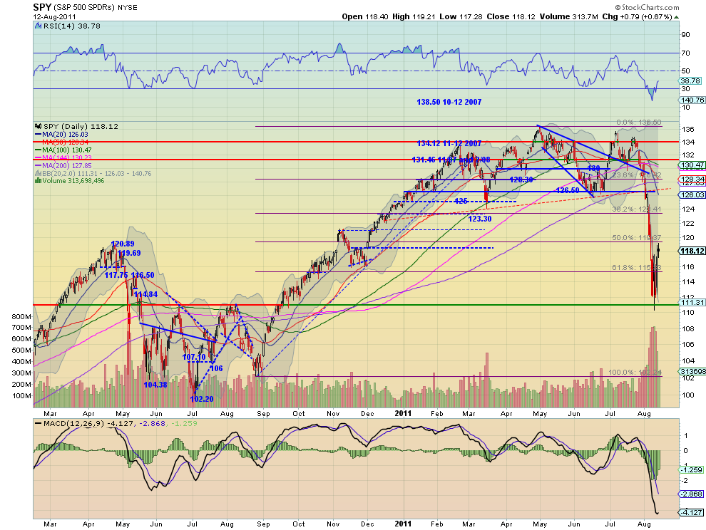
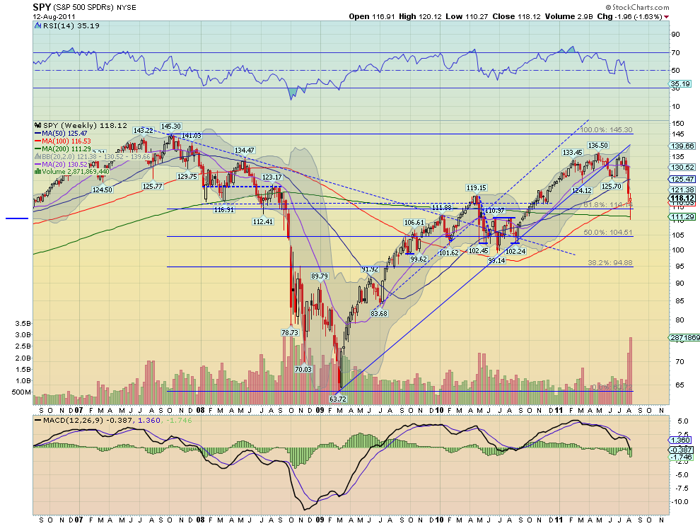
The SPY broke lower Monday and then bounced in a range for the week finishing Friday with a doji candle just above that range but under last Friday’s close. The RSI on the daily chart bottomed and is rising sharply while the MACD also has been improving off of the low from Wednesday. The weekly chart shows a hollow red Hammer candle at support with the RSI and MACD still pointing lower. It is well outside of the Bollinger band on this time-frame and printed volume not seen since the March 2009 lows. Look for next week to be biased higher with resistance at 119.20 and 121.50 above that, but the trend remains lower. It would take a move above 126.50 to negate the trend. A move lower would find some support at 116 and 113 followed by 111.15.

IWM Daily, $IWM

IWM Weekly, $IWM

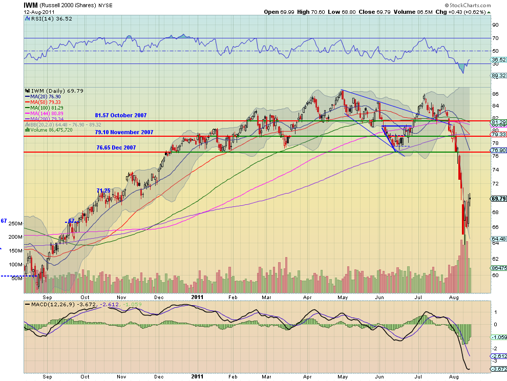
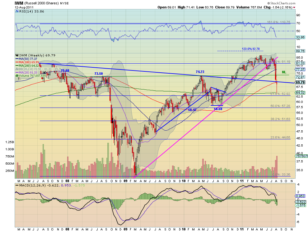
The IWM also broke lower Monday and then bounced in a range for the week finishing Friday with a doji candle just above that range but under last Friday’s close. The RSI on the daily chart bottomed and is rising sharply while the MACD also has been improving off of the low from Wednesday. The weekly chart shows a hollow red Hammer candle just below the resistance of the extended downtrend line from the 2007 highs, with the RSI and MACD still pointing lower. It is well outside of the Bollinger band on this time-frame and printed volume not seen since the 2008 move lower. Look for next week to be biased higher with resistance at 70.40 and 74 above that, but the trend remains lower. It would take a move above 76.75 to negate the trend. A move lower would find some support at 68 and 67 followed by 65.50.

QQQ Daily, $QQQ

QQQ Weekly, $QQQ

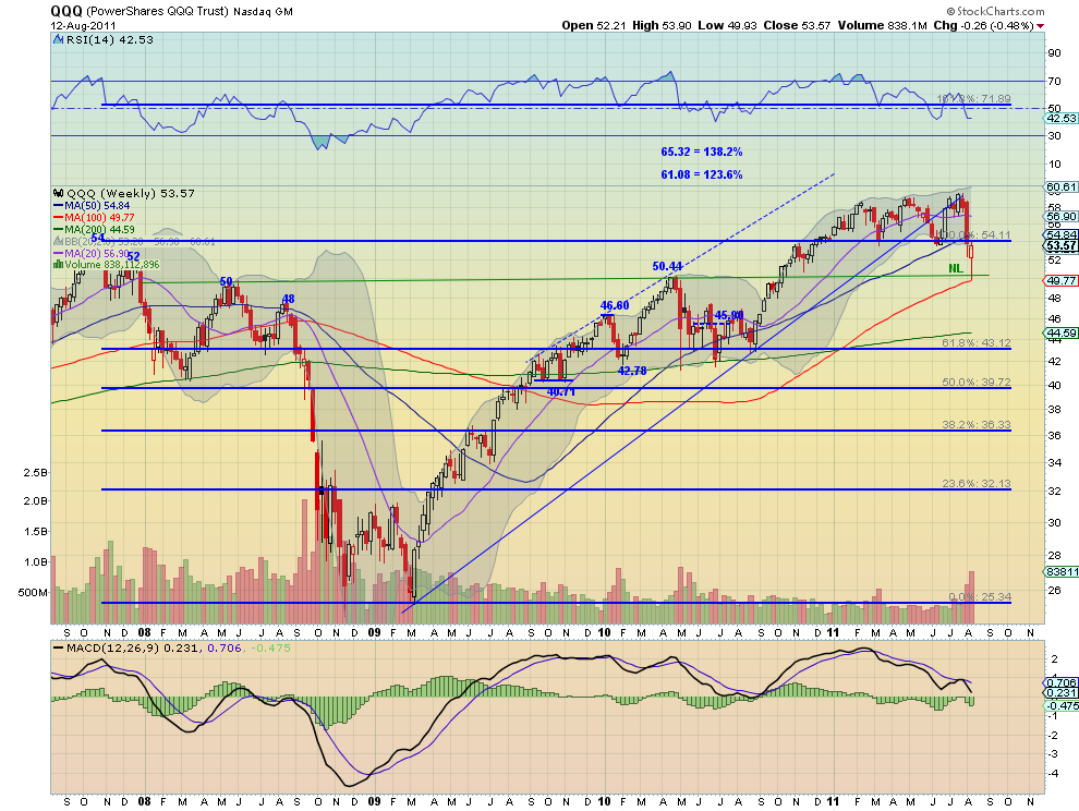
Finally the QQQ also broke lower Monday and then bounced in its range for the week finishing Friday with a doji candle just above that range but under last Friday’s close. The RSI on the daily chart bottomed and is rising sharply while the MACD also has been improving off of the low from Wednesday. This is the only index that has moved back into the previous six month consolidation channel. The weekly chart shows a hollow red Hammer candle just below the resistance of the 2007 highs, with the RSI just turning flat and the MACD still pointing lower. It is close but outside of the Bollinger band on this time-frame. Look for next week to be biased higher with resistance at 54.26 and 55.50 above that, and a move into the channel. A move lower would find some support at 52 and 50.60 followed by 47.40.

Next week looks like a reversal of this week. Gold looks heading lower while Crude Oil has a short term bias higher in a downtrend. The US Dollar Index looks to continue sideways in the 73.50-76 range, while US Treasuries look to continue lower in an uptrend. The Shanghai Composite and Emerging Markets look to be headed higher. Volatility looks biased to the downside with a move under 34 key to continuing lower, and giving a bias to the upside for the Equity Indexes SPY, IWM and QQQ, also within a downtrend. the big question looks to be whether this is a dead cat bounce or for real. Use this information as you prepare for the coming week and trade’m well.

Wall Street Bailout: Too Big To Collect?


In light of the recent S&P downgrade, the U.S. suddenly looks more dire financially than before the downgrade ( (at least psychologically, as the country still has the ability to borrow at its pre-downgrade low interest rates.) So it would make tracking down Wall Street bailout money still outstanding a good start to reclaim some of the lost treasure.

However, more than two years after the bailout, there never seems to be a straight answer to these two questions: (1) Where has Uncle Sams' bailout money gone? (2) Has the money been paid back yet?

The Treasury Dept. already declared milestone reached in June, 2010 when "Repayments to Taxpayers Surpass Tarp Funds Outstanding." New York Times and CNNMoney both keep stattistics of the bailout and tell a different story from the government's account. NYT says fund outflow has amounted to $550 billion, funds returned is $70.1 billion, that leaves amount outstanding $480 billion. CNNMoney data suggest $475 billion out of the door, $118.5 billion returned, netted to $357 billion still needs to be collected.

Pro Publica also keeps track of a bailout list including the $700 billion TARP program, and the separate bailout of Fannie Mae and Freddie Mac. According to Pro Publica,

"Altogether, accounting for both bailouts, $580 billion has gone out the door—invested, loaned, or paid out—while $273 billion has been returned. The Treasury has been earning a return on most of the money invested or loaned. So far, it has earned $67 billion. When those revenues are taken into account, $239 billion is the net still outstanding as of August10, 2011."
The spreadsheet downloaded from Pro Publica shows the top 5 bailout deadbeat recipients--Fannie Mae, AIG, Freddie Mac, General Motors, and GMAC (now Ally Financial)--account for almost 97% ($232 billion) of the total net amount still outstanding.

Now, the more jaw dropping numbers come from a recent analysis done by the Center for Media and Decmocracy (CMD), pointing to an actual total still outstanding at $1.5 trillion (See Chart),
".....while the TARP bailout of Wall Street (not including the bailout of the auto industry) amounted to $330 billion, the government also quietly spent $4.4 trillion more in efforts to stave off the collapse of the financial and mortgage lending sectors. The majority of these funds ($3.9 trillion) came from the Federal Reserve, which undertook the actions citing an obscure section of its charter."
"..$4.8 trillion went out the door to aid financial companies and repair the damage they caused to financial markets, and $1.5 trillion of that is still outstanding."

CMD keeps a list of 'Total Wall Street Bailout Cost' here, but not down to the detail recipient level. CMD’s analysis also shows that most of the bailout funds were comprised of aid to banks, in the form of loans with below-market interest rates and for questionable collateral to banks directly from the Treasury and Federal Reserve (See Chart).


The $4.8 trillion bailout of the financial sector, according to CMD, also dwarfs the $600 billion that the Federal Reserve spent on the QE2 that was intended to stimulate the broader economy.

Andrew Ross Sorkin at NYT also pointed out that when WSJ quoted the U.S. Treasury that "the projected cost of the bailout is shrinking" to $89 billion from an earlier estimate of $250 billion (see graph below),
"....there’s a small problem with all this happy Washington math: it doesn’t take into account the piles of cash we’re likely to lose on Fannie Mae and Freddie Mac..... The overall math also doesn’t account for the more than $1 trillion the Federal Reserve pumped into the system through loans to Wall Street that were virtually interest-free." 

Source: WSJ.com

So it looks like the bailout could have different ROIs (return on investments), depending on what you count as "investments."

Fannie and Freddie just recently asked for $7 billion more bailout funds, and looking at the domestic housing market and the current economic outlook, American taxpayers probably should consider it a draw even if just no future funding will be directed to the two government-sponsored housing entities, let along expecting a single dime coming back form Fannie and Freddie.

But the sad thing is that even if Uncle Sam gets to collect the whole 1.5 trillion as calculated by the CMD, it would not have made a difference in the debt and deficit of the U.S. government (as the S&P Rating Agency has taught us.)

See the original article >>

Lack of Panic Suggests More Market Downside to Come – And Buying Opportunities After That

By Keith Fitz-Gerald

According to the Bloomberg News, the recent sell-off has scraped a staggering $3 trillion from U.S. markets and a whopping $8 trillion from global markets between July 22 and Monday of this week.

And still the pros aren't panicking, which suggests to me there's more downside ahead - a lot more.

Indeed, I see the very real possibility that we could re-test the bear-market lows of March 2009.

You can dismiss this warning if you wish. But having navigated global financial markets for more than 20 years, I've learned that sentiment is one of the most powerful indicators of all - perhaps the most powerful indicator.

So the fact that the pros - including our politicians (I think everyone now understands that Wall Street and Washington are linked at the hip) - haven't panicked in the face of this bloodbath suggests one thing: They believe they understand the risks that we face - and that's almost a de facto indication that they don't.

You can analyze all the data you want, run through the market fundamentals and gaze at your technicals until you're in a chart-pattern-induced coma.

At the end of the day, the direction the markets move is entirely dependent on how people feel.

And that, my friends, is the classic definition of market sentiment.

How do we know?

When it comes to professionals, we can turn to the Investors Intelligence Survey, which evaluates marketing-timing signals from professional-investment newsletters nationwide. As of Tuesday, the bulls represented 47.3% - and the bears held their own, with 23.7%. That compares with the prior week's data, which showed 46.3% in the bullish camp and 24.7% of the bearish persuasion.

Or the AAII Investor Sentiment Survey, which attempts to measure the percentage of individual investors that are bullish, bearish or simply neutral on the markets. For the week ended Aug. 20, it's pretty balanced - with 33.4% bullish, 21.8% neutral and 44.8% bearish.

Both are far from the extreme readings that are typically associated with market reversals - either to the downside or, as many investors are now wondering, to the upside.

On May 2, I stated in a Money Morning column that "even the most strident pessimists had become optimists." Therefore, I was extremely concerned about the downturn that has led us to where we are today. That's the sort of extreme I am talking about - when everybody goes to one side of the boat. 

We haven't reached that extreme in sentiment, yet - in the broader markets. And that's especially problematic. My good friend, Dr. John L. Casti, one of the world's leading experts on the development of early warning methods for extreme events in human society, notes in his book, "Mood Matters: From Rising Skirt Lengths to the Collapse of World Powers," that "human hubris is about as reliable an indicator as you can find for financial trouble" - especially when it reaches extremes.

But in two critical areas, we are approaching that extreme : market volatility and gold prices. Not surprisingly, we've seen hundreds of millions of dollars flood into both investments in recent weeks.

According to CNBC, as the Dow was plummeting more than 600 points last Monday, traders poured $162 million into the iPath S&P 500 VIX Short-Term Futures ETN (NYSE: VXX) . And this is actually from people who believe volatility would go down, which implies a rally that may be more than the single- or double- day bounces we've seen this week.

It's much the same with gold: New investments in the SPDR Gold Trust Exchange Traded Fund (NYSE: GLD) rose by $1.3 billion on Monday alone. In other words, that one-day infusion was equal to 48% of the $2.68 billion that flowed into the fund for all of July.

If that doesn't stun you, this factoid will: If gold investments continue at this rate, the total amount held by the Gold Trust could actually surpass what is invested in the SPDR S&P 500 ETF (NYSE: SPY)!

And unlike when Apple Inc. (Nasdaq: AAPL) recently surpassed Exxon Mobil Corp. (NYSE: XOM) in market capitalization to become the world's most valuable company, this really will be news because it will herald the next leg down.

And it will happen. How do I know?

Simple. Although we led the charge -- and were way ahead of "the crowd " -- my colleagues and I here at Money Morning are no longer lone voices in the woods predicting gold will hit $2,500 an ounce.

Since 2001, when I first began encouraging clients and subscribers to begin accumulating the "yellow metal" - and from the very beginning of this crisis - gold has risen from a low of $255 to where it is now.

JP Morgan Chase & Co. Inc. (NYSE: JPM) noted Tuesday that gold prices may hit $2,500 by year's end. Goldman Sachs Group Inc. (NYSE: GS), while not biting on the $2,500, has come out of the woodwork with an $1,860-an-ounce target, according to The Financial Times.

Legendary investor Jim Rogers has also notably and vigorously advocated gold, and puts prices in the same neighborhood. (Both of us, incidentally, are worried about the run- up right now, and hope it pulls back - so we can buy more!)

With all this playing out, why aren't the pros panicked?

In a word: perspective.

The average individual investor looks at this market and is directly vested in its performance − because that performance, on any given day, has a direct, quantifiable and highly personal bottom line. Panic, therefore, is a logical and entirely understandable emotion - albeit one that leads to lots of bad decisions.

It's the one emotion retail investors would be wise to control. That's why we spend so much time at Money Morning and in our sister publication, The Money Map Report, on such stress -reducing tactics as trailing stops, profit targets and disciplined plans that one can set up ahead of time.

Professional investors, in contrast, tend to look at charts and figures. And by virtue of what they do, they have learned to calmly, coldly and analytically evaluate what they see.

So far, what they see is a normal market correction.

Technically speaking, we're just barely under the 200-day moving average. And the U.S. Federal Reserve is widely expected to gallop to the rescue again - as are the other central banks around the world. So traders are looking at this as a point of entry.

The real fireworks will begin when they have to scramble to get short or get out.

That's when we'll be buying.

Relative Strength of Industrials and Technology vs. S&P 500

by Bespoke Investment Group

The chart below shows the relative strength of the Industrials and Technology sectors versus the S&P 500. When the lines are rising, it indicates that the sector is outperforming the S&P 500 and vice versa when the line is falling. So far this Summer, it's been rough sledding for the Industrials sector. In June, the sector was handily outperforming the S&P 500, but now just two months later the sector is underperforming the S&P 500 by its largest amount in a year.

While Industrials have been slumping, the Technology sector has been ramping. Although there have been numerous calls to avoid the sector during this downturn, Tech stocks have been handily outperforming the market. In fact, heading into today, Technology was the least oversold of the ten sectors.


See the original article >>

Market And Economic Indicators

by Macro Story

A weekly update of market and economic indicators across various asset classes. 

Copper VS SPX
Copper VS Copper Commercial Net Position
Skew Vix Divergence VS SPX (short term)
Skew Vix Divergence VS SPX (long term)
Margin Debt VS SPX
30 Year Treasury Yield VS SPX
Corporate Bond Spreads (HG/IG) VS SPX
AAII Investor Sentiment VS SPX
ECRI Weekly Leading Indicator

See the original article >>

Follow Us