Monday, June 6, 2011

Week in Review: The Power of Zero To Be Tested?

By Global Macro Monitor

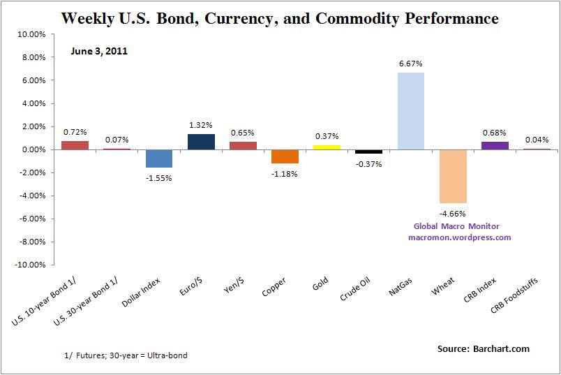
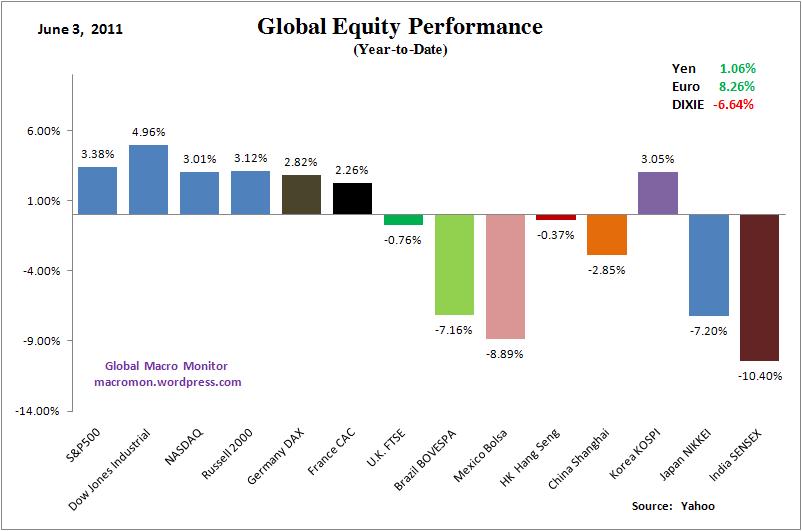
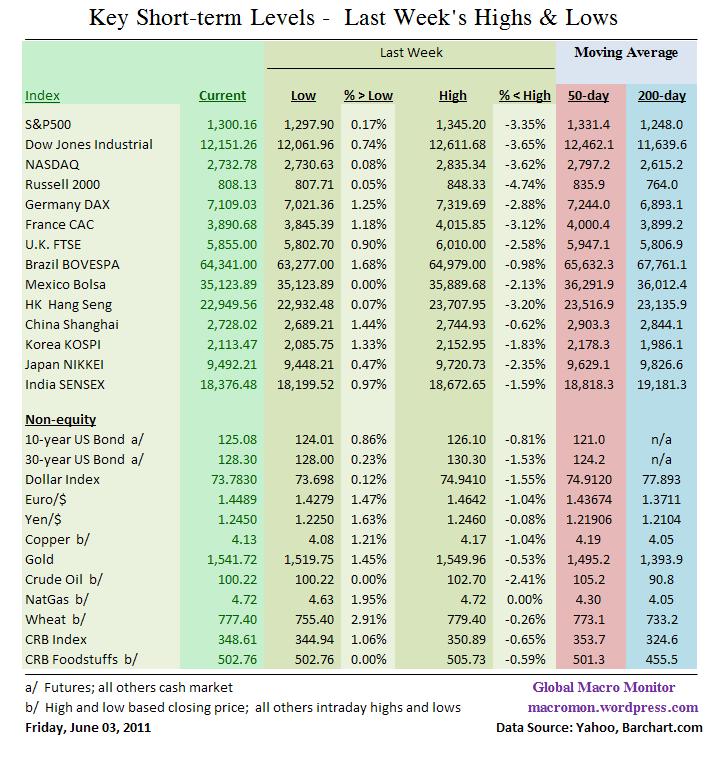
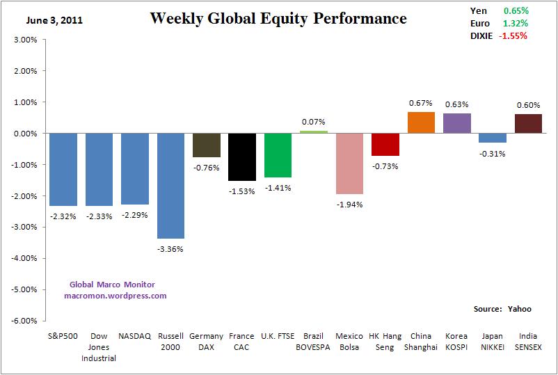
The S&P500 and Dow Jones Industrials suffered their worst weekly loss of the year, both down 2.3 percent. The U.S. and European equity indices had bearish outside moves and all major global equity indices we track closed the week below their 50-day moving averages. Asia fared better only due to the fact they closed before the release of Friday’s weak employment data. Investors and traders have definitely sold in May and gone away in the S&P500, Dow Jones, and all three European equity indices, which have had negative closes for five weeks in a row.

On the positive side, the Brazilian BOVESPA looks like it’s trying to put in a bottom and the Shanghai Composite was able to hold its January’s important closing low of 2677 after trading down to 2689 early in the week. We will be watching Asia closely at the open on Sunday night as their equity markets have a chance to react to Friday’s employment report.

Apple, the general of this bull market, closed up 1.79 percent on the week and could be a catalyst for a market bounce if Mr. Jobs surprises at the company’s worldwide developers conference this week. Many traders are short the stock going into the conference on the expectation nothing of significance will be announced. Shorting Apple? Ouch!

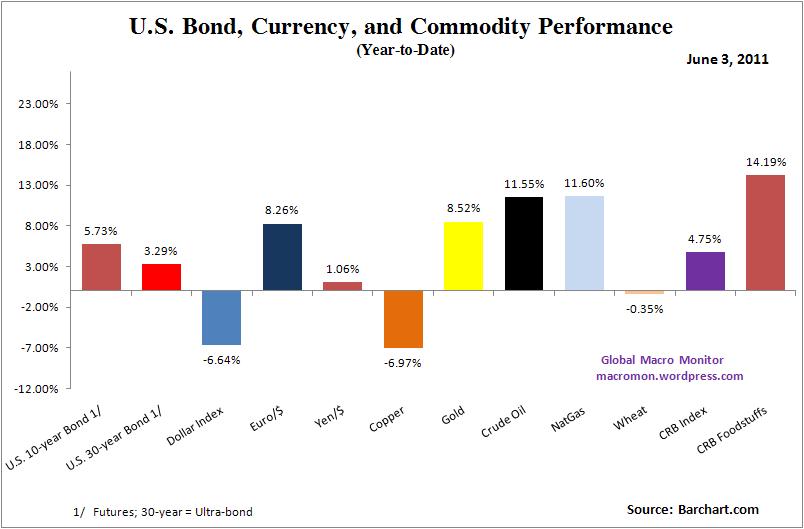
U.S. Treasury bonds closed stronger, but were unable to take out Wednesday’s highs even on the dismal employment data. The dollar closed down for the second straight week and we find it interesting that risk assets have been unable to rally on the weak dollar. Though it’s too early to tell, keep this on your radar as the weak dollar/risk on trade may be a changin’.

The power of zero (interest rates) as a risk-on market prop may be about to face its first serious test. The toxic brew, which would signal something more serious than a garden variety correction, would be the combination of a weaker dollar, equity and bonds moving lower, crude oil and gold moving higher. Not yet a high probability event, in our opinion, and let’s hope we don’t see it, but keep it on your McSwan list. A credible and sustainable long-term debt/fiscal program included in a Congressional debt ceiling deal would go a long way in easing the concerns of the ratings agencies and increase the confidence of foreign investors in their dollar holdings. Further dithering will be costly.

Good luck this week!

See the original article >>

Basis of the Stocks Bear Market Rally


Of late, I have been receiving questions asking how I can justify saying that the advance out of the March 2009 low is a bear market rally. After all, doesn't a rally of some 26 months have to be a bull market? No, it does not and I continue to believe that this is a bear market rally that will ultimately separate Phase I from Phase II of a much longer-term and ongoing secular bear market. I have addressed this topic before, but for some reason these questions are being asked again, so I will address them here again. The explanation that this is a bear market rally within a much longer-term secular bear market lies with the historical bull/bear market relationships, Dow theory phasing and values.

Let's first look at bull and bear market relationships. But, before I even begin, I want to clarify that cycles have absolutely nothing to do with Dow theory. Cycles and Dow theory are two completely different disciplines. However, they can be used to compliment each other if we understand both disciplines.

Now, with that being said, the bull and bear markets of the late 1800's and very early 1900's, which Dow, Hamilton and Rhea wrote about, are one in the same as the upward and downward movements of the 4-year cycle. In other words, the upside portion of a 4-year cycle was the same thing as a bull market in accordance with Dow theory and the downside portion of the 4-year cycles were the same as the bear markets in accordance with Dow theory.

But, beginning in 1921, these bull and bear market periods began to grow in duration. I feel that this is a direct result of the growth in population. As our country grew, more and more people began investing and as a result, the bull and bear periods became longer. In turn, bull and bear markets evolved into a series of multiple 4-year cycle events. For example, the first bull market to consist of multiple 4-year cycles ran from 1921 to 1929 and consisted of two 4-year cycles. The low in November 1929 was a 4-year cycle low. The rally, or "Secondary Reaction," as it would be termed in accordance with Dow theory, that followed was the upside portion of a 4-year cycle that topped in only 5 months. Once this "Secondary Reaction" was over, the DJIA moved down below the previous 4-year cycle low and into the 1932 4-year cycle low, which proved to be the bear market bottom. I would also like to point out that the 1921 to 1929 bull market advanced a total of 568% from the 1921 4-year cycle low at 67 on the DJIA to the 1929 4-year cycle top at a high of 381.

The next great bull market began with the 4-year cycle low in 1942 and ran to the 4-year cycle top in 1966. This time the "Primary" bull market was comprised of a series of six 4-year cycles and advanced a total of 1,076% from the 1942 4-year cycle low at 93 on the DJIA to the 1966 4-year cycle top at a high of 1,001 on the DJIA. Note that in percentage terms of the advance, this bull market advance was roughly double the preceding great bull market of the 1920's. The bear market that followed was also a series of 4-year cycles. From the 1966 4-year cycle top, the bear market moved down into the 1974 bear market low. This was a series of two 4-year cycles.

Now, I want to focus on the bear market declines. Prior to the first great bull market that ran between 1921 and 1929, the bear markets averaged some one-third the duration of the previous bull market. This relationship has also held true with the extended bull market periods as well. For example, the 1921 to 1929 bull market was 8 years in duration and the 1929 to 1932 bear market was 3 years, making the bear market duration 37.5% of the preceding bull market. The 1942 to 1966 bull market was 24 years in duration and the 1966 to 1974 bear market was 8 years, which was 33.3% of the duration of the preceding bull market.

From both a cyclical and a Dow theory perspective, the last and greatest bull market of all time began with the 1974 4-year cycle low. Some say that it began at the 1982 low, but in reality, that is when the new bull market became obvious. The low occurred in 1974 and Richard Russell called that low at the time using Dow theory. The bull market that began in 1974 carried price up into the 2007 top, which was a period of 33 years and consisted of a series of eight 4-year cycles for a total advance of 2,390%. Note that once again this bull market advance more than doubled the magnitude of the preceding bull market advance, which is also another consistency.

Now, if we apply the normal bull bear relationship of approximately one-third, then given that the last great bull market ran some 33 years, this bear market should last until somewhere late in this decade. I will add to that, the more they monkey around with the natural forces of the market, the longer they are apt to drag things out and the worse it will be. Because the 2009 low occurred only 17 months after the 2007 top, that low falls far short of the normal one-third relationship that has historically been seen. Therefore, based on these historical relationships I do not believe that we have seen the bear market bottom.

According to Dow theory, each bull and bear market period has three separate phases. This phasing is an important aspect of the Dow theory that is most often over looked. The 1966 to 1974 bear market is a perfect example of a bear market, its three phases and the rallies separating each of the phases. Therefore, I will use that chart to illustrate this concept.


Referring to the chart above, Phase I of the second great bear market began at the top in February 1966. This top was confirmed under Dow theory in May 1966. From this top the market declined into the Phase I low in October 1966. This Phase I decline is marked in blue on the chart above and it carried the market down some 25%. From this Phase I low the typical rally that serves to separate Phase I from Phase II began. This rally carried the market up some 26 months and is marked in green on the chart above. During this 26 month advance you can see that there were a couple of false breakdowns that the market was able to recover from and inevitably pushed higher. In fact, with the advance into 1968 bettering the 1967 secondary high points, a traditional Dow theory bullish trend change even occurred.

But, those who understood Dow theory phasing would have understood that this was a bear market rally separating Phase I from Phase II of a much longer-term bear market and not a new bull market. I can also assure you that the longer this rally lasted the more bullish and more convinced the public became that a new bull market was underway. Also, when the market would recover from these false breaks, I strongly suspect that the bullish sentiment must have been off the chart. I'm also sure that the Dow theorists continued to warn, but few understood or listened to these warnings. Then, with the Dow theory trend change in 1968 I'm sure that the public was convinced that a new bull market was underway. They probably proclaimed that anyone stating anything other than this "obvious" bull market needed to be admitted for a psychiatric evaluation. After all, this was "obvious" and anyone not seeing it was obviously blind.

However, in spite of the false breaks, the bullish sentiment, false recoveries and claims of new bull markets, the Dow theory phasing prevailed and the decline into the Phase II low carried the market down some 36% to new lows over a 17 month period. This Phase II decline is marked in red on the chart above.
Then came the rally separating Phase II from Phase III of this ongoing secular bear market. This rally carried the market up 66% over a 32 month period. This advance is also marked in green on the chart above. Once again, the world was convinced that the bear market was over. After all, the market had made a new high. How in the world could we still be in a bear market with the market at new highs? Those Dow theorists had to be wrong this time around because this time was different and it was "obvious" with the market at a new all time high.

But, once again, the Dow theory phasing prevailed and Phase III took the market down 45% into the final Phase III low. This low marked the bottom of the second great bear market. This time, those who understood the Dow theory were able to recognize this bottom for what it was, as did Richard Russell. History tells us that the public was so beaten down by the time the Phase III low had occurred that once again they did not listen to the Dow theorists. Bearish sentiment was sky high and anyone pushing stocks at this point, again needed counseling. Who in their right mind would buy stocks after suffering through these declines? However, the Dow theory phasing was proven correct and the third great bull market, that ran until the 2007 top, was born at the 1974 Phase III bear market bottom.

This brings us to our current chart below. From the 2007 top, the Industrials dropped some 53% over a 17 month period into the bear market Phase I low in March 2009. This decline is marked in blue on the chart below. From that low the typical rally separating Phase I from Phase II began. Just as with the 1966 to 1968 rally, the longer this rally lasts, the more convinced the public will become that this is a "new bull market." I know from my research what this bear market rally top will look like because I have identified a common DNA Marker that has appeared at every major top since 1896. I'm covering these details and developments in the research letters and updates at Cycles News & Views. This rally will top in accordance with those DNA Markers and will allow me to identify it as well. Therefore, based on my knowledge of Dow theory phasing and the historical bull and bear market relationships I do not believe that we have seen the bear market bottom or that the advance out of the March 2009 low is a new bull market.


Let's now look at value, which is another historical marker of secular bear markets. Historically, the dividend yield will be roughly equal to the price earnings ratio at secular bear market bottoms. I have used the S&P data here because I did not have this data as far back on the Industrials. At the 1932 bear market bottom the yield was 10.50% and the P/E was just under 10. At the 1942 bear market bottom the yield was 8.71% and the P/E was 7.3. At the next great bear market bottom in 1974 the yield was 5.9% and with a P/E of 7.24. If we take this same reading at the 1982 low the yield was 6.2% and the P/E was 6.9. For the record, these P/E ratios are based on Generally Accepted Accounting Principles and not the bogus George Orwellian methods of today. At the 2009 low, the P/E was 26 with a dividend yield of 3.2, which is hardly at par. Therefore, based on this historical measure, there is also no indication that the 2009 low marked the bear market bottom.

The top of the rally separating Phase I from Phase II of this ongoing bear market is looming. The manipulation and efforts to keep the market afloat will not matter. The natural forces of the market will prevail. By understanding the environment in which we are operating and by knowing how to identify the top we can prepared for what lies ahead. I was able to identify the top in 2000, which is well documented. All throughout the 4-year cycle advance into the 2007 top I warned that the efforts to prop up the markets would not work, that it was stretching the 4-year cycle and that it would ultimately only serve to make matters worse and I was also able to identify that top, as well. Again this was all documented. Few listened. I am again warning. The manipulation does not matter. This time, it is a bear market rally and the Phase II decline will come, once the proper setup is in place.
Stock Market Cycles Analysis


Let’s take a step back and examine the intermediate-term outlook for 2011 based on some observations we made earlier this year.

Earlier we discussed the outlook for 2011 based on an “echo analysis” of the Kress cycles. In January, Ned Davis Research produced a chart which combined the stock market’s 1-year, 4-year and 10-year tendencies. This composite chart suggested that most of this year’s gains will occur in the first half of the year. Our own composite work based on the Kress cycle “echo” phenomenon also suggested that the stock market could make a significant peak in the April-May time frame and that most of the market’s gains would be made in the first half of 2011.

The Kress cycle “echo” effect is a composite of the 6-year, 10-year, 30-year and 60-year cycles. Using 2011 as the starting point we go back 6 years to 2005, 10 years to 2001, 30 years to 1981 and 60 years to 1951 to arrive at the composite “road map” for the stock market. This provides us with only a rough approximation of what could happen and shouldn’t be used as an absolute guideline since no two markets are ever exactly alike. These cyclical tendencies are worth noting, however, since they do tend to show the same tendencies during the echo years mentioned above.

In the Feb. 4 report we did an in-depth echo analysis in which we looked at the 6-year cycle going back to 2005, the 10-year cycle going back to 2001, the 30-year cycle back to 1981, and the 60-year cycle back to 1951. We concluded that the February-March time frame tends to be a rally period for the stock market with April being a “blow off” or peak month. We found that in the previous “echo” periods of the analysis that the market had a tendency to post interim peaks in late April or early May.

For instance, going back to the year 1951 we found that the stock market posted an interim peak in the early part of May that year in keeping with the common theme of all four years. In the 30-year echo year of 1981 the market’s final peak was made at the end of April. In the 10-year echo year of 2001 the market’s peak was in mid-May.

In the Feb. 4 report we wrote, “There are two conclusions that can be made from this echo analysis of the four key Kress cycles. The first is that the stock market tends to rally in February with a significant short-term peak in March. The second conclusion is that a significant intermediate-term top tends to occur in the May time frame.” Also in the Feb. 4 report it was noted that Ned Davis Research had produced a chart which combines the stock market’s 1-year, 4-year and 10-year tendencies. This composite chart suggested that most of this year’s gains will occur in the first half of the year.

With the benefit of hindsight we can see that this echo analysis proved itself useful in predicting the late April/early May top this year. There was a tradable rally in February with a correction March, followed by another significant peak at the start of May. So far the Kress cycle “echo analysis” has proven to be reasonably correct in predicting the first five months of 2011. The question we want to examine tonight is what the second half of 2011 will likely show based on the Kress cycle echoes.

To answer this question it will help us to once again go back and examine the stock market chart patterns from the key years 2005 (6-year cycle), 2001 (10-year cycle), 1981 (30-year cycle) and 1951 (60-year cycle). Once we’ve done this we can average out the patterns to form a composite for what the second half of 2011 might look like. By way of disclaimer, please keep in mind that “markets and snowflakes are never exactly the same,” so this is only a rough approximation and should be used as an absolute rule by itself.

Before we continue with our echo analysis, I’d like to point out that while I’ve always employed the S&P 500 Index (SPX) as my preferred benchmark for the U.S. broad market this has only been true since about 2002 at the previous 12-year cycle low. Prior to this the Dow 30 Industrial Average was a useful proxy for the broad market and was much more representative of the broad market (and economy) than it is today. Another point worth mentioning is that the SPX was unduly influenced by its tech stock component during the tech stock crash of 2000-2002, which explains why the SPX significantly underperformed the Dow for much of that bear market.

Starting with the 10-year Kress cycle echo, in 2001 the Dow 30 Index peaked in early February and followed this up with a higher peak in May. The May 2001 peak proved to be the high for that year. This was followed by a steady decline into September, at which point the dominant interim weekly cycle bottomed. Of course the year 2001 was a bear market year and this influenced the path stock prices took for much of that year.


This year has seen a continuation of the bull market and as such the comparison isn’t analogous. The point worth emphasizing here is that instead of a sustained decline in the coming summer months like we saw in 2001, the upcoming months could see a lateral trading range. This is what would have happened in the summer of 2001 had it not been for the severe downward pressure exerted by the tech stock market deflation.

Next we have the 30-year echo which takes us back to 1981. The Dow peaked at the end of April ’81 as you can see here. This is a chart that I suspect will be very instructive for us in the upcoming weeks. As you can see, while the Dow peaked in late April there was a secondary peak in mid-June which came just short of equaling the late April peak. In other words, it was a classic “double top.” As we’ve been discussing in recent reports, the technical indicators have been suggesting a rally is in the process of unfolding which could bring the major indices back up to the May 2 peak – or close to it. A failure for the market to achieve a higher high above the May 2 peak from here would be interpreted as a bearish omen, especially with the Fed’s quantitative easing (QE2) Treasury purchasing program coming to an end at the end of June.

The 1981 chart of the Dow shown above is instructive only insofar as it shows a double top into the May-June time frame. What happened after this in ’81 probably won’t happen this year as the market still has a lot of support from the 6-year cycle peak scheduled for late September/early October.

We’ve discussed the possibility that the summer months will witness a lateral trading range with the May 2 top forming the upper boundary of this range. The final element of our echo analysis, namely the 30-year echo from 1951, provides us with more of a positive slant. What’s interesting about 1951 is that the stock market pattern from that year is nearly identical with the year to date. There was an early year rally and short-term peak in February followed by a higher – and more significant – peak at the beginning of May. The S&P 500 Index bottomed in late May that year and rallied into mid-June.

After a double bottom in July 1951, the S&P proceeded to rally to new highs before peaking in October, at which time the 6-year cycle peaked (just as it will this coming October). Here is where the potential similarity ends with 2011. While it’s possible the market could make a token new high heading into the upcoming 6-year cycle peak in late September/early October, the bigger likelihood is that the market will go into range-bound mode once QE2 expires on June 30.

See the original article >>

Towards a Worldwide Inflationary Depression, Collapse of the Anglo-American Empire


According to our calculations we have been in an inflationary depression since February of 2009. Everyone looks back on the deflationary depression of the 1930s as a benchmark or a reference. As far as we are concerned the 1930’s depression only ended when the powers behind government arranged another war. Few talk about the recession of the early 1920s, which only lasted two years and was caused by the newly formed Fed, which financed US participation in World War I. They raised interest rates, which enticed citizens to save, which provided money for loans for research and expansion. The Fed, other than raising rates, stayed neutral, as did the Treasury. The result was the recession ended quickly. A bad story with a happy ending, which contributed to the roaring 20s, which the Fed eventually turned into a depression via their interference.

There was no deficit spending in the 1920s and funded debt fell by 1/3rd. That went on from 1945 to 1960. Today we have a different kettle of fish, which consists of perpetually kicking the can down the road, hoping some miracle will save the day, when those who caused these problems know full well the situation cannot now be saved without purging the system and allowing maleinvestment and speculation to die a normal death in bankruptcy. The Fed, Wall Street and speculators cannot bring about recovery, but they try anyway. Those who agree with these elitists are fools and they will pay a high price for not listening. 

The Treasury is issuing $2.16 trillion in debt annually and if the Fed purchases 80% that works out to $1.7 trillion a year. As QE2 comes to end this month there will be few to buy that $1.7 trillion in treasuries and the system will collapse into deflationary depression. That means the Fed has to keep doing what it is doing. If the Fed stops we’ll have deflationary depression with a year. If they continue doing what they are doing we will have hyperinflation in 2 to 2-1/2 years.

Today’s worldwide crisis centered in the US, UK and Europe did not have to happen. It was not caused by incompetence and greed. It was designed to destroy the economic and financial system to a point where the inhabitants of these countries would beg for world government. It began, as we know it on August 15, 1971, when the US went off the gold standard. Since then the dollar has lost 98% of its value versus gold, silver and in some cases other currencies. As this became the monetary future, events were put in place to move almost all industry and some services out of the US, UK and Europe, better known as free trade, globalization, offshoring and outsourcing. In addition unsustainable debt was created to make sure the system collapsed. Of course, as far as the elitists are concerned, there is no problem - there is just a period of adjustment. Part of this adjustment is the extension of the short-term debt limit to $16.3 trillion from $14.3 trillion.

When, we ask, will Social Security and Medicare be cut? Trillions in taxes were paid for this old age and survivor’s pension. From its very inception the money was looted from the general fund and the bonds issued are not worth the paper they are written on. Mandated benefits can never be covered as the taxes are at this very moment being looted. This is a reflection of what is happening in the entire global system, a hallmark of socialism. As the debate rages, we can assure you the elderly will get screwed again with major cuts in Social Security and Medicare.

As we said earlier the longer the inevitable is delayed the worse the result will be. We do not know what untoward event will bring on the inevitable, but it is there lurking somewhere. When it happens it will be like a bolt out of the blue.

The Anglo American empire is in an ongoing state of collapse, which they deliberately caused themselves in order to subdue and enslave humanity. We saw the faux adulation afforded to the illegal alien who calls himself president. The Anglo American special relationship still is firm at the upper levels. This includes their joint role of guardians of civilization. Just more Illuminist sanctimonious crap. The key to globalist power is control of the world banking system and we plan to take that away from them. This is not 1348, and there will be no exile from Venice. There will only be long prison terms, a confiscation of all family wealth and execution for those who have betrayed our country. This time the Illuminists will suffer the unthinkable. Something they have not suffered in the last 1,000 years.

The Fed is now holding just under $2.8 trillion in bonds of which they say $1.6 trillion is in Treasury paper. The rest is in Agency securities and toxic bonds. By the end of June they should be over $3 trillion. Our question is what is the real figure? How much do they have or are they committed for with other nations that are not visible? Remember, it took two years and a trip to the Appeals Court to force the Fed to tell us what they were secretly hiding from us. As a result they have no credibility, so anything they say has to be taken with a grain of salt. From June to June, we expect that $1.6 trillion to grow to $3.3 trillion and the Fed may well have to disperse another $500 to $850 billion to keep the system afloat. That would bring to figures to $3.8 to $4.15 trillion. That should be enough to keep the system afloat, provide 50% hyperinflation and tend to the beginnings of WW III. The creation of war will be the distraction needed to force inflation, debt and monetary problems into a second position. Who worries about money and purchasing power when they may be dead shortly? This is the pattern the elitists have followed for centuries.

At the same time the amount of Treasuries purchased by foreign investors and other nations are falling and that we believe will continue. The question then arises how much additional paper will the Fed have to absorb – another $600 billion a year? We do not know that answer, but it doesn’t look good.

We believe after having seen Mr. Strauss-Kahn set up for extinction as head of the IMF and as the main challenger to Mr. Sarkozy, that there is a power struggle going on between the European and the Anglo American interests to above all make sure that the dollar remains the world reserve currency no matter what the circumstances. This is really the main battle that is going on. The Europeans want the SDR, the British and Americans the dollar. The latter’s thinking is that since WW II the US has again and again saved the world economy, being the engine that has driven all economies. In the recent case of China it is the same as well. If US markets had not approved and opened their markets to China’s exports and most favorite nation treatment, China would not be where it is today. The American elitists believe the dollar deserves its position no matter how much they have damaged it.

You can see Europe going all out to make sure French Finance Minister Christine Lagarde becomes head of the IMF. They want a European running the IMF in spite of the fact that Strauss-Kahn said in 2007 that the next leader of the IMF would not be a European. That is why the Mexican finance minister, Mr. Carstens, threw his hat in the ring. He is in reality the US designate. An additional reason that has brought Lagarde strong European support is that Sarkozy wants to get rid of her, because she is doing a good job. Another reason we see conflict within the inner sanctum is that Greece could bring down the ECB and the euro and it seems the elitists would like that. It switches focus away from a falling dollar and destroys its main competitor, the euro. This is a titanic struggle that most observers are missing. It makes Strauss-Kahn’s arrest and termination at the IMF and his fall from socialist party grace a diversion. The battles are for the continued supremacy of the US dollar and more control over the IMF via Carstens. US interests want a Greek default and a euro breakup. The US rating agencies continue to attack the ratings of all of the weak euro counterparts and at the same time short European country bonds. The UK is in this with the US up to their eyeballs. The US and UK have left Europe to swing in the wind. This is what is really going on in Europe. Remember, there is no honor among thieves.

Late developments from our contacts in Greece tell us the bankers, EU and IMF had best forget about collateralizing debt (Mnemonic). The entire country is now aware of what the bankers are up too. What put the frosting on the cake was that a publication in the Netherlands said as a result of the secret deal, the Turks would get a Greek Island and raise their flag over it. That has really enraged the Greeks. PM Papandreou told 30 of his party legislators (Voulefles) that if they didn’t vote for collateralization he will fire them and replace them with people off the street. He obviously thinks he is a dictator because that is beyond his legal authority. Each day 150,000 people are surrounding the Vouli, the Parliament and the members are growing. PM Papandreou now only moves by helicopter, obviously fearful of assassination. One thing is for certain he will have difficulty ever living in Greece again. A woman professor said on TV that a Patriotic resistance has already started in Crete and in many smaller cities; people are signing up in the new movement. The police cannot handle the massive crowds and the military is securely behind the people. The bankers had best give it up and walk away. They are going to lose this one and it means the end of the euro zone and the EU.

Switching back we must remind you again that the Fed is monetizing $900 billion, not $600 billion as you have been told. Without that number the Fed could not have accomplished all of its Treasury buying. Of the almost $2.8 trillion in bonds some $900 billion are toxic waste, that is about 33%. We do not know their value, but we would guess it to be close to $200 billion, which the American taxpayer will get to pay for – that is a $700 billion loss, if that is what it works out to be. By what has happened over the last few years we conclude the Fed is the main source of economic instability. There is very little savings and that is understandable with virtually zero deposit interest rates. The Fed can throw money and credit at the problems, but in the final analysis you have to have a large pool of savings to borrow from. For some time there was negative savings. Presently they are 4% to 5%, which is inadequate to launch a permanent recovery. Quantitative easing only temporally solves the problem. The Fed’s approach has driven what savings there are and funds from QE2 into speculation and that does not create recovery. Loose monetary policy diverts funding away from positive recovery activities to speculation and into bubbles. The Fed’s policies will bring about one or two conclusions: hyperinflation is obvious as an extension or present policies. The other is a cessation of creation of money and credit, which will bring about a falling economy and economic contraction. At least at this juncture the Fed continues on Plan A – expansion. At the same time we are told an increase in interest rates are a long way off. Toward this end the Fed’s balance sheet is quickly expanding and we do not see any slowdown ahead. An increase from 15% to 17% might not seem like much, but it is, especially when savings numbers are falling causing a loss in underlying momentum. This is negative for Treasuries because 80% of buying has to continue to come from the Fed via monetized money created out of thin air.

If anyone believes higher inflation is going to act as a governor on monetary growth they are mistaken. The Fed has little concern regarding inflation and price stability, if they did they wouldn’t be doing what they are doing. The government lies about the CPI figures and the Fed swears to it. The figures are far higher than stated and anyone who believes official figures is very remiss in professional evaluation.

Between the Fed and Congress $1.8 trillion has been spent to achieve 1.8% growth in the first quarter and all indications are that the economy is slowing again. We thought the carryover in the first quarter would have been 2-1/2% to 3-1/4%, but that didn’t happen. We expected a further slowing in the second quarter to 2% and then negative growth for the remainder of the year. We’ll stick to that projection, but the slippage will come from a lower level. Unless QE3 is already underway we should see minus 2% for the second half of the year. What professionals and investors have to understand is that what the Fed is doing doesn’t work and the Fed knows that. The longer they create money and credit the higher inflation will rise along with gold, silver and commodities and the lower the dollar will fall versus other currencies, but more importantly the lower the US dollar will fall versus silver and gold.

The same kind of condition exists in Europe with the same systemic corruption we see worldwide. The current Greek government is an excellent example. It is probably the most dishonest since WWII. And that includes the mid-80s communist government of George’s father, Andres of the Papandreou crime family. As we look back we wonder what EU countries were thinking of when they knew they were subsidizing a lifestyle Greeks could never afford? Government workers were retiring at 50. Living standards have been cut 30% to 40% and retirement is now 70 years. These are appropriate measures, but the changes should have been stretched over years. The shock has essentially crippled the economy. Even Draco was not that cruel. The very concept agreed to by the Greek administration to put $400 billion in assets into the hands of foreign experts is something that will harbor strife for years to come. It must be remembered that the banks and governments should have never made those loans in the first place. Who is to know whether these fellow EU socialists are going to do any better than the Greeks have done? The European and British banks want their money back, and it will be interesting to see if they are successful.

In the US a similar situation exists. Even if there is debt approval on August 2nd, the damage caused by the impasse will continue far into the future because printing of money and credit by the Fed is certainly not the answer and financial people worldwide are well aware of that. If legislation is not passed, real interest rates will rise from today’s ridiculously low levels very quickly. That means bonds would plunge along with the stock market, which in turn means all Treasury fiscal needs would have to be filled in a vacuum by the Fed. Hyperinflation and a dollar collapse would be the final outcome.

As a result of this predicament the only real asset the US has that is worth anything are the portfolios of Fannie Mae, Freddie Mac, Ginnie Mae and FHA. Instead of nationalization their holdings would be sold off to collateralize outstanding US debt to the debtors. That would be $6 trillion worth. Or perhaps 401Ks and IRAs could be commandeered by Congress in behalf of the state and given to creditors. The Americans thus robbed of their lifetime assets would receive worthless government guaranteed annuities. Those assets would probably be exchanged for perhaps $0.50 on the dollar or $0.33 on the plunging dollar. Can you see what your government has been doing and continues to do to you in order to further enrich those in government, on Wall Street and in banking? This is what you have worked so hard for – betrayal. This is probably where this is all headed and you are the victims. You cannot do much about the situation, as the Greeks and others cannot, short of a military coup. This is where you stand and this is where this is all headed and you had best prepare for it, because if you do not you will be very sorry.

See the original article >>

Stock Market S&P 500 Structure and Momentum

By: Piazzi

In this post of May 20, I used weekly Momentum Cycle, OEW aggregate trend, and Market Alignment Index indicators to sum up the state of S&P in 4 words

“Structurally positive, but weak!&

In that same post, I said:

“It’s not a disastrous situation. All three indicators are still above zero denoting a positive tilt to aggregate trend (as measured by OEW) and aggregate structure (as measured by MAI). The weekly momentum cycle we just saw is also above zero (dropping but above zero). So the situation is not terribly negative, but it reeks of internal weakness, like a patient with a serious yet curable disease. The cure of the market’s disease at this time is money deployed on the bid side.”

It seems like our proprietary indicators were correct spotting structural weakness 2 weeks ago
Let’s look their current status

Weekly momentum cycle (red graph) is still pointing down


Notice that the price low of March has so far not fetched a momentum low. Price has now dipped to an important area of support (1295-1305). A break of this area may accelerate selling and make the March low susceptible to a retest or even a break.

This is a daily chart with OEW aggregate trend, and Market Alignment Index (MAI) indicators


If you compare the current status of chart above with its status of the post of May 20 you will notice that the indicators have deteriorated rather significantly.

These indicators measure aggregate trend and aggregate price structure of all constituents of the index. Deteriorating structure cannot hold price and that’s what we warned then and that’s what we see now.

The only somewhat positive is that, while mid-term OEW and daily MAI have dipped below their respective March lows, price itself is still above its March low. This is price positively diverging from structure at this point. Will that lead to a bottom good enough soon for at least a tradable rally?
All I can say is what I said back in the post of May 20:

Market structure reeks of internal weakness, like a patient with a serious yet curable disease. The cure of the market’s disease at this time is money deployed on the bid side — we need buyers.
In that post of May 20, I also said:

“Weak structure is a sign that buyers are lacking. We need buyers to hold support, strengthen the internals and then lift the index. We need them while mid-term trend is up and index is above support”

Buyers did not show and we now have a mid-term downtrend.

For me to take bulls seriously, they should take a very small first step and get a swing low. They should then take a very small next step and get a short-term uptrend. After that, we’ll see how good they are maintaining a short-term uptrend and squeezing the shorts.

See the original article >>

WHAT HAPPENS WHEN THE GOVERNMENT TIGHTENS ITS BELT? (PART 2)


In a recent post, I used a simple teeter-totter diagram to show how the government’s financial balance is related to the private sector’s financial balance in a closed economy. With only two sectors – government and non-government – I showed that a government deficit necessarily implies a surplus in the private sector.
As expected, this accounting truism ruffled the feathers of a flock of readers who have been programmed to launch into an anti-government tirade at the mere mention of the public sector and to regard the dangers of deficit spending as an unimpeachable fact. And while you’re certainly entitled to your own political views, you are not, as Senator Moynihan famously said, entitled to your own facts.

Other, less impenetrable minds, agreed that the private sector’s financial position must improve as the government’s deficit increases in a closed economy, but they argued that I had not demonstrated anything meaningful because I ignored the financial flows that occur in an open economy.

I still hope to convince both groups that they are acting against their own economic interests when they support policies to balance the budget or reduce the deficit, either by raising taxes or cutting government expenditures. So let’s continue the exercise and, as promised, extend the argument to the more realistic open-economy in which we actually live.

In an open economy, income flows into and out of the domestic economy as residents and foreigners buy goods and services (exports minus imports), make and receive payments such as interest and dividends (factor income) and make net transfer payments (such as foreign aid). Each country keeps track of these payments using a balance of payments (BOP) account, which summarizes the international monetary transactions that take place between the home country and the rest of the world. The BOP has two primary components – the current account and the capital account – and we can use either one to show whether, on balance, money is flowing into or out of a country.

When we incorporate these international flows, we transform the closed-economy accounting identity I used in my previous post:
[1] Domestic Private Surplus = Government Deficit
into the open-economy accounting identity shown below:
[2] Domestic Private = Government + Current Account
Surplus Deficit Balance
or, equivalently,
[3] Domestic Private = Government + Capital Account
Surplus Surplus Balance
When the current account balance is positive, it means that we in the private sector (households and domestic firms) are accumulating net financial claims on foreigners. When it is negative, they are accumulating net financial claims on us. Thus, a positive current account implies a negative capital account and vice versa.

To see this in the context of the teeter-totter model, let’s initially hold the public sector’s balance constant at zero (i.e. let’s assume the government is balancing its budget so that G = T). With the government budget in balance, Uncle Sam is a “weightless” entity on the teeter-totter, so that the private sector’s financial position will simply reflect the “weight” of the capital account. Suppose, first, that the current account is in surplus (i.e. the capital account shows an equivalent deficit):
The image above depicts the benefit (to the private sector) of a current account surplus (a.k.a a capital account deficit), and it is the outcome that many of you accused me of sidestepping in my previous post. Of course, the U.S. does not have a current account surplus, so let’s address that point before moving on. (And lest anyone begin to hyperventilate, I’ll also address the fact that G ≠ T). First, the current account.

Sticking with (G = T) for the moment, we can show how a current account deficit impacts the private sector’s financial position. As the capital account moves from deficit (diagram above) into surplus (diagram below), we see that the private sector’s financial position moves from surplus into deficit.
But does this all of this hold true in the real world, or is it some kind of economic chicanery? Let’s check the facts.

Equations [2] and [3] above are not based on economic theory. They are accounting identities that always “add up” in the real world. So let’s firm up the discussion about the implications of government “belt tightening” by running through some examples using the real world data found in the table below (Hat tip to Scott Fullwilir for sharing the file. All of the data comes from the National Income and Product Accounts (NIPA) and the Flow of Funds.)


Let’s begin with the data from 1998 (Q3), when the public sector deficit was just 0.01% of GDP and the current account deficit was 2.56% of GDP. Plugging these numbers into equation [2] above, the identity tells us (and the data in the table confirm) that the private sector’s balance must have been:
[2] Domestic Private Sector’s Balance = 0.01% + (-2.56% )= -2.55%
Here, we can see that the private sector’s financial position was deteriorating because it was making large (net) payments to foreigners. Because this loss of financial resources was not offset by the public sector, the private sector’s financial position deteriorated.

To see how a bigger government deficit would have improved the private sector’s financial position, let’s look at the data from 1988 (Q1). As a percent of GDP, the current account balance was 2.59%, nearly the same as before, while the government’s deficit came in at a much higher 4.2% of GDP. We can use Equation [2] to see effect of the larger budget deficit:

[2] Domestic Private Sector’s Balance = 4.2% + (-2.59%) = 1.61%

In this period, the private sector ends up with a surplus because the government’s deficit was large enough to more than offset the negative effect of the current account deficit.
Again, this is simply a property of the sectoral balance sheet identities. Whenever the government’s deficit is too small to offset a deficit in the current account, the private sector will experience a net loss. The result my ruffle your feathers, but it is an unimpeachable fact.

So let’s go back to President Obama’s comment and the reason I wrote this blog in the first place. The President said:

“[S]mall businesses and families are tightening their belts. Their government should, too.”
Wrong! When we tighten our belts, it means that we are trying to build up our savings. We do this by spending less. But spending drives our economy. Sales create jobs. So unless Obama has a secret plan to reverse three decades of current account deficits, the Government needs to loosen its belt when we tighten ours. If it doesn’t, then millions of us will lose our shirts.

** An aside: I am aware that I have said nothing about the usefulness of the spending projects, the waste and inefficiency that exists with many government programs, cronyism, inequality, etc., etc. These are legitimate and important questions, but they are not the focus of this analysis. I wrote this series of blogs to try to get people to understand the interplay between the private, public and foreign sectors’ balance sheets. Criticizing me for not addressing a myriad of other issues is like reading Old Yeller and complaining, “What about the cat? You’ve completely ignored the genus Felis!”

See the original article >>

Follow Us