Monday, June 6, 2011

CHINA DIVESTS 97% OF TREASURY BILL HOLDINGS – WHAT DOES IT MEAN?


So it looks like QE2 indeed managed to scare China out of the dollar. This is the portfolio shifting previously discussed that’s been dragging down the dollar even though, fundamentally sound, as Fed Chairman Bernanke correctly stated. When China (and Japan) offered to buy Spanish and other euro zone national government debt to ‘help out’, the euro zone fell for that one, watching their currency rise against their better judgment with regards to their euro wide exports.

Maybe Fed Chairman Bernanke is aware of this, and has assured China he does favor a strong dollar as per his latest public statements, and let them know that QE3 is unlikely, and has ‘won them back’? No way to tell except by watching the market prices. And with most everyone out of paradigm with regards to monetary operations, there’s no telling what they all might actually do next. What we know is that the world fiscal balance is tight enough to be slowing things down, and looking to keep getting tighter.

QE/lower overall term structure of rates removes interest income from the economy, and shifts income from savers to bank net interest margins. If China’s growth is going to slow dramatically, it’s most likely to happen in the second half as they tend to front load their state lending and deficit spending each year. And all the while our own pension funds continue to allocate to passive commodity strategies, distorting those markets and sending out price signals that continue to bring out increasing levels of supply that are filling up already overflowing storage bins.
Note in particular that reserve accumulation has been high and rising recently, though UST accumulation has been moderate.


Macro Week in Review/Preview 6/4/2011


Last week’s review of the macro market indicators looked for more upside for Gold and a drift higher for Crude Oil. The US Dollar Index looked headed to test the recent lows while US Treasuries continue higher. The Shanghai Composite looked to continue lower after falling out of the symmetrical triangle while Emerging Markets head higher toward resistance. With continued stable and low Volatility the Equity Index ETF’s are diverging, with the IWM looking better to the upside while the SPY and QQQ need to break resistance to join it and so are looking better to the downside. This divergence should resolve soon but could also lead to more sideways action. 

The short week unfolded as the charts laid out for Gold and Crude Oil. The US Dollar Index and Treasuries also moved as suggested but with Treasuries reversing mid week. The Shanghai Composite and Emerging Markets flew flags for the week and with Volatility rebounding but not much. The Equity Index ETF’s resolved their divergence issue by weeks end, Wednesday and proceeded lower. What does this all mean for the coming week? Let’s look at some charts.

As always you can see details of individual charts and more on my StockTwits feed and on chartly.)

Gold Daily,$GC_F
gold d e1307151874937 stocks
Gold Weekly,$GC_F
gold w stocks
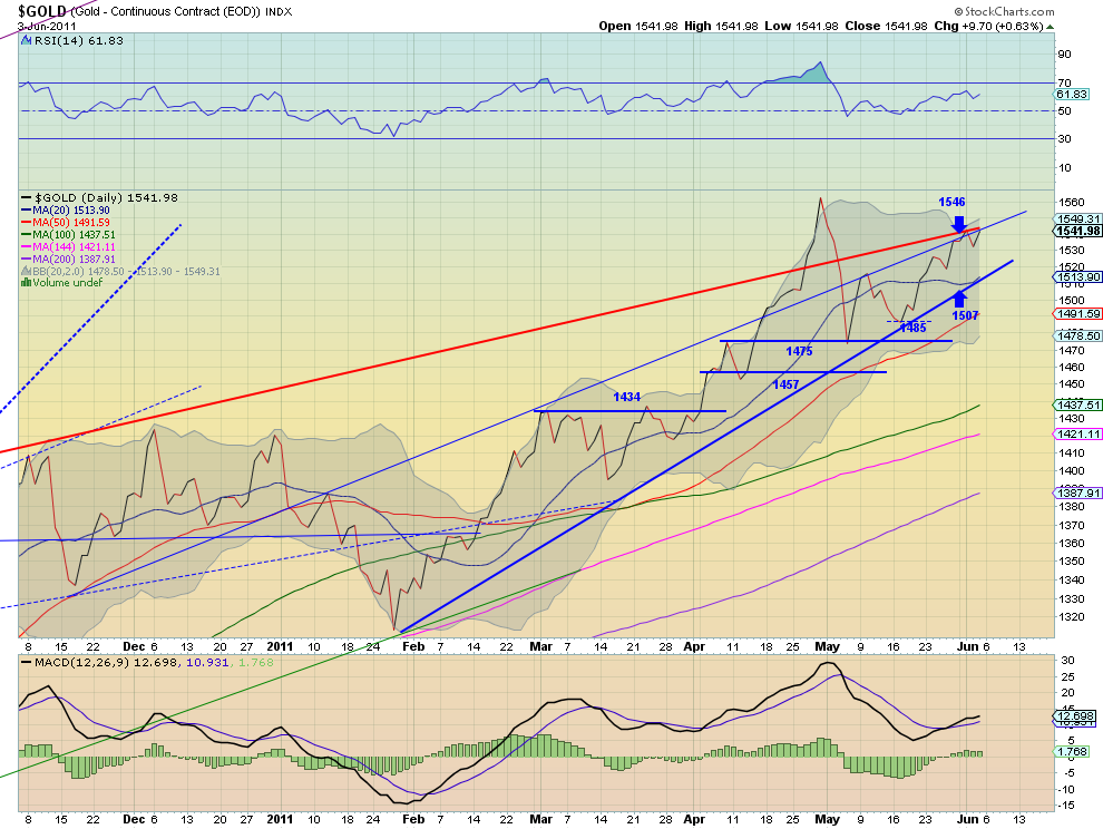
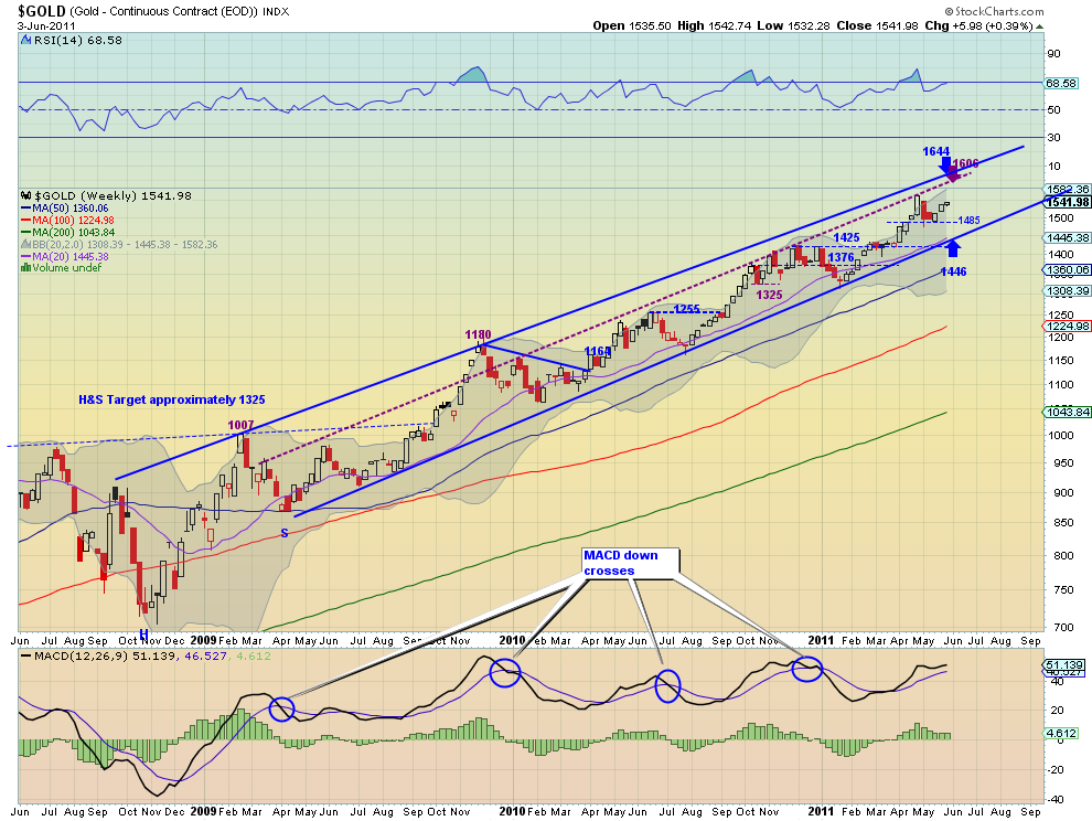
Gold remained in contact with resistance of the rising trend line on the daily chart for the entire week. The Relative Strength Index (RSI) shows a slight trend upward and the Moving Average Convergence Divergence (MACD) a gradual increase. Both support a run higher either through the trend resistance or along it. The weekly chart shows Gold in the clear and rising with a rising RSI and a MACD that is starting to grow slowly again. Both timeframes suggest more upside in the coming week. If it gets above the 1546 resistance area the previous high at 1563.20 is the next resistance and then 1600. Look for pullbacks to find support at 1517 and 1510.

West Texas Intermediate Crude Daily,$CL_F
oil d e1307151899513 stocks
West Texas Intermediate Crude Weekly,$CL_F
oil w stocks
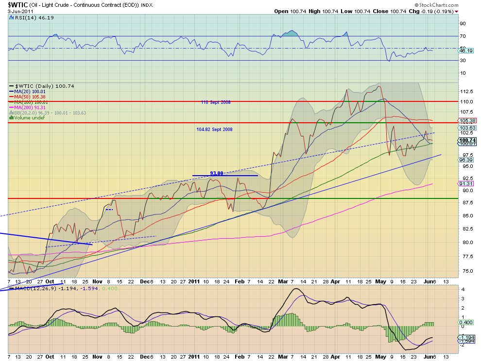
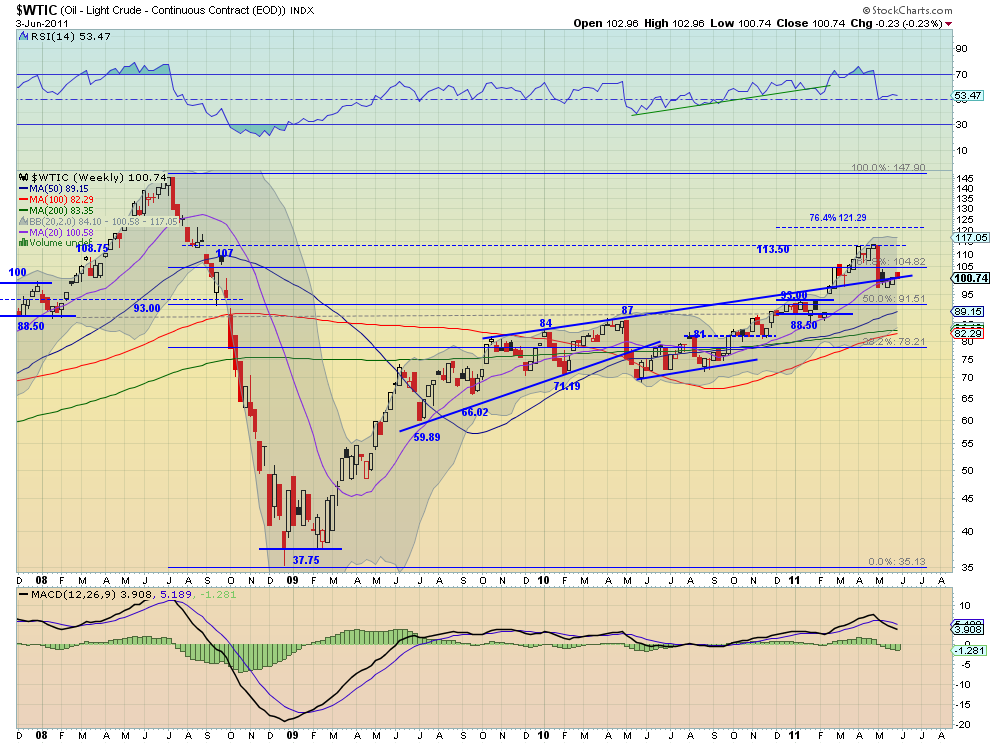
Crude Oil spent the week bouncing off of the 100 day Simple Moving Average (SMA) and the slowly rising trend line resistance, currently at 102.45. The RSI has been flirting with the mid line on the daily chart as the MACD levels. Also the SMA have started to flatten as the Bollinger bands (BB) are tightening. Consolidation before a move. The weekly chart shows a drift higher alternating around the extension of the resistance line from 2008 and the 20 week SMA. The RSI on this timeframe is holding in bullish territory but the MACD is diverging lower. This suggests a bias for the BB tightness to resolve lower. Look for next week to continue a sideways to slightly upward drift with a break of 104.82 to the upside or 97 to the downside signalling a next trend direction.

US Dollar Index Daily,$DX_F
usd d e1307151927760 stocks
US Dollar Index Weekly,$DX_F
usd w stocks
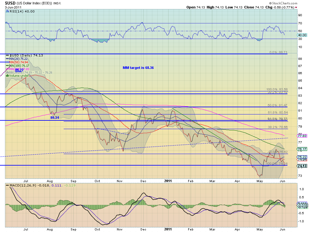
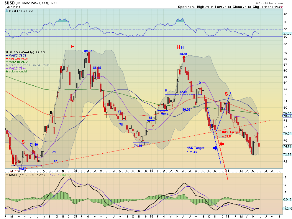
The US Dollar Index moved lower for the week and looks to continue that in the coming week. The daily chart shows it breaking below the 2009 lows again at 74.24 and resting just above previous support at 74.10 from 2008 and slightly outside of the lower BB. But with the RSI looking sharply lower and the MACD crossing negative this week the slight break of the BB on the daily chart should not stop it. The weekly chart shows a continuation off of the Marubozu from last week, with a falling RSI and a flat MACD. Support comes next at 73 with only 72 and 71.50 lower keeping it from making new all time lows. Targets get ugly down there, but for the time being look for it to continue disintegrating next week.

iShares Barclays 20+ Yr Treasury Bond Fund Daily,$TLT
tlt d stocks
iShares Barclays 20+ Yr Treasury Bond Fund Weekly,$TLT
tlt w stocks
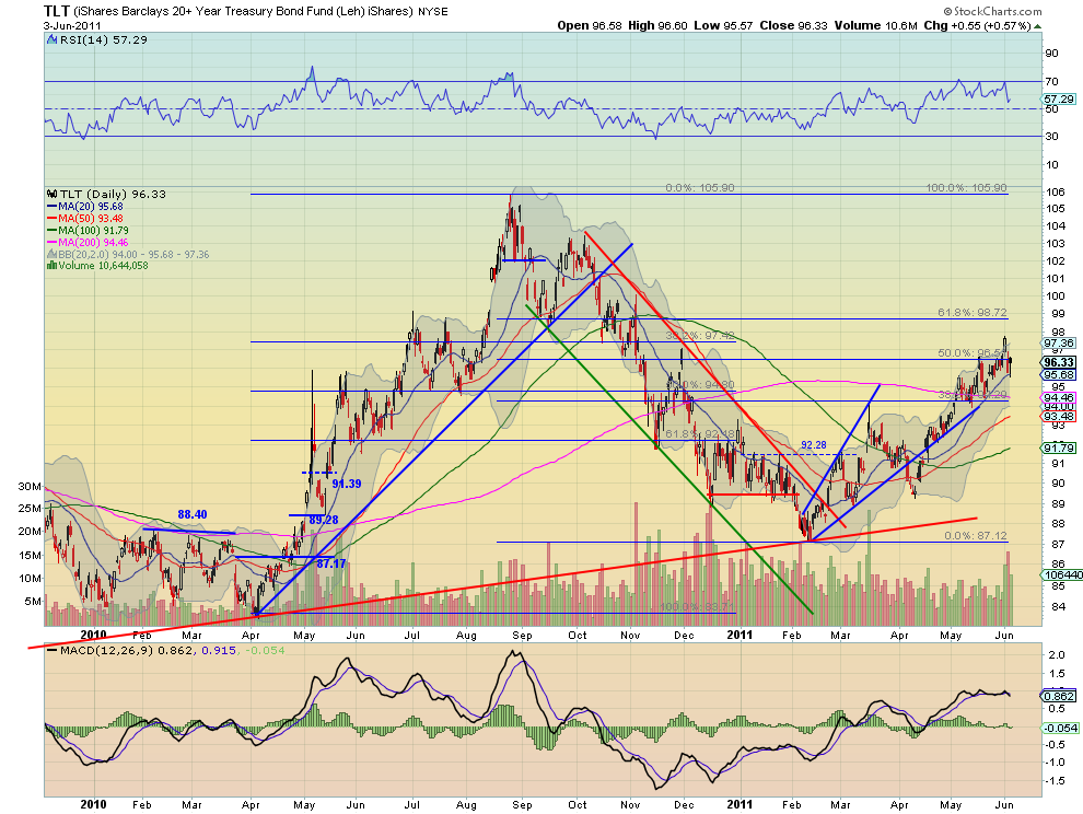
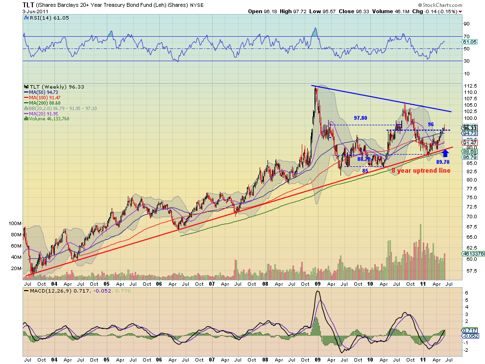
Treasuries, as measured by the TLT ETF, probed higher before falling back to support of the 20 day SMA at 95.68 and bouncing back to the 96.51 Fibonacci level. These are now short term resistance and support. The daily chart shows the RSI may be ready to turn higher again, but the MACD is crossed lower, but relatively flat. It could go either way from this chart. The weekly chart shows that indecision by way of long upper shadowed doji printed, nearly touching the 97.80 resistance and reaching just under the 96 support. The RSI on the weekly chart is rising, but flattening, as is the MACD, suggesting more upside, and that agrees with the trend since February. But add that together with the declining volume and the doji and the picture says there may have been a top set. A move below 94.20 would confirm more downside. If it gets over 97.8 then I like the upside to continue to test 100. Remain with the uptrend for next week until proven other wise.

Shanghai Stock Exchange Composite Daily,$SSEC
ssec d stocks
Shanghai Stock Exchange Composite Weekly,$SSEC
ssec w stocks
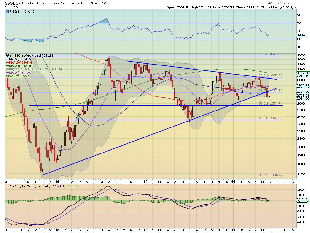
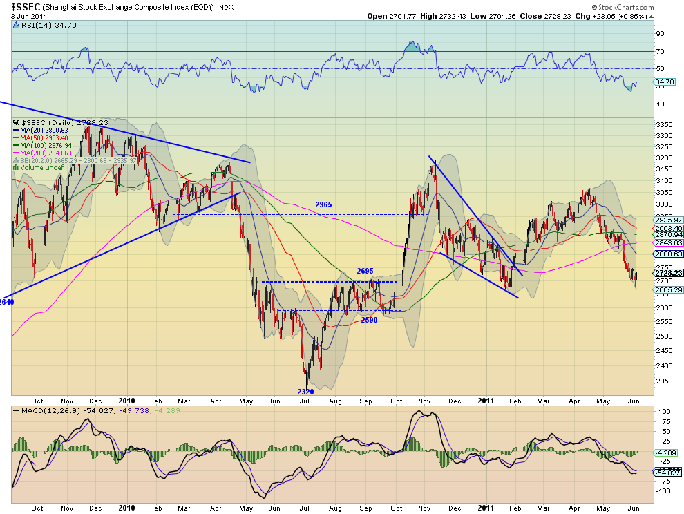
The Shanghai Composite consolidated in a bear flag at support 2695-2700 this week after a big fall last week. This allowed the RSI to work off the slightly oversold condition and the MACD to work back to level. The SMA’s turning lower suggest more downside. The weekly chart concurs with a falling RSI and a MACD growing more negative. Look for more downside short term but maybe more consolidation first with upside resistance at 2800 and a move above that changing the trend. A Measured Move (MM) lower would take it to the bottom of the support channel at 2590.
eem d stocksiShares MSCI Emerging Markets Index Weekly,$EEM
eem w stocks
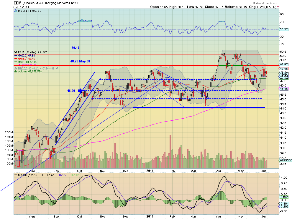
Emerging Markets, as measured by the EEM ETF, consolidated in their own flag of sorts over the 20 day SMA at 47.54 and below long term support/resistance at 48.78. The RSI on the daily chart shows this indecision resting on the mid line, but the MACD is diverging higher suggesting more upside. The weekly chart shows a solid black candle for the week holding over the 20 week SMA, and just under resistance. The flat RSI and MACD give little guidance for the next move. Look for a move above 48.78 to trigger another run to 50.17 but failure at 48.20 to lead to further consolidation in the channel above 44.30. So flat with a slight bias higher for the coming week. 

VIX Daily,$VIX
vix d stocks
VIX Weekly,$VIX
vix w stocks
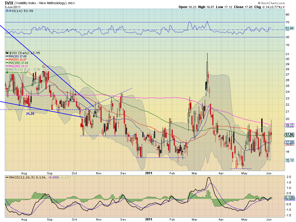
The Volatility Index tested both ends of the recent range again at 15 and 20 before settling in the middle. The SMA, RSI and MACD on both the daily and weekly charts are all still very flat and give little clue as to where the next move will be. Look for a continued tight range at relatively low levels within that range with upside possible up to 21.25 before any worries of increasing volatility.

SPY Daily,$SPY
spy d stocks
SPY Weekly,$SPY
spy w stocks
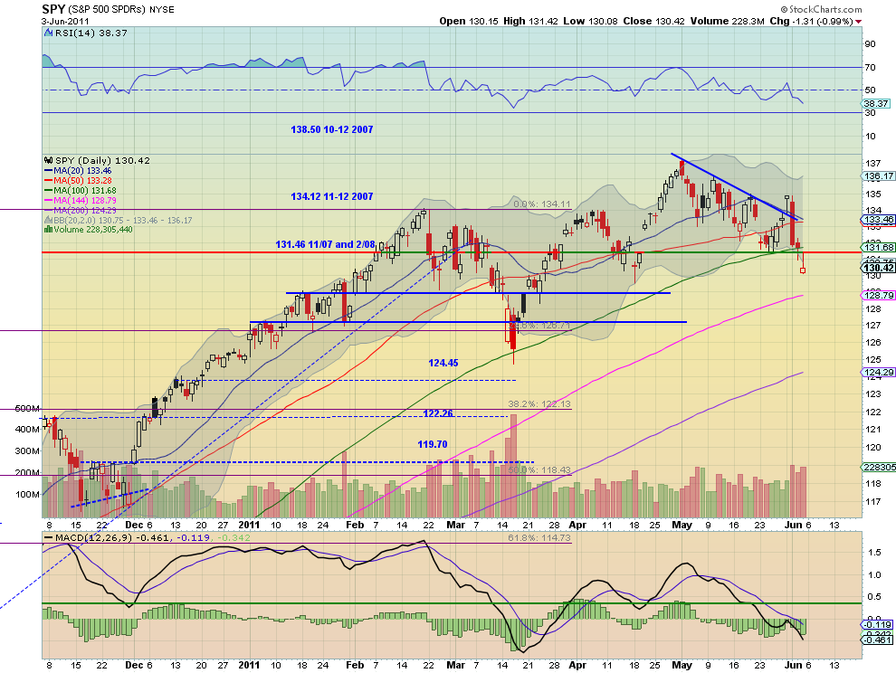
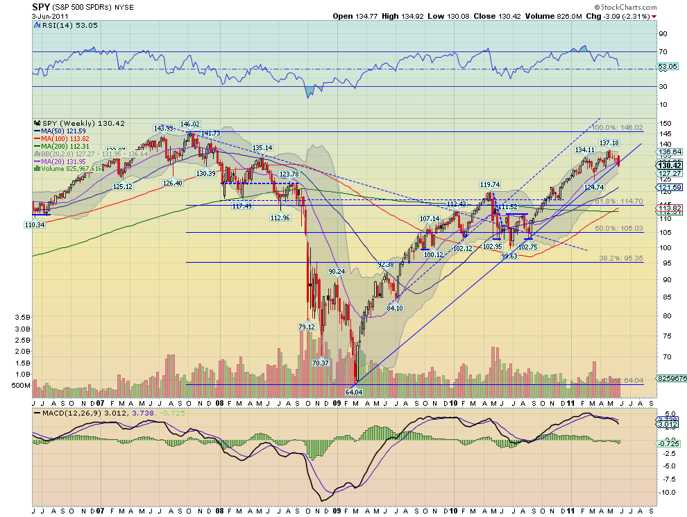
The SPY popped to a higher high on Tuesday over the downtrend resistance only to fall back and continue lower the rest of the week closing with a Hollow Red Inverted Hammer Friday near support at 130 and a lower low. A possible reversal signal after a hard move lower. It also closed under the 100 day SMA for the first time since September, when the rally began. The RSI and MACD suggest that there is more downside to come and the elevated volume confirms that. The weekly chart shows a bearish engulfing candle through the uptrend support line and the 20 week SMA. The RSI is heading sharply lower and the MACD is increasing negative. Look for next week to bring more downside, minding the inverted hammer, with support next at the 129 area near the 144 day SMA and then 127. 

IWM Daily,$IWM
iwm d stocks
IWM Weekly,$IWM
iwm w stocks
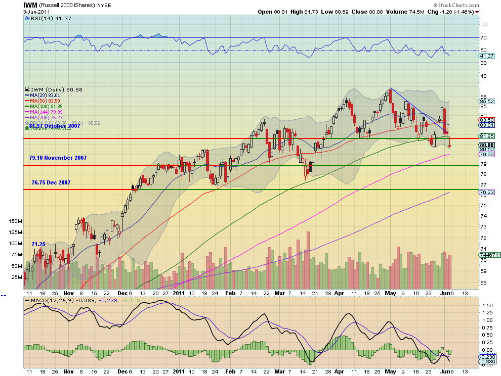
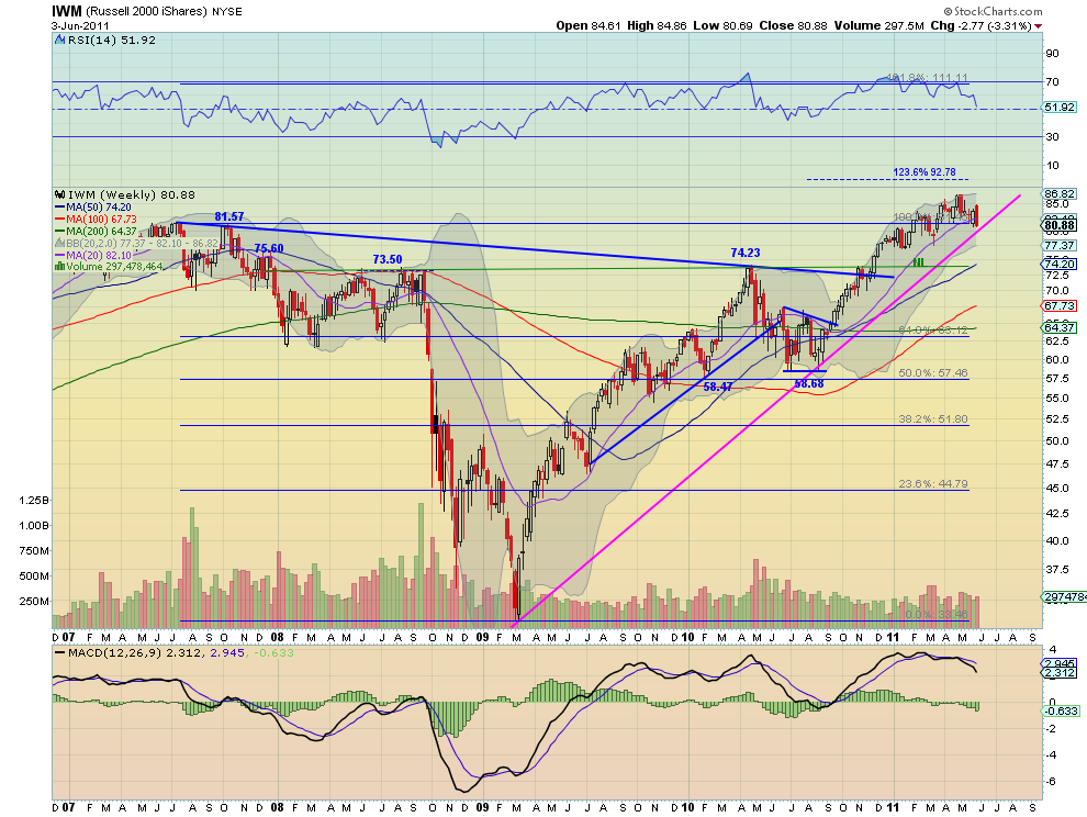
The IWM also popped to a higher high on Tuesday over the downtrend resistance only to fall back and continue lower the rest of the week closing with a Hollow Red Inverted Hammer Friday near support at 80.60 and a lower low. It also closed under the 100 day SMA for just the third time since September, the other two being last week. The RSI and MACD suggest that there is more downside to come. The weekly chart shows a bearish engulfing candle just above the uptrend support line and under the 20 week SMA. The RSI is heading sharply lower and the MACD is increasing negative. Look for next week to bring more downside, minding the inverted hammer again, with support next at the trend at 80 near the 144 day SMA and then 79.10 and 77. 

QQQ Daily,$QQQ
q d stocks
QQQ Weekly,$QQQ
q w stocks
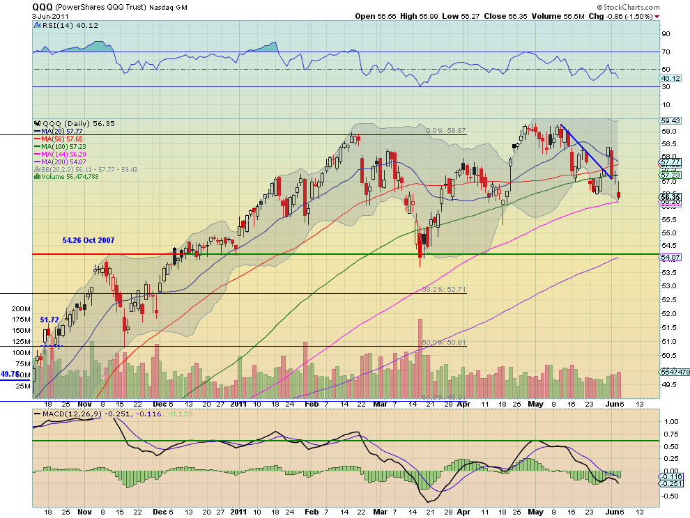
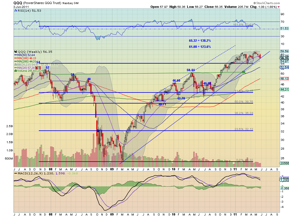
The QQQ followed suit also popping to a higher high on Tuesday over the downtrend resistance only to fall back and continue lower the rest of the week closing with an Inverted Hammer Friday near support at 56.20, and a lower low. The RSI and MACD suggest that there is more downside to come. The weekly chart shows a bearish engulfing candle at the uptrend support line and under the 20 week SMA. The RSI is heading sharply lower and the MACD is increasing negative though only slightly. Look for next week to bring more downside, minding the inverted hammer again, with support next at 56.20 near the 144 day SMA and then 55.50 and 54.26.

The coming week look to continue the trend higher for Gold with Crude Oil drifting sideways to slightly higher. The US Dollar Index should continue lower while US Treasuries remain in an uptrend but with a potential reversal looming. The Shanghai Composite could continue its flag or head lower while Emerging Markets continue their flag or head higher. Volatility should remain subdued but start to watch for a break of 21.25 to change that. The Equity Index ETF’s, SPY, IWM and QQQ are all on the same page again and look lower. Use this information to understand the major trend and how it may be influenced as you prepare for the coming week ahead. Trade’m well.

Editorial Note: My service provider is no longer providing open-hi-lo, but only close data for Gold, Crude Oil and the US Dollar Index. I will be making a decision about substituting ETF’s for the going forward vs using close only data. If you have a preference please leave your thoughts in the comments.

See the original article >>

Economic Whiplash

By John Mauldin


Non-Farm Payrolls Even Worse than the Headline
Velocity Rolls Over
Intolerable Choices for the Eurozone
And It Just Gets Worse
Tuscany

>
Do you feel as if you are suffering from some sort of economic whiplash? Between focusing on the European crisis (and it is a crisis), then looking at softening data in the US and political turmoil in Japan, not to mention the Middle East, you can be forgiven for feeling like someone just slammed into the back of your “economic recovery car.” This week we look at today’s US employment numbers, then at a troubling slowing of economic velocity, precisely at a time when it should be rising, and then consider a powerhouse, must-be-read-twice commentary from Martin Wolf on the European situation. Then I will weigh in with some of my own thoughts. Counterintuitively, the holders of certain European debt are being put at further risk by the bailout. (This letter may be a little shorter and take more work than others –which some of you think will improve it – as I am suffering from Caesar’s Revenge here in Tuscany, although I am getting better!)

As you know, I am a firm believer that the state of the global economy is such that we as investors have to be especially agile and focused today. Consequently I spend a great deal of time and effort looking into alternative investment strategies and managers. I’m very pleased to announce that I am relaunching my special newsletter for accredited investors, to share the latest opportunities and pitfalls in alternative assets.

The good news is that this Accredited Investor Letter is completely free. The only restriction is that, because of securities regulations, you have to register and be vetted by one of my trusted partners before you can be added to the subscriber roster. They include Altegris Investments in the US, Absolute Return Partners in Europe, Nicola Wealth Management in Canada, and Fynn Capital in Latin America. This is a painless process (I promise!), and just to sweeten the pot, after you register my partner will provide you access to the video of Gary Shilling’s speech from my Strategic Investor Conference in La Jolla. I don’t need to remind you how insightful Gary is, but if you’ve never seen him speak, let me just tell you that he’s absolutely compelling.

[[Click here now to register]] and you’ll be part of the summer relaunch of my letter exclusively for accredited investors. In the meantime, enjoy Gary’s video presentation and benefit from his intelligence as you plot your investment course. Over time, we will make all the conference videos available to the subscribers of the free Accredited Investor E-letter. Those who attended the conference, or have spoken with an Altegris professional, already have access to all the speeches and panels.

I do not like limiting the letter to accredited investors, but those are the rules under which I work. This is not of my choosing, and I have worked in front of and behind the scenes to try to change what I think is a very unfair rule. (See important risk disclosures below. In this regard, I am president and a registered representative of Millennium Wave Securities, LLC, member FINRA.) And now to the letter.


Velocity Rolls Over

Quickly, the following came to my inbox from my friends at GaveKal. They chart their own private calculation of the velocity of money. Notice in the chart below that the velocity of money was screaming “Problem!” during the recent crisis, began to improve with the recovery in 2009, rolled over with the end of QE1, and started to improve again (more or less) with QE2. Now, with QE2 ending, velocity is already down and falling, which is worrisome, as this comment shows. (Understand, the guys at GaveKal are typically looking for reasons to be bullish.)

“As we have highlighted in recent Dailies, our Velocity Indicator has been heading south rather rapidly. At first glance, this might appear surprising as there are few signs of stress in the financial system today: corporate spreads are decently tight, IPOs continue to roll out, and the VIX remains low. Sure, Greek debt has now been downgraded below Montenegro’s and stands at the same ratings as Cuba’s, but even acknowledging this, the recent depths reached by our Velocity Indicator is still somewhat surprising. Why, in the face of fairly benign markets, is our indicator so weak?

“The answer is very simple and it is linked to the recent underperformance of banks almost everywhere. Indeed, with short rates still low everywhere, and yield curves positively sloped, we are in the phase of the cycle when banks should be outperforming. The fact that they are not has to be seen as a concern. So does the underperformance come from the fact that the market senses that losses have yet to be booked (Europe?)? Is it a reflection of a lack of demand for loans (US?) or that more losses and write-offs are just around the corner (Japan?)? Is the bank underperformance signaling that we are on the verge of a new banking crisis, most likely linked to the possibility of European debt restructurings? Or perhaps it is linked to the coming end of QE2 and consequential tightening in the liquidity environment (see our Quarterly
published earlier today for more on this topic)?

“In our view, any of the above could potentially explain the recent bank underperformance. But whatever the reasons may be, it has to be seen as a worrying sign. One of our ‘rules of thumb’ is that if banks do not manage to outperform when yield curves are steep, the market must be worried about the financial sectors’ balance sheets (given that, with a steep yield curve, there are few reasons to worry about the bank’s income statement).”

As I have noted before, Martin Wolf is one of my all-time favorite writers. He alone is worth a subscription to the Financial Times (www.ft.com). I highlight below a column he did earlier this week. It presents the rather stark choices faced by Europe. This sentence from the 5th paragraph is spot on: “Moreover, because national central banks have lent against discounted public debt, they have been financing their governments. Let us call a spade a spade: this is central bank finance of the state.” If such a situation is allowed to prevail, it has to undermine the value of the euro. My comments, after you read this slowly and thoughtfully.


“Intolerable Choices for the Eurozone”

By Martin Wolf
“The eurozone, as designed, has failed. It was based on a set of principles that have proved unworkable at the first contact with a financial and fiscal crisis. It has only two options: to go forwards towards a closer union or backwards towards at least partial dissolution. This is what is at stake.

“The eurozone was supposed to be an updated version of the classical gold standard. Countries in external deficit receive private financing from abroad. If such financing dries up, economic activity shrinks. 
Unemployment then drives down wages and prices, causing an ‘internal devaluation’. In the long run, this should deliver financeable balances in the external payments and fiscal accounts, though only after many years of pain. In the eurozone, however, much of this borrowing flows via banks. When the crisis comes, liquidity-starved banking sectors start to collapse. Credit-constrained governments can do little, or nothing, to prevent that from happening. This, then, is a gold standard on financial sector steroids.

“The role of banks is central. Almost all of the money in a contemporary economy consists of the liabilities of financial institutions. In the eurozone, for example, currency in circulation is just 9 per cent of broad money (M3). If this is a true currency union, a deposit in any eurozone bank must be the equivalent of a deposit in any other bank. But what happens if the banks in a given country are on the verge of collapse? The answer is that this presumption of equal value no longer holds. A euro in a Greek bank is today no longer the same as a euro in a German bank. In this situation, there is not only the risk of a run on a bank but also the risk of a run on a national banking system. This is, of course, what the federal government has prevented in the US.

“At last month’s Munich economic summit, Hans-Werner Sinn, president of the Ifo Institute for Economic Research, brilliantly elucidated the implications of the response to this threat of the European System of Central Banks (ESCB). The latter has acted as lender of last resort to troubled banks. But, because these banks belonged to countries with external deficits, the ESCB has been indirectly financing those deficits, too. Moreover, because national central banks have lent against discounted public debt, they have been financing their governments. Let us call a spade a spade: this is central bank finance of the state.

“The ESCB’s finance flows via the euro system’s real-time settlement system (‘target-2’). Huge asset and liability positions have now emerged among the national central banks, with the Bundesbank the dominant creditor (see chart). Indeed, Prof Sinn notes the symmetry between the current account deficits of Greece, Ireland, Portugal and Spain and the cumulative claims of the Bundesbank upon other central banks since 2008 (when the private finance of weaker economies dried up).

“Government insolvencies would now also threaten the solvency of debtor country central banks. This would then impose large losses on creditor country central banks, which national taxpayers would have to make good. This would be a fiscal transfer by the back door. Indeed, that this is likely to happen is quite clear from the striking interview with Lorenzo Bini Smaghi, a member of the board of the European Central Bank, in the FT of May 29 2011.

“Prof Sinn makes three other points. First, this backdoor way of financing debtor countries cannot continue for very long. By shifting so much of the eurozone’s money creation towards indirect finance of deficit countries, the system has had to withdraw credit from commercial banks in creditor countries. Within two years, he states, the latter will have negative credit positions with their national central banks – in other words, be owed money by them. For this reason, these operations will then have to cease. Second, the only way to stop them, without a crisis, is for solvent governments to take over what are, in essence, fiscal operations. Yet, third, when one adds the sums owed by national central banks to the debts of national governments, totals are now frighteningly high (see chart). The only way out is to return to a situation in which the private sector finances both the banks and the governments. But this will take many years, if it can be done with today’s huge debt levels at all.

“Debt restructuring looks inevitable. Yet it is also easy to see why it would be a nightmare, particularly if, as Mr Bini Smaghi insists, the ECB would refuse to lend against the debt of defaulting states. In the absence of ECB support, banks would collapse. Governments would surely have to freeze bank accounts and redenominate debt in a new currency. A run from the public and private debts of every other fragile country would ensue. That would drive these countries towards a similar catastrophe. The eurozone would then unravel. The alternative would be a politically explosive operation to recycle fleeing outflows via public sector inflows.

“Events have, in short, thoroughly falsified the premises of the original design. If that is the design the dominant members still want, they must remove some of the existing members. Managing that process is, however, nigh on impossible. If, however, they want the eurozone to work as it is, at least three changes are inescapable. First, banking systems cannot be allowed to remain national. Banks must be backed by a common treasury or by the treasury of unimpeachably solvent member states. Second, cross-border crisis finance must be shifted from the ESCB to a sufficiently large public fund. Third, if the perils of sovereign defaults are to be avoided, as the ECB insists, finance of weak countries must be taken out of the market for years, perhaps even a decade. Such finance must be offered on manageable conditions in terms of the cost but stiff requirements in terms of the reforms. Whether the resulting system should be called a ‘transfer union’ is uncertain: that depends on whether borrowers pay everything back (which I doubt). But it would surely be a ‘support union’.

“The eurozone confronts a choice between two intolerable options: either default and partial dissolution or open-ended official support. The existence of this choice proves that an enduring union will at the very least need deeper financial integration and greater fiscal support than was originally envisaged. How will the politics of these choices now play out? I truly have no idea. I wonder whether anybody does.”


And It Just Gets Worse

It now appears that a “troika” of the ECB, the EU, and the IMF will bail out Greece yet again. They clearly cannot go to the private market. But what happens in 2013 when financing is once again needed? The lucky bond holders who have debt maturing in the next two years get 100% on the euro. Without another large bailout, the other bond holders will be lucky to get 30 cents on their debt. And this is just Greece.

The “troika” is doubling down on its losing bet in Greece and is playing with the dice loaded against them. With debt-to-GDP over 160% in just a few years, how can Greece work it out? And that is with very optimistic assumptions about GDP in a country whose government will be in severe austerity mode. GDP is likely to fall significantly, not rise slightly.

Martin Wolf is as wired in to the leadership of Europe as anyone. If he does not know how this plays out, you can bet the leaders don’t either. Milton Friedman predicted (I think in 1999) that the euro would only last until the first real financial crisis. We are almost there. If it looks like the leaders of Europe are unsure what the game plan should be, it is because they have no idea beyond kicking the can down the road and hoping that something turns up.

The political winds in Europe are shifting. The crowd that runs the various member countries today, making decisions, etc., will not long survive the changes. I think there will be new politicians with different mandates as it becomes clear that the costs of the bailout are going to fall on the tax backs of the solvent countries and that austerity is going to mean hellishly bad deflation, high and rising employment, and depression in the indebted countries.

There is $600 trillion in derivatives now loose in the world. Who knows which banks have written them and to whom? Who are the counterparties? We did not fix this with the last political fix. The next crisis has the potential to be just as bad or worse than 2008, which is why I think Europe’s leaders are so dead set on avoiding a day of reckoning. If you look under the hood, as they most assuredly have, it must be frightening. And with pushback from voters?

Contagion, thy name is Europe. And with the US economy slowing down, it might not take much to push us over the edge. We need to pay attention to European politics, which if anything is more arcane than that of the US. Stay tuned.


Tuscany

Five of my kids, three spouses or significant others, and a grandchild are here with me in Tuscany. Some of us have been a little under the weather, but are starting to feel better, and we did gamely go touring. I so love this part of the world, and the weather has been cool enough to be pleasant at night.

The next few weeks will see my kids (except for Trey) leave this weekend, and then friends from all over are coming to share the villa with us. Tiffani and Ryan and I will be working during the day and sharing company and good times with our guests in the evening. And now they are calling dinner.

… And what a dinner it was. We had a local chef come in with fresh food, homemade pasta, and all sorts of goodies. LOTS of Prosecco. Plus, Mother Nature put on a show for us. Sitting out eating under the canopy, we watched a lightning and rain storm worthy of West Texas spread out over the Tuscan hills. The French, in a 100-year drought and not that far away, must be jealous. So would West Texas today.

I am not sure I can remember when life has been better.

Night before last we went to a local destination restaurant, Il Conte Matto (The Mad Count), 100 meters from our house, and with the 600-year-old city wall running through it. I have to make a confession that is hard for this Texan to make. I normally do not order steak in Europe. In general, it is tough and tasteless. There are other dishes which are excellent that I can focus on. (Sorry, Scotland.) But the filet I had was as tender as any I have ever had. It is from a local breed called Chianina, which is a porcelain-white breed of cattle.

They are huge, the largest cattle in the world. Average for a bull is 3,500 pounds, with the largest weighing in at 3,850. Taller than anyone but Dirk (who was awesome last night against Miami). Ten feet long. I would have bet something so large would be tougher than nails, but I would have lost that bet. (Google them.) I will take that walk down the street to Il Conte Matto a few more times. And the local Italians have learned how to do Chardonnay California style. Awesome.

Time to hit the send button. The kids are waiting for Dad to join them for the final night. Have a great week. I know I am.

Your wishing I could speak some Italian analyst,

See the original article >>

Friday, June 3, 2011

Indicator suggesting a 15% stock decline ...

by Kimble Charting Solutions


See the original article >>
Morning markets: funds' return keeps crop rally ticking over

by Agrimoney.com

Agricultural commodities could have been forgiven a soft start to Friday, given something of a malaise abroad in financial markets.
Tokyo's Nikkei share index closed down 0.7%, with Hong Kong's Hang Seng losing 0.5% and Australian stocks ending 0.4% lower as weak US data from earlier in the week kept investors on the defensive, and with a much-watched monthly report on American jobs to come later.
The dollar was marginally firmer too, while oil was a touch lower, with New York crude hanging on to the $100-a-barrel level by its fingertips.
But in fact grains continued where they left off the last session, on the front foot, helped by something of an idea that losses in some other markets were to agricultural commodities' benefit.
Back in vogue
Kim Rugel at Benson Quinn Commodities said that "new money was seen pouring back into the ag complex" in the last session as funds reverse the switch to energy investments made earlier in the year when North Africa was in crisis.
"Returns appear limited in the energies on slowing US economic recovering and slack consumer demand, while the ag sector could offer higher returns on tight crop situations and new crop production concerns."
Mike Mawdsley at Market 1 braced investors for prices swinging "violently back and forth" as funds take a greater interest.
Weather threats
And the fears for this year's harvests remained alive on Friday, with weather forecasts overnight doing little to improve the situation for northern US and, in particular, Canadian farmers attempting to sow spring wheat.
Canada is into the weekend to suffer "significant" rain, WxRisk.com said, noting another system due midweek, which will hit the Dakotas too, and a further cold front around June 9-10 that "sets up the potential for significant showers and thunderstorms across large areas of the upper Plains and the Great Lakes".
The weather service added that "south of these weather systems, which means most of the Plains and the Midwest as well as the deep South, will continue to run warm and generally dry over next several days", which is not a universal benefit either given that many of these areas, such as Texas, are in drought.
Cotton, of which Texas is America's top growing state, added a further 2.1% to 167.60 cents a pound for July delivery as of 07:40 GMT (08:40 UK time), although the December lot was 0.03 cents lower at 139.20 cents a pound.
'On the defensive'
Concerns over the former Soviet Union's return in earnest to exports appeared to have been overcome, for now, too, with Australia & New Zealand Bank highlighting the "bullish developments" of Ukraine's cut on Thursday to its grain export forecast for 2011-12, and talk in Russia of levies on shipments.
There are weather worries in the region too, with a notable lack of rain of late, and forecasts not offering relief.
"The recent forecasts for this region are point to warmer, drier conditions, which could limit the potential 53m tonnes of [wheat] production that is currently expected [in Russia]," Benson Quinn said.
"While I believe they have wheat available, exporters may remain on the defensive until new crop wheat is closer to harvest."
Minneapolis leads
So Chicago wheat added 0.5% to $7.73 ½ a bushel for July delivery, with the September lot contract 0.6% at $8.23 ½ a bushel.
Minneapolis spring wheat, the high-protein type around which US spring sowing concerns are centred, soared 1.3% to $10.33 a bushel for July, with the new crop September lot showing a more measured gain of 0.7% to $9.94 a bushel.
Corn edged 0.2% higher to $7.67 ¾ a bushel with further ahead contract having a more mixed job of building on contract highs set in the last session.
The September contract gained 0.2% to $7.42 ¾ a bushel, while December eased 0.25 cents to $6.94 ¾ a bushel.
China concession?
Soybeans had extra boosts. The first was from talk that China, the top soybean importer and consumer, may lift price controls on vegetable oils, reviving margins for oilseed crushers.
The second was US data on Thursday showing that demand for soyoil from biofuels groups, following a resumption of a tax perk at the start of the year, with the amount of the vegetable oil going into biodiesel hitting 216.8m pounds in April, up 23% from March.
And thirdly, technical factors were in its favour, with the oilseed in the last session closing at a two month high, above $14 a bushel, and breaking – upwards - out of a trading range.
Slow sowings of US soybeans, and Canadian canola, besides dry weather threats to European rapeseed, helped too.
Chicago's July soybean lot added 0.4% to $14.12 a bushel.
Elsewhere in the oilseeds complex, palm oil did even better, gaining 1.4% to 3,450 ringgit a tonne in Kuala Lumpur, helped by talk of the lifting of Chinese price curbs, besides hopes for a build-up in demand ahead of the Ramadan festivities.
Data later
Later on, direction may depend on reaction to the US jobs data, which looks like a potentially multi-market moving event.
However, for crops, the US Department of Agriculture will also release weekly export sales data expected to show soybeans at least matching last time's 150,000 tonnes.
Corn export sales are pegged at 500,000-1.0m tonnes, roughly in line with last week, while wheat is seen doing well to match its 432,000 tonnes last time.

See the original article >>
Unemployment During the Great Depression Has Been Overstated

By Washingtons Blog

Unemployment During the Great Depression Has Been Overstated and Current Unemployment Understated (We’ve Now Got Depression-Level Unemployment)

The commonly-accepted unemployment figures for the Great Depression are overstated.

Specifically, government workers were counted as unemployed by Stanley Lebergott (the BLS economist who put together the most widely used numbers) … even though gainfully employed and receiving a pay check.

If we’re trying to compare current unemployment figures with the Great Depression, the calculations of economists such as Michael Darby are more accurate.

Here is a comparison of Lebergott and Darby’s unemployment figures:

Year Lebergott Darby

1929 3.2% 3.2%

1930 8.7% 8.7%

1931 15.9% 15.3%

1932 23.6% 22.9%

1933 24.9% 20.6%

1934 21.7% 16.0%

1935 20.1% 14.2%

1936 16.9% 9.9%

1937 14.3% 9.1%

1938 19.0% 12.5%

1939 17.2% 11.3%

1940 14.6% 9.5%
(see Robert A. Margo’s Employment and Unemployment in the 1930s.)

We’ve Got Depression-Level Unemployment

Unemployment is currently underreported. Even government officials admit that their “adjustments” to unemployment figures are inaccurate during recessions.

In addition, the most widely-cited statistics use the Department of Labor’s Bureau of Labor Statistics’ “U-3″ methodology. But “U-6″ figures are more accurate, because they include people who would like full-time work, but can only find part-time work, or people who have given up looking for work altogether. U-6 is also is closer to the way unemployment was measured during the Great Depression than U-3

Current levels of unemployment are Depression-level numbers, especially when compared to Darby’s figures.

For example, economist John Williams puts current U-6 unemployment at 15.9%. That’s higher than 9 out of 12 years charted by Darby.

And there are certainly Depression-level statistics in some states. For example, official Bureau of Labor Statistics numbers put U-6 above 20% in several states:
  • California: 22.0
  • Nevada: 23.7
  • Michigan 20.3
  • (and Los Angeles County has 24.1% unemployment, higher than any of the Depression years as reported by Darby)
Williams puts SGS unemployment – which he claims is the most accurate measure – at 22.3%. That’s higher than 11 out of 12 years charted by Darby.

Youngstown State University’s Center for Working Class Studies puts the “De Facto Unemployment Rate” at 28.76%. I’m not sure if that compares to methods used during the Great Depression, but it surpasses all 12 out of 12 years charted by Darby.

More People Are Unemployed than During the Great Depression

As I noted in January 2009:
In 1930, there were 123 million Americans.
At the height of the Depression in 1933, 24.9% of the total work force or 11,385,000 people, were unemployed.
Will unemployment reach 25% during this current crisis?
I don’t know. But the number of people unemployed will be higher than during the Depression.
Specifically, there are currently some 300 million Americans, 154.4 million of whom are in the work force.
Unemployment is expected to exceed 10% by many economists, and Obama “has warned that the unemployment rate will explode to at least 10% in 2009″.
10 percent of 154 million is 15 million people out of work – more than during the Great Depression.
Given that the broader U-6 measure of unemployment is currently around 17% (ShadowStats.com puts the figure at 22%, and some put it even higher), the current numbers are that much worse.

Unemployment is Long-Term

USA Today reported in December:
So many Americans have been jobless for so long that the government is changing how it records long-term unemployment.
Citing what it calls “an unprecedented rise” in long-term unemployment, the federal Bureau of Labor Statistics (BLS), beginning Saturday, will raise from two years to five years the upper limit on how long someone can be listed as having been jobless.
***
The change is a sign that bureau officials “are afraid that a cap of two years may be ‘understating the true average duration’ — but they won’t know by how much until they raise the upper limit,” says Linda Barrington, an economist who directs the Institute for Compensation Studies at Cornell University’s School of Industrial and Labor Relations.
***
“The BLS doesn’t make such changes lightly,” Barrington says. Stacey Standish, a bureau assistant press officer, says the two-year limit has been used for 33 years.
***
Although “this feels like something we’ve not experienced” since the Great Depression, she says, economists need more information to be sure.
The Wall Street Journal noted in July 2009:
The average length of unemployment is higher than it’s been since government began tracking the data in 1948.
***
The job losses are also now equal to the net job gains over the previous nine years, making this the only recession since the Great Depression to wipe out all job growth from the previous expansion.
The Christian Science Monitor wrote an article in June entitled, “Length of unemployment reaches Great Depression levels“.

60 Minutes – in a must-watch segment – notes that our current situation tops the Great Depression in one respect: never have we had a recession this deep with a recovery this flat. 60 Minutes points out that unemployment has been at 9.5% or above for 14 months.

Pulitzer Prize-winning historian David M. Kennedy notes in Freedom From Fear: The American People in Depression and War, 1929-1945 (Oxford, 1999) that – during Herbert Hoover’s presidency, more than 13 million Americans lost their jobs. Of those, 62% found themselves out of work for longer than a year; 44% longer than two years; 24% longer than three years; and 11% longer than four years.

Blytic calculated last year that the current average duration of unemployment is some 32 weeks, the median duration is around 20 weeks, and there are approximately 6 million people unemployed for 27 weeks or longer.

As Calculated Risk noted last month:
According to the BLS, there are 5.839 million workers who have been unemployed for more than 26 weeks and still want a job. This was down from 6.122 million in March. This remains very high, and is one of the defining features of this employment recession.

Job Destruction is Permanent

Many leading economists say that America is suffering a permanent destruction of jobs.
For example, JPMorgan Chase’s Chief Economist Bruce Kasman told Bloomberg:
[We've had a] permanent destruction of hundreds of thousands of jobs in industries from housing to finance.
The chief economists for Wells Fargo Securities, John Silvia, says:
Companies “really have diminished their willingness to hire labor for any production level,” Silvia said. “It’s really a strategic change,” where companies will be keeping fewer employees for any particular level of sales, in good times and bad, he said.
And former Merrill Lynch chief economist David Rosenberg writes:
The number of people not on temporary layoff surged 220,000 in August and the level continues to reach new highs, now at 8.1 million. This accounts for 53.9% of the unemployed — again a record high — and this is a proxy for permanent job loss, in other words, these jobs are not coming back. Against that backdrop, the number of people who have been looking for a job for at least six months with no success rose a further half-percent in August, to stand at 5 million — the long-term unemployed now represent a record 33% of the total pool of joblessness.
And see this.
Despite What the Government Says, Reducing Unemployment Is a Very Low Priority


Some Jobs Are Being Created … But Mainly In the Military
127,000 jobs need to be created each month just to make sure that things aren’t getting worse. (127,000 is the monthly population increase in the United States.)

But – according to ADP – last month only 38,000 jobs were created in the private sector.
There is fierce debate about how much the government has spent to create a few measly jobs. Some say that it is an insane amount, while others say the figure is lower. And see this .

But the truth is that there wasn’t very much government stimulation aimed towards creating jobs at all … other than in the military. As I pointed out in 2009, public sector spending – and mainly defense spending – has accounted for virtually all of the new job creation in the past 10 years:
The U.S. has largely been financing job creation for ten years. Specifically, as the chief economist for BusinessWeek, Michael Mandel, points out, public spending has accounted for virtually all new job creation in the past 10 years:
Private sector job growth was almost non-existent over the past ten years. Take a look at this horrifying chart:
longjobs1.gif
Between May 1999 and May 2009, employment in the private sector sector only rose by 1.1%, by far the lowest 10-year increase in the post-depression period.
It’s impossible to overstate how bad this is. Basically speaking, the private sector job machine has almost completely stalled over the past ten years. Take a look at this chart:
longjobs2.gif
Over the past 10 years, the private sector has generated roughly 1.1 million additional jobs, or about 100K per year. The public sector created about 2.4 million jobs.
But even that gives the private sector too much credit. Remember that the private sector includes health care, social assistance, and education, all areas which receive a lot of government support.
*** 
Most of the industries which had positive job growth over the past ten years were in the HealthEdGov sector. In fact, financial job growth was nearly nonexistent once we take out the health insurers.
Let me finish with a final chart.
longjobs4.gif
Without a decade of growing government support from rising health and education spending and soaring budget deficits, the labor market would have been flat on its back.
Indeed, Robert Reich lamented last year:
America’s biggest — and only major — jobs program is the U.S. military.
Raw Story argues that the U.S. is building a largely military economy:
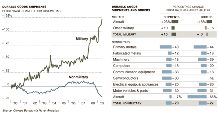
The use of the military-industrial complex as a quick, if dubious, way of jump-starting the economy is nothing new, but what is amazing is the divergence between the military economy and the civilian economy, as shown by this New York Times chart.
In the past nine years, non-industrial production in the US has declined by some 19 percent. It took about four years for manufacturing to return to levels seen before the 2001 recession — and all those gains were wiped out in the current recession.
By contrast, military manufacturing is now 123 percent greater than it was in 2000 — it has more than doubled while the rest of the manufacturing sector has been shrinking…
It’s important to note the trajectory — the military economy is nearly three times as large, proportionally to the rest of the economy, as it was at the beginning of the Bush administration. And it is the only manufacturing sector showing any growth. Extrapolate that trend, and what do you get?
The change in leadership in Washington does not appear to be abating that trend…
So most of the job creation has been by the public sector. But because the job creation has been financed with loans from China and private banks, trillions in unnecessary interest charges have been incurred by the U.S. And this shows military versus non-military durable goods shipments:

[Click here to view full image.]

So we’re running up our debt (which will eventually decrease economic growth), but the only jobs we’re creating are military and other public sector jobs.

This might be okay from a strictly economic (as opposed to moral) perspective if defense jobs reduced unemployment. But, as many economists point out, the fact is that massive military spending actually increases unemployment in the long-run.

For example, PhD economist Dean Baker notes that America’s massive military spending on unnecessary and unpopular wars lowers economic growth and increases unemployment:
Defense spending means that the government is pulling away resources from the uses determined by the market and instead using them to buy weapons and supplies and to pay for soldiers and other military personnel. In standard economic models, defense spending is a direct drain on the economy, reducing efficiency, slowing growth and costing jobs.
A few years ago, the Center for Economic and Policy Research commissioned Global Insight, one of the leading economic modeling firms, to project the impact of a sustained increase in defense spending equal to 1.0 percentage point of GDP. This was roughly equal to the cost of the Iraq War.
Global Insight’s model projected that after 20 years the economy would be about 0.6 percentage points smaller as a result of the additional defense spending. Slower growth would imply a loss of almost 700,000 jobs compared to a situation in which defense spending had not been increased. Construction and manufacturing were especially big job losers in the projections, losing 210,000 and 90,000 jobs, respectively.
The scenario we asked Global Insight [recognized as the most consistently accurate forecasting company in the world] to model turned out to have vastly underestimated the increase in defense spending associated with current policy. In the most recent quarter, defense spending was equal to 5.6 percent of GDP. By comparison, before the September 11th attacks, the Congressional Budget Office projected that defense spending in 2009 would be equal to just 2.4 percent of GDP. Our post-September 11th build-up was equal to 3.2 percentage points of GDP compared to the pre-attack baseline. This means that the Global Insight projections of job loss are far too low…
The projected job loss from this increase in defense spending would be close to 2 million. In other words, the standard economic models that project job loss from efforts to stem global warming also project that the increase in defense spending since 2000 will cost the economy close to 2 million jobs in the long run.
And the Political Economy Research Institute at the University of Massachusetts, Amherst has also shown that non-military spending creates more jobs than military spending.

Government policy has largely caused the current unemployment crisis. And until Washington and Wall Street are forced to change course, things will not meaningfully and significantly improve for a long time.

Follow Us