Saturday, May 21, 2011

S&P cuts credit outlook for Italy to "negative"


(Reuters) - Credit ratings agency Standard & Poors cut its outlook for Italy to "negative" from "stable," citing weak outlook for growth and reduced prospects for slashing its debt mountain.
The downward revision, which raises the risk of a downgrade of Italy's sovereign rating, may heighten fears that contagion from Greece's and other European countries' debt crisis could be spreading to the euro zone's third-largest economy.

"In our view Italy's current growth prospects are weak, and the political commitment for productivity-enhancing reforms appears to be faltering," Standard & Poor's said in a statement early on Saturday.

"Potential political gridlock could contribute to fiscal slippage. As a result, we believe Italy's prospects for reducing its general government debt have diminished."

Standard & Poor's affirmed its 'A+' long-term and 'A-1+' short-term sovereign credit ratings on Italy, which is slowly recovering from its worst economic downturn since World War Two and has one of the world's largest public debts.

In recent years, the ratings agency has often taken a bleaker view of the state of Italy's economy, compared to its counterparts Moody's and Fitch.

Moody's currently has an Aa2 rating for Italy, while Fitch rates it at AA-, which means S&P has Italy two notches below Moody's and one below Fitch.

Italy has weathered the financial crisis better than some of its euro zone's peers but its growth has lagged behind the bloc's average for over a decade.

Many analysts say unless it adopts reforms needed to sharply improve its growth potential, it has little chance of meeting its medium term target to cut the debt.

Italy hardly grew in the first quarter, with gross domestic product (GDP) edging up only 0.1 percent, compared with rises of 1.5 percent in Germany and 1.0 percent in France. Crisis-hit Greece grew 0.8 percent.

ITALIAN TREASURY DEFENDS ITS POLICIES

The Italian Treasury criticized the move by S&P, saying data on its economic growth and public accounts had "constantly been better than expected."

However, Italy last month cut its economic growth forecasts for 2011, 2012 and 2013 and raised its projections for the public debt. It kept the deficit outlook unchanged.

The economy is now expected to expand by 1.1 percent this year, down from a previous forecast of 1.3 percent. In 2012, GDP growth is seen at 1.3 percent, compared to 2.0 percent previously.

Public debt is expected to reach 120 percent of GDP this year, before falling slightly to 119.4 percent in 2012.

In a statement after the S&P outlook revision, the Treasury said major international organizations such as the OECD, the International Monetary Fund and the European Commission had recently given "very different" assessments on Italy from that of S&P.

Analysts from the IMF and the OECD said this month that Italy's economy was recovering slowly, but added that it would require major structural reform to boost its growth potential.

A weak economy weighs heavily on the debt and deficit ratios, and both organizations urged efforts to stimulate productivity growth and labor supply.

The Treasury ruled out the risk of political gridlock, which S&P cited as a factor that could contribute to fiscal slippage together with weaker-than-expected economic growth.

It also said measures aimed at meeting its target of balancing the budget in 2014 were "at an advanced stage of preparation" and will get parliamentary approval by July.

S&P's revision is another blow for center-right Prime Minister Silvio Berlusconi, who is embroiled in sex and corruption trials.

The media tycoon's People of Freedom party also suffered a setback this week in local elections seen as a test of his coalition government's popularity and is facing a risky run-off on May 29-30 for the city government of Milan, Italy's business capital.

The Standard & Poor's outlook change implies a one-in-three chance that the credit ratings could be lowered within 24 months.

Standard & Poor's forecast net government debt at 116 percent of GDP this year, up from 100 percent in 2007.

"Under our analysis, the economic contraction between 2008 and 2009 has negated all of Italy's fiscal-consolidation efforts over the last decade," it said.

The Italian banking sector has been strengthened by moves to strengthen capital "and is in a stronger financial position than it was six months ago," the agency said.

See the original article >>

U.S. Dollar Index Reversal Signs


The 2011 downleg in the US Dollar Index recently violated the 2009 low but has held above the more major 2008 low, finding support on the long term chart and producing an initial reversal sign too.


See the original article >>

Gold Breakout or Breakdown, What’s Next?


The precious metals blogosphere was buzzing with the news that billionaire investor George Soros has sold most of his holdings in the bullion-backed SPDR Gold Trust (GLD) and iShares Gold Trust (IAU) in the first quarter of 2011. According to reports filed with the U.S. Securities and Exchange Commission, Soros bought shares of mining companies Goldcorp Inc. and Freeport-McMoRan Copper and Gold Inc. (FCX). All together Soros sold almost $800-million (U.S.) in gold. 

Soros must have been pleased as punch to take his colossal profits off the table.

Last year Soros described gold as “the ultimate asset bubble” as he kept buying more gold. In a Nov. 15 speech Soros said that conditions for the metal to keep rising were “pretty ideal,” and in January this year, he said the boom in commodities may last “a couple of years” longer. 

What effect did Soros’s actions have on the precious metals market? While Soros was selling (and it was not yet in the news) the precious metals markets were actually rising. By the time reports leaked that George was selling, the markets had already begun to correct. So, on the face of it, there was very little effect. We would hardly be surprised if we read in the next Securities and Exchange filing that Soros took advantage of the correction to pile into gold again. In any case, Soros’s gold is still just a small fraction of the global gold market. As a measure of gold’s acceptance as a mainstream investment, the SPDR Gold Shares was the second-most-popular E.T.F. in the United States on April 30, trailing only the SPDR S&P 500 fund.

And, if you’re still worried about Soros’s sale of his gold holdings, the next item should cheer you up. The World Gold Council yesterday reported that China’s total annual gold demand topped 700 metric tons for the first time ever last year and is expected to keep rising over the next decade. China is the second-largest gold-consuming market in the world. China’s gold demand has grown by an average of 14% per year since deregulation of the gold market by Chinese authorities in 2011. Much of the demand is due to concerns about inflation. Keep in mind that China’s market is still in the neonatal stage since it has only been a decade since deregulation. There is still plenty of room for Chinese consumers to catch up with the West.

Let’s have a closer look at the gold market (charts courtesy by http://stockcharts.com). We begin with the long-term chart which looks at gold from a non-USD point of view. We do this is order to put gold’s current short-term volatility into its proper perspective. 


It appears that we have simply seen a testing of the short-term support line, a verification of its support and a move to levels slightly above the 2010 highs based on weekly closing prices. The outlook therefore remains bullish and the price action seen in 2011 is actually now creating what appears to be a very bullish cup-and-handle pattern which indicates the possibility of a strong rally from here. This does not appear to be highly likely at this time but such a rally simply cannot be ruled out based on signals from the non-USD chart.


In gold’s long-term chart (see our previous essay for long-term gold price analysis) from the USD side, we see that the trend remains up. Recent price declines here were stopped by the long-term support line and the outlook still appears to be bullish at this time. Low volume levels on days with rising prices are generally a cause for concern but that may not apply in this case.
Let’s take a look at the short-term chart for more details. 


In the short term GLD ETF chart, we see a number of signals which are worthy of mention. Technical analysis generally yields negative sentiment with the type of price/volume action we see at the end of the above chart.
The case however is simply not as bearish as it would seem and it seems somewhat premature to state that buying power is drying up. We note four previous examples of similar cases (rally on small volume preceded by a decline on big volume) in this chart within the past several months. In 3 of the 4 situations, a short-term rally followed and for this reason, the situation does not appear to be bearish at this time.

A breakout above the declining short-term resistance line has actually taken place in the last two days in the chart. In fact, the resistance lines based upon daily closing prices and daily highs in our chart were both surpassed towards the end. This is overall a bullish development.

Summing up, the overall situation appears bullish for the yellow metal in the short term. Support levels have recently been tested and held, and a study of similar corrections in the recent past indicates that there appears to be at least a short-term time frame in which a further rally appears likely. Once the next local top is in, we expect the decline to continue.

See the original article >>

QE End, Training Wheels Off, Crash Helmets On


Based on many pronouncements by economic policy makers, reams of articles by the top financial journalists and near continuous discussion on the financial news channels, it appears that the quantitative easing juggernaut that has steamed the high seas of macroeconomics for the last three years is finally pulling into port...supposedly for the last time. According to the dominant narrative, QEI and QEII helped stabilize the economy during the Great Recession and now the Federal Reserve is ready to take the training wheels off. If so, the economy may need a helmet because there is virtually no chance that it can avoid major contractions without central banking support.

It is ironic, but there is no doubt that the proposed removal of artificial stimulus would be the best thing for the country in the long term. But very few observers understand how it will inflict short term pain. So confident is the Fed that earlier this week, St. Louis Fed President James Bullard indicated that any notion of additional quantitative easing is off the table. In fact, he said the central bank may tighten policy in 2011 by allowing its balance sheet to shrink. Investors would do well to remember that Bullard was the first Fed official to support the second round of bond purchases now known as QEII. It is likely that he will make a similar reversal if the economy shows any signs of weakening in the months ahead.

Fed policy makers like Bullard are guilty of reckless optimism if they believe the economy has truly healed. The evidence of a pending slowdown is abundant. The Empire State's business conditions index decreased 10 points from April to just 11.9 in May. Meanwhile, the prices paid index rose sharply, with about 70% of respondents reporting price increases for inputs, and none reporting price reductions. That inflation index advanced 12 points to 69.9, its highest level since mid-2008. And things are even worse in Philadelphia. The Federal Reserve Bank of Philadelphia's general economic index fell to 3.9 in May from 18.5 a month earlier.

Turning to the labor front, the four week moving average of initial jobless claims rose to 439,000 last week, from 437,750 in the week prior. Of course, the real estate market continues in its malaise. According to the National Association of Realtors, April existing home sales dropped to an annual rate of just 5.05 million. Prices continue to set new post crash lows, with prices down 5% YOY. Despite the fact that the government still accounts for nearly the entire mortgage market and the Fed has rates near zero percent, inventory of existing homes jumped from 3.52 to 3.87 million units and the months' supply climbed from 8.3 to 9.2. Does it sound like the economy is ready to get up on its own two feet?

But the Fed is under pressure to do something about the growing inflation threat. Year over year increases of CPI, PPI and Import prices are 3.2%, 6.8% and 11.1%, respectively. As price increases hit middle class consumers, the Fed is facing intense pressure to push down inflation by draining the balance sheet and raising interest rates. It's a dangerous game.

In its simplest terms quantitative easing is nothing more than the government's attempt to boost consumption by borrowing trillions of dollars. Over the long haul this is no way to run an economy, and a sustainable recovery will be impossible as long as such borrowing continues. But in the short term, a cessation of government borrowing will lift the veil on our artificial economy, and reveal how dependent we have become.

U.S. fiscal and monetary austerity will cause GDP to fall as the deleveraging process that was interrupted in 2009 returns with a vengeance. I do not believe the Fed or the Administration has the intestinal fortitude to let that happen.

A bona fide Fed exit from interest rate manipulation means that both nominal and real interest rates would rise significantly. The ten year note yield is less than half its average over the past 40 years. Normalization of rates would provide a serious headwind to markets and the economy.

The high leverage that brought on the Great Recession has not been addressed in the slightest. U.S. 

household, corporate and government debt as a percentage of GDP has never been greater. So, if interest rates were to rise, why should we expect a different result from what occurred in 2008?

Whether or not the Fed is bluffing has dramatic implications for investors and the country. Mr. Bernanke will eventually have to choose whether he wants another depression or more of the inflation the Fed is so adept at causing and then denying.

For in-depth analysis of this and other investment topics, subscribe to The Global Investor, Peter Schiff's free newsletter. Click here for more information.
See the original article >>

Stock Market S&P500 Cycle Analysis Update

What leads, technicals or fundamentals? Does a price chart discount all fundamentals? These debates rage on, but I can say with the utmost accuracy that cycles are great for predicting in the next explosion of activity. A rally or a sell off, no matter cycles have an uncanny knack of being on the money when either is in the infant stages.

The latest cycle for the SP500 chart is below. The trend has been up and I have numbered the cycle tops from 1 to 5 in heavy red. One was the news of Greek debt issues, or more precisely QE1 ending, four was the Japanese Tsunami, two and three were not material. What will 5 be? I am not sure yet, but mostly likely the pricing in of QE2 ending masked in another euro debt story just to fool the mums and pops.

We are never keen to trade cycle peaks that are against the trend, but this time I feel its different. Should five be more like one, as both are consulted by the ending of a QE episode. I am not saying a flash crash is to be upon us (but never say never), but we are due for a doosie. I would not take a position base on the Hurst cycle roll over alone, I would need to see confirmation by some selling by the big boys first (via our tool RTT TrendPower). Watching and waiting.

SPY Cycle

SPY Gann Angle

Fundamentals are rolling over to bearish
See the original article >>

CPI Doesn’t Fill Your Belly Like CRB Can


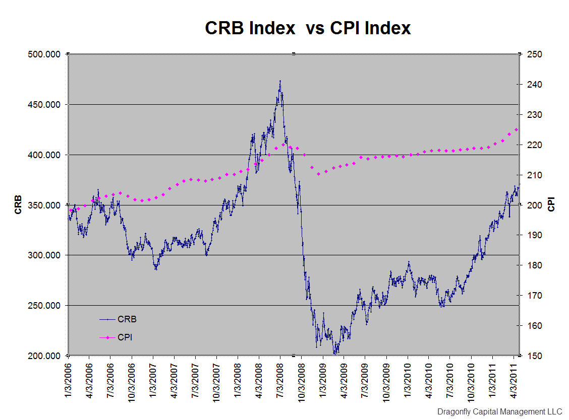
The cost of everything you need to buy, food, gasoline, and clothes is higher and rising rapidly, yet the the Federal Reserve continues to see moderating inflation that is at best transitory. How can that be? Part of the answer lies in how you measure inflation. The Consumer Price Index (CPI) is what the Federal Reserve uses. The ThomsonReuters/Jefferies CRB Index measures the cost of things you actually buy. Below is a chart of the two plotted against each other. The CRB is plotted on the left scale and shows a rise from about 200 to over 360 since the low in 2009. That is about 34% per annum rise in the cost of goods you buy. The CPI is plotted on the right hand scale and shows a rise from about 210 to 226 over this same period or about 3.7% per annum rise. The first thought that comes to mind is that it is no wonder that Ben Bernanke and his team cannot see that everything is more expensive. The second thought is then, how can there be such a big difference?
crb vs cpi2 e1305589026873 stocks
The answer lies in what items you use and how you create your basket of goods. From the US Department of Labor Bureau of Labor Statistics website, “The CPI represents all goods and services purchased for consumption by the reference population (U or W) BLS has classified all expenditure items into more than 200 categories, arranged into eight major groups. Major groups and examples of categories in each are as follows:

FOOD AND BEVERAGES (breakfast cereal, milk, coffee, chicken, wine, full service meals, snacks)
HOUSING (rent of primary residence, owners’ equivalent rent, fuel oil, bedroom furniture)
APPAREL (men’s shirts and sweaters, women’s dresses, jewelry)
TRANSPORTATION (new vehicles, airline fares, gasoline, motor vehicle insurance)
MEDICAL CARE (prescription drugs and medical supplies, physicians’ services, eyeglasses and eye care, hospital services)
RECREATION (televisions, toys, pets and pet products, sports equipment, admissions);
EDUCATION AND COMMUNICATION (college tuition, postage, telephone services, computer software and accessories);
OTHER GOODS AND SERVICES (tobacco and smoking products, haircuts and other personal services, funeral expenses).”

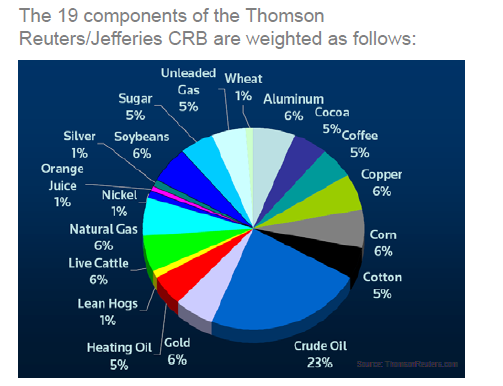
The Composition of the CRB is as below.
5 19 2011 4 29 34 PM stocks

Can you see the difference? The CRB consists of a basket of goods that you buy regularly. You are reminded how much theses goods change every time you fill up your tank or go to the grocery store. The major additions to that the CPI adds in are important costs but ones that often only change once per year or less like a mortgage or rent payment and the cost of healthcare. Additionally it adds items that are usually one off or so expensive that you do not look at them the same way, like college tuition or a new car. These additions have significant weights. Housing for example has a weighting of over 35% excluding energy costs, and new cars, education and medical costs another 18% weighting. Over 50% of the index is from items that change once a year or less. No wonder it is more stable. This does not answer whether or not the Federal Reserve is looking at the correct measure, but at least now you can make the argument with valid data.

Follow Us